|
Size: 15073
Comment:
|
Size: 15072
Comment:
|
| Deletions are marked like this. | Additions are marked like this. |
| Line 106: | Line 106: |
| Typical contemporary behavior is to hide scrollbars when static, as in the left image. When scrolling (here, so fast the images are not yet loaded as it is an [[Infinite Scroll]]) the scrollbar appears: | Typical contemporary behavior is to hide scrollbars when static, as in the left image. When scrolling (here, so fast the images are not yet loaded as it is an [[Infinite Scroll]]) the scrollbar appears:<<BR>>{{attachment:iOS-scroll.png|Typical contemporary behavior is to hide scrollbars when static, as in the left image. When scrolling (here, so fast the images are not yet loaded as it is an [[Infinite Scroll]]) the scrollbar appears.}} |
| Line 108: | Line 108: |
| {{attachment:iOS-scroll.png|Typical contemporary behavior is to hide scrollbars when static, as in the left image. When scrolling (here, so fast the images are not yet loaded as it is an [[Infinite Scroll]]) the scrollbar appears.}} | The length of the scrollbar communicates a sense of how much content is in the viewport, vs on the page:<<BR>>{{attachment:DSC6337.png|The length of the scrollbar communicates a sense of how much content is in the viewport, vs on the page.}} |
| Line 110: | Line 110: |
The length of the scrollbar communicates a sense of how much content is in the viewport, vs on the page: {{attachment:_DSC6337.png|The length of the scrollbar communicates a sense of how much content is in the viewport, vs on the page.}} Anti-pattern -- This scroll area includes arrows, so looks like a desktop scrollbar. But in that case the little arrows are controls. Mobile scrollbars (like this one) are just indicators so cannot be interacted with. Avoid using elements that imply control. {{attachment:_DSC5579.png|Anti-pattern -- This scroll area includes arrows, so looks like a desktop scrollbar. But in that case the little arrows are controls. Mobile scrollbars (like this one) are just indicators so cannot be interacted with. Avoid using elements that imply control.}} |
Anti-pattern -- This scroll area includes arrows, so looks like a desktop scrollbar. But in that case the little arrows are controls. Mobile scrollbars (like this one) are just indicators so cannot be interacted with. Avoid using elements that imply control.<<BR>>{{attachment:_DSC5579.png|Anti-pattern -- This scroll area includes arrows, so looks like a desktop scrollbar. But in that case the little arrows are controls. Mobile scrollbars (like this one) are just indicators so cannot be interacted with. Avoid using elements that imply control.}} |
Problem
More information is in the page or element than can fit in the viewport. You have to provide a method to access this information.
Usually, the OS provides this function. Certain behaviors will occur automatically, but in application design especially, you may need to customize your interaction and interface to work in the best possible manner.
Solution
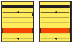
Scroll bars (Figure 1-3) have long been used in information display systems of all sorts. For mobile, you will display them to indicate the scrollable axes, and the relative position within the scrollable area.
Due to the scale of mobile devices, as a general rule you should not allow the scroll bar to be manipulated directly. Instead, allow the content to be grabbed directly by a gesture, or make the entire area movable via dedicated Directional Entry keys.
You will find that scroll behaviors are key to interaction with mobile devices. As with all the patterns around page Composition, Scroll will be mentioned in most of the patterns in the rest of the book. It is especially relevant to the list and list-like Display of Information patterns:
Although scrolling does occur in other patterns, do not confuse it with other patterns, such as Infinite Area. That pattern does not use scroll bars due to the arbitrarily large data set presented.
Variations
Whenever possible, you should make sure scrolling takes place on a single axis. This is why the whole set of patterns based around Vertical Scroll exist. When the situation demands, such as for zooming in to content which otherwise fits the area, you can also offer a secondary scroll axis. Keep the secondary axis in mind throughout the design process; it may help you to understand how to avoid behaviors which may lead to confusion or cause the user to become lost when scrolling.

In rare cases, both axes of movement may be equally important. When zooming in on images, for example, the information is equally important in all directions.
Regardless of whether you are making a single-axis scroll or just selecting a primary axis, vertical scrolling is usually the easiest for users to understand and use. This is a result of language, where text uses horizontal space inefficiently, so additional items must be displayed in the vertical axis. See the Vertical List pattern for more discussion. This also means users are most familiar with vertical scrolling items, and so react best to them, though this may change over time.
Using the horizontal axis is occasionally useful for certain kinds of data, but is most useful when you must present a subsidiary scrolling area. If you have a vertically scrolling page of information, you can provide areas which allow for scrolling horizontally. This can provide additional clarity, and removes conflicts around in-focus scrolling that we have all encountered. (Think of what happens when you encounter a large form area in the middle of a web page.)
Whenever possible, you should display scroll indicators. Try to solve space and clutter problems with options presented in this pattern, and not by removing the indicators entirely.
For multiaxis scrolling especially, you can instead provide a thumbnail of the entire avail- able area, as shown in Figure 1-4. This is usually, but not always, in addition to the scroll bars. The thumbnail shows the current viewport as a subset of the total area.
Interaction Details
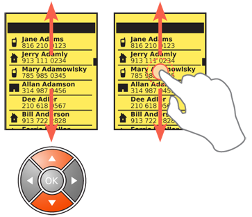
Only allow items which are in focus to scroll. For scroll-and-select devices especially, be sure this is clearly communicated and strictly enforced. See the Focus & Cursors pattern for a discussion of communicating focus.
For scroll bars on touch or pen devices, it is almost always best to not allow the scroll bar itself to be directly manipulated. Handset-size devices are too small, so this would encourage accidental input on the screen. Instead, the entire page is scrolled by gestural movement. Use care with detection of gesture to avoid selecting items on the page.
When designing for devices with larger screens, you may be able to add actionable scroll bars. Often, these still are distractingly large, so you may want to make them appear only conditionally. A similar function, suitable for many sizes, is discussed in the Location Jump pattern.
Scroll-and-select devices will use a scroll key pair, or more often a five-way pad of some sort(see Directional Entry). Scrolling may be by item (line by line, or jumping link to link) or by moving a pointer on the screen. When you use a pointer, do not allow it to get too close to the edge of the screen; scroll when one-third to one-fourth of the way across. Of course, at the limits of the displayable information, it may approach the edges in order to select all items in the screen.
For item scrolling, do not allow the user to jump past content. For example, when viewing a web page, if the primary method jumps link to link, when there is a large area of content with no links, temporarily suspend this and scroll a few lines at a time so that all content can be seen.
You can also provide item scrolling as a secondary method. If you have set the Up and Down scroll keys to move line by line, the unused Left and Right keys may be set to jump from link to link.
When using the five-way pad, users should always be able to press and hold in one direction for a short time to accelerate scrolling. The absolute speed depends heavily on the amount of content. Scrolling must be slow enough to allow the user to see his current position; otherwise, he will not know when to stop scrolling. This is extremely expected behavior, and so is noted when not included.
For touch and pen devices, inertia scrolling has also become expected behavior. If the user’s finger (or pen) initiates a drag action, and departs the screen while still moving, the screen will continue scrolling at the departure speed until it is stopped by another form of input. It is usually best if you configure this to simulate friction so that the scrolling gradually slows over time, but do not overdo this deceleration if the list is very long.
If a thumbnail of the total content is provided, this may also be interactive. For touch and pen devices, tapping another area of the thumbnail will jump to that area. For scroll-and-select devices, Accesskeys may be provided to allow jumping to a region of the displayed area.
You can also use Kinesthetic Gestures, such as tilting the device, to scroll pages. These are not very common, so there are few standards regarding their implementation, and users must generally be instructed in their use.
Presentation Details
Scroll indicators are not usually used in mobile devices to enable scrolling, but to:
- Provide an affordance (communicate the function) that the area is scrollable
- Convey the current location within the total content
- Indicate the relative amount of information the viewport displays, as a ratio of the total content
Always be sure to display an indicator of position. This may be hidden for full-screen views, when other information is hidden. But be sure to display the scroll position indicators whenever the user is interacting with the content, and especially whenever the user is scrolling.
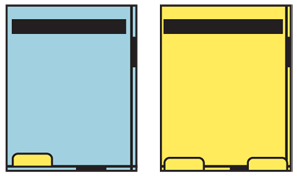
Scroll bars may be made very small, or be obscured by other elements in some cases, as in Figure 1-5. Effective, visible scroll bars can be as small as two pixels wide: a single pixel line defines the outside of the bar, a single pixel line defines the inside, and a different colored area is for the current position. Naturally, this depends on the resolution of the display, so larger bars will be needed for very high-resolution displays due to the small pixels; for devices where the screen may overscan (such as for TV output) or the bezel is large enough, it may occlude the screen.
You can also eliminate the scroll bar itself, and just use the scroll indicator alone. A small tab can be anchored to the edge of the screen, protruding into the content a small amount. This must be larger (at least 5 to 10 mm wide), but since it floats on top of content, it doesn’t take any actual room from the display area, unlike a traditional scroll bar. The position of the scroll indicator within the viewport indicates the position of the view- port relative to the total scrollable area.
The height of the scroll indicator, in either case, should reflect the ratio of the viewport to the total scrollable area. For scroll bars, this should use the viewport as the 100% scale, so if very little is outside the viewport, the scroll indicator is almost as large as the viewport. For indicators without scroll bars, the size of the indicator must often remain relatively small to avoid obscuring information; a relative size change may still be possible, but will not be as effective at communicating the relative scale to users, or might obscure too much content.
When you have a scrolling area displayed, but it is not in focus so the scroll actions will have no effect, be sure to communicate this to the user. Generally, simply removing the scroll indicators will do, but often the secondary value of the indicator (position and size) is still useful. When displaying a Pop-Up layer, simply graying out the scroll bar in the parent window may or may not be sufficient. Additional changes to the scroll indicators may be needed.
Antipatterns
Do not allow users to become lost in the scrollable area. Especially be sure to not allow scrolling single-axis lists so far that no content is visible.
Consider anchoring secondary axis scrolling to an edge when scrolling on the primary axis. Two-dimensional scrolling is often very difficult to achieve with precision.
If you have to use multiaxis scrolling to show the information, do not assume it will be easily understood. Try it out, and add additional help or more prominent scroll indicators as needed.
Whenever possible, avoid vertically scrolling areas within other vertically scrolling areas. For example, a form text area within a page will, when it is in focus, stop the page scroll and grant all scrolling to itself until it has scrolled all the way to the bottom, then may allow the page to regain scroll focus. This is confusing, and often leads to errors. Avoid it instead.
For touch and pen devices, avoid drag-and-drop interfaces, or other interactions that re- quire dragging an element within a scrollable area. If required, consider multifinger On-screen Gestures or Press-and-Hold interactions as a method to initiate a mode switch.
Be sure to support all the available input methods for the devices you will support. Touch and pen devices which also have five-way pads must be able to be entirely used (as far as scroll and selection goes) with the five-way pad. If there are multiple types of hardware for your target audience, be familiar with all of them, and do not just design for your handset.
When scroll indicators are used on an Infinite List, the location and relative size must reflect the total size of the available data. Do not allow the scroll indicator location to be based on the currently loaded data, and therefore to constantly change as new data is re- trieved. You can do this by getting a count of the total number of items, and loading empty containers of the full size; only load data into them when demanded, instead of loading the container as well.
Next: Annunciator Row
Discuss & Add
Please do not change content above this like, as it's a perfect match with the printed book. Everything else you want to add goes down here.
Examples
Typical contemporary behavior is to hide scrollbars when static, as in the left image. When scrolling (here, so fast the images are not yet loaded as it is an Infinite Scroll) the scrollbar appears:
![Typical contemporary behavior is to hide scrollbars when static, as in the left image. When scrolling (here, so fast the images are not yet loaded as it is an [[Infinite Scroll]]) the scrollbar appears. Typical contemporary behavior is to hide scrollbars when static, as in the left image. When scrolling (here, so fast the images are not yet loaded as it is an [[Infinite Scroll]]) the scrollbar appears.](/wiki/Scroll?action=AttachFile&do=get&target=iOS-scroll.png)
The length of the scrollbar communicates a sense of how much content is in the viewport, vs on the page:
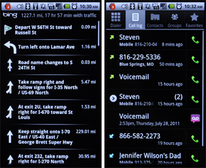
Anti-pattern -- This scroll area includes arrows, so looks like a desktop scrollbar. But in that case the little arrows are controls. Mobile scrollbars (like this one) are just indicators so cannot be interacted with. Avoid using elements that imply control.
Make a new section
Just like this. If, for example, you want to argue about the differences between, say, Tidwell's Vertical Stack, and our general concept of the List, then add a section to discuss. If we're successful, we'll get to make a new edition and will take all these discussions into account.

