Problem
You must present a set of information, which is either a series of screen-sized items or can be grouped into screens, for viewing and selection.
The Film Strip is directly supported by several mobile OSs, and programming platforms. It can be simulated effectively on many others. It may be difficult to use this in certain platforms, such as within web pages, due to scrolling conditions.
Solution
As with many of these terms and concepts, the filmstrip is a real machine-era display device, a sort of cheaper way to display a slideshow. Instead of the slide film being cut up and placed into slides, however, the film was kept on a continuous roll and fed into a very simple machine that displayed an area as large as one exposed frame. The transition was not hidden but out in plain sight for all the viewers. One frame slides up while another takes it's place, separated by a small gap. Clever presentations embraced this paradigm and had images span the frames, or discussed processes as continuous vertical flows, with arrows leading from one frame to the next.
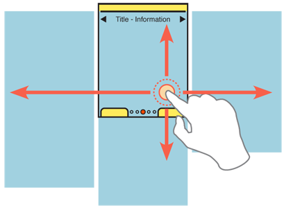
In mobile devices, a Film Strip is similarly a series of screens, displayed as a continuous strip, with small spaces or markers between them. When a particular screen is centered, it fills the entire viewport. During a scroll, part of two screens and the divider can be seen at the same time.
For viewing individual items, such as images, you may fit the entire image to the viewport. For collections or groups of information such as articles, lists or groups of icons, the individual screen may also scroll up and down.
Variations
The Filmstrip is used in two distinctly different ways.
 When displaying full-frame items, such as images, this essentially is a Slideshow where the relationship between images is more clearly defined. You might find this to be helpful to your users when transitioning to this view from a Carousel or other list, where the relationship was explicitly stated.
When displaying complex items, such as a grid of Icons, or a page of text content, the individual frames are considered pages, either in a process, or display of equal information. A common use is for a multi-page Home & Idle Screen. The basic interaction of pages sliding in from the side may also form the basic interaction paradigm for the entire application, or OS.
Rarely, you may wish to implement the Filmstrip as a large grid, with scrolling between frames in both axes, or possibly even at angles. The full-screen nature of the individual panes makes this different from the rare version of the Grid or from the Infinite Area patterns.
Interaction Details
When you use the Film Strip to display full-screen content, like images in a Slideshow, only allow scrolling to reveal more images. Scrolling is most effective when side-to-side, or horizontal to the ground. This means you have to account for Orientation changes and make the display and interaction work in both portrait and landscape.
If you use the Film Strip to display complex, page-level information, the pages do not need to be restricted to the size of the viewport. Scrolling sideways, via touch or with hardware Directional Entry keys will perform the usual action to reveal a new page, but conventional vertical Scroll may also be used, within the page currently in focus.
Other methods of accessing the adjacent pages, such as clicking on a Link to reveal it, can be designed to look and feel related but are outside the scope of this pattern.
Scrolling must always be "live", or show the items moving on the screen. If you cannot do this for technical reasons, the point of the pattern will be lost. Users will not understand the relationship between the frames. Do not use the pattern and select another method.
When designing for scroll-and-select devices, or touch devices with hardware Directional Entry keys, make a single click load the entire next frame, by animating a sideways slide. For gestural scrolling, enable dragging so that when the frame divider is about halfway across the screen, it will "snap" to the frame in the gestured direction. If the user's touch input is stopped at this point, the next frame will slide into view anyway. Any movements smaller than this will revert back to the starting frame. For all these, including snapping back to the starting point, the action should be animated.
For full-frame displays, such as Slideshows, be sure to include acceleration or key repeat functions to allow the user to scroll across several frames quickly. This should work for both touch and scroll-and-select devices. Unlike high speed scroll through Vertical Lists, at each frame in a Film Strip the scroll should pause for fraction of a second. The time to transition may be greatly increased.
 When not suppressed for full-screen display, the Annunicator Row should be fixed to the viewport, and not scroll.
When on any single screen or page, you can use conventional design elements, including scrollbars, Titles and Fixed Menus or Revealable Menus. Or, you may hide these if the frame is a full-page display and they are not appropriate. When the scrolling action is taking place, these items should generally be suppressed, to avoid users becoming confused as to what is a selectable item.
For certain types of data, or certain interaction models on the device (e.g. especially scroll-and-select devices) you will want to add a Pagination. This may be visible at all times, made to be visible via an option, or only visible when scroll has otherwise been initiated. Unlike the other widgets, it is generally available during the scroll actions.
Circular scrolling is encouraged when practical, but may not apply to certain types of data. It may be important, for example, if you have a list of date-ordered information, that the information have a distinct start and proceed from there.
Presentation Details
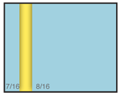
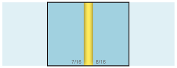
You must make a clear delineation between the individual frames. The best solution is to display a gap, as though each frame is a physical object, floating above another surface. If this is not practical, you can sometimes get by with divider lines, or by creating a "gutter" from the margins along the edge of each frame. Without some indication of the edge, the relationship between elements while moving may not be clear.
A Location Within widget should be displayed if there is no Pagination widget as described above. Depending on the type of data used, this may be visible only when scrolling, or at all times.
When on any single screen or page, you should follow conventional design methods for page design, and include common elements, such as Titles.
Antipatterns
Do not allow horizontal scrolling within a single panel of the filmstrip. For example, if displaying a list of images, zooming in must disable the ability to scroll between frames, or must not be allowed. Without this, it will be unclear where the edge of the scrolling within the image is, and users will unexpectedly jump, loosing their place.
Make sure that each vertically scrolling area is entirely independent. Scrolling to the bottom of a page, then moving to the right will load the top of that page.
If live scrolling (animating the transition between screens) cannot be implemented for technical reasons, the pattern being used is not a Filmstrip.
Next: Slideshow
Discuss & Add
Please do not change content above this like, as it's a perfect match with the printed book. Everything else you want to add goes down here.
Examples
If you want to add examples (and we occasionally do also) add them here.
Make a new section
Just like this. If, for example, you want to argue about the differences between, say, Tidwell's Vertical Stack, and our general concept of the List, then add a section to discuss. If we're successful, we'll get to make a new edition and will take all these discussions into account.
