Problem
You must present a set of information, most or all of which are unique images, for selection.
Grid display does not require unusual or special conditions in order to be implemented. It maybe easily used for applications or websites on any device which can display the images adequately.
Solution
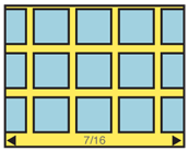
A Grid displays a set of selectable images, not all of which can fit in the available space. It simulates a continuous array of images, only some of which can be seen at once due to the limited size of the device viewport.
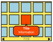
The images presented should be similar in size and aspect ratio. You can display a small amount of additional information about each image as it becomes in focus. The in-focus item will be indicated in some way, but does not change size.
The user can scroll through the set via any number of methods. Indicators should be present whenever acceptable to the OS standards. Scrolling brings more images in from the sides, and changes the item in focus. You must always use live scrolling, so the items move as part of the continuous list, instead of appearing or jumping.
Variations
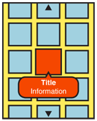
You should only use a Grid when one axis of movement works well for the display and organization of your information. This one axis can be either vertical or horizontal. Two dimensional grids will generally scroll in the longest direction of the viewport, regardless of orientation. No movement should be allowed in the short direction.
All Grids simulate an array of images on a flat surface, such as a desktop. But they do not have to do so literally; the backdrop may be anything, or a solid color. Today, it is common to use the conventional backdrop image, which indicates that the images in the Grid are floating above a relatively distant surface.
Some 3D effects may be used, especially with accelerometer-equipped devices, as loading or scrolling animations, to allow viewing more images by tilting, and so forth.
A rare alternative type of Grid arranges the thumbnail images as though on a sheet or globe, allowing scrolling in any direction. This may be useful for emphasizing certain types of data relationships between images in the grid. This is very similar to the Infinite Area pattern, but the individual thumbnails align it more closely to Grid.
Interaction Details
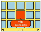
Any visible item may be selected. Selection may result in any of a number of actions; you may display of additional information, or perform drilldown methods such as a Pop-Up, Slideshow or simply displaying a new page of information.
If your information set can be applied to it well (such as all for images photographed on a certain day), a Location Jump widget may be useful.
You may offer scrolling by On-screen Gestures, Directional Entry keys, or selection of scroll functions directly on the screen. Scrolling must always be "live" or show the items moving on the screen pixel-by-pixel, as the movement is made. If you cannot implement this due to technical constraints, do not use the pattern and select another method instead.
For most data sets, scrolling should be circular, where scrolling past the end of the grid will load the next end of the grid. This prevents the user from having to scroll large distances in many cases.
Array items so lines are read the short direction, then jump to the opposite end on the next line. For example, for a photo album with a grid scrolling horizontally, the newest item is in the top left corner. The next oldest is below it, and so on to the end of that column. The next oldest item is at the top of the next column to the right.
Presentation Details
You should indicate position in the list with a conventional Pagination or Location Within widget. The total number of items should be easily obtainable or shown, but other features of the Pagination widget may not apply to the particular data set, or presentation.
The item in focus may display additional information, such as labels, or meta-data. This may be presented below the image, or in an entirely other area reserved for this information, such as a bar across the bottom of the entire image area. This is a good place to use Tooltips or Annotations to hold this information. A small Pop-Up dialogue may also serve this need, and may be easier to implement.
For pen and touch devices, without explicit in-focus or hover states, the focus paradigm is usually eliminated, and no attempt is made to simulated it. This is exactly the same as it is with position in the Carousel pattern. However, be sure to support scroll-and-select actions for devices that have Directional Entry controls, even if they are secondary to a touch screen.
For circular scrolling grids, a gap or other indicator should be displayed to mark the start and end of the grid. This may be as large as the viewport, so a very deliberate scrolling action is require to scroll to the other end of the grid.
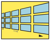 Images at the end of the viewport, along the scrolling axis, should imply there are additional images outside the viewport by being cropped, and not fitting entirely within the viewport. This is to lead the user to believe there is addition information if they scroll; if they just try to scroll enough to see the rest of the image, they will also become aware of additional images.
Additional Scroll indicators are strongly encouraged. Simple arrow/triangle indicators to the sides, or immediately to either side of labels for the item in focus are common. If selectable directly, the indicators should change when selected and while the carousel is moving to indicate their activity. Scroll bars or other such indicators may or may not work depending on the design of the page.
Antipatterns
Use caution when choosing the selection action. Do not make it too difficult to do alternative tasks, such as clicking on adjacent items or functions attached to the image, by making a single selection task too easy.
Avoid making the display overly-complex. Despite the information density of the grid, a conventional one-axis scrolling grid is easy to control. Two-dimensional (spherical) grids present challenging mental models, and may be difficult to control.
Only use the Grid display if there is sufficient room and resolution for the thumbnail images to be viewed. If the screen is too small or of insufficient resolution, use another solution instead, such as a Slideshow.
If live scrolling is not available, avoid using this. Jumping screens or refreshing will not present the items -- or their relationship to each other as a set -- as clearly to the user.
Be sure to provide plenty of space between images. Do not butt them against each other, as it is difficult to discern individual images when they are similar in content. Also try to account for common OS elements such as the Annunciator Row, and Fixed Menus.
Next: Film Strip
Discuss & Add
Please do not change content above this like, as it's a perfect match with the printed book. Everything else you want to add goes down here.
Examples
If you want to add examples (and we occasionally do also) add them here.
Make a new section
Just like this. If, for example, you want to argue about the differences between, say, Tidwell's Vertical Stack, and our general concept of the List, then add a section to discuss. If we're successful, we'll get to make a new edition and will take all these discussions into account.
