Problem
Scrolling to items in a long vertical list is cumbersome. You must be sure to design an indexing system to assist in retrieval, and to design a method to allow easy access to key indexed portions of the list.
Location Jump controls are typically custom-built to integrate with their host interactive methods. Enough variations of this pattern exist to allow it to work on any device, but to be sure to choose one that works best with your display and input features, and standards of interaction.

Solution
The problem of accessing long lists of ordered data is not unique to interactive systems, and the solutions are directly related to the methods derived in the machine-era. The Rolodex (a portmanteau of "rolling index") is the prime example, a series of cards separated by tabbed label cards for letters of the alphabet.
This might seem to be akin to the Tab pattern, but the tabs here are different. Instead of providing access to different, parallel information sets, they are simply markers inline with the same, continuous list.
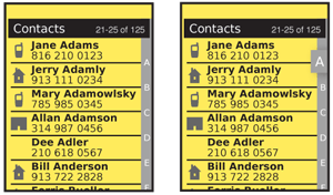
The variation on this, the flat Autodex with a single list of letters and a sliding control to select the section is even more directly what is copied into digital Location Jump systems. An indicator of location, or indexing system, is visible on the screen and this may be used to jump to the front of an indexed section.
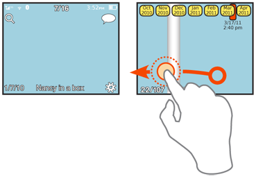
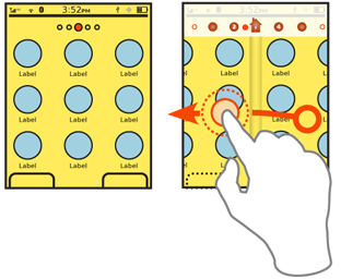
These are used with the Vertical List pattern, but could be used in other types of displays as well. Specifically, the Location Within pattern used on Filmstrip-like Home & Idle Screens can be interactive instead.
The Location Within pattern is very similar, but does not have interaction. Pagination is likewise similar, but page numbers are not an indexing method as they are unrelated to the content itself.

Variations
There are two key sets of variations. The first is in display:
Content indexing - The strict Rolodex style, with letters, numbers, or whatever other key indexing item in the list. Thumbnails generally do not work well.
General indicators - Most often dots, sometimes in varying quantities or sizes, but also icons and numbers. These are only really suitable for smaller sets, like Home & Idle Screens but there is much room to expand the pattern here. General indicators may seem to be not content-indexed, but are arranged in physical proximity or another manner to remind the user of the relationship so items may be found.
You can also allow interaction with each of these in one of two key ways:
Direct selection - Click on the indicator label directly, or type it in. Press a P, and jump to the "P" section.
Drag selection - Drag an indicator of the current position, much like a scrollbar, to the position you want.
Of course, both of these can be used together. And other methods can also be used to move the list, such as simple Scroll.

Interaction Details
Direct selection, or scrolling within the list, is very straightforward when touch or pen interfaces are used. Virtual cursors and 5-way Directional Entry pads do not work well with this pattern.
You may take advantage of the Location Jump pattern for scroll-and-select interfaces by using Accesskeys for the input method. This works best when the input method corresponds to the indexing method. A 10-key device will present difficulties with alpha input, though methods have been devised, such as clustering and using numeric keys to jump to sections. More often, the Search Within pattern is used for the actual keypad input, even if a Location Jump like [Position Within] indicator is also presented.
For Vertical List displays, you must usually remove or heavily modify any any scrollbar, in favor of the Location Jump indicator complex. Any use of other scroll methods, such as gestural scroll or hardware keys must work in concert with this pattern, and indicate changes immediately.
Presentation Details
Store any indicators, whether a symbol, or an index value like a letter, in a strip (which may not be opaque) along the axis of movement of the list. A vertical list will have a vertical strip. Generally, you should put this on the lowest-use side, so put it on the right side for vertical lists.
The key problem with this pattern is making the widget large enough to be visible -- or for touch devices, large enough to be selected -- without using too much screen space or distracting the user from the primary task.
The general solution is to always present the indicator, but very small (with the characters as much as half the conventional minimum size). As soon as any action occurs relating to item finding -- such as scrolling, direct input via keypad or on-screen gestures to that edge -- have the indicator strip expand to a viewable and selectable size.
An alternative is to have only the currently in-focus portion expand to the larger size, if scrolling instead of direct selection is the access method. For all scrolling-only interfaces, the index item currently in focus should be approximately centered in the viewport along the scroll axis. At the ends of the list, this may be odd looking, and it may have to skew to the natural edge instead.
When a position is selected by scrolling the Location Jump widget, the list itself must live scroll, although you may simulate this by adding a motion blur to the data presentation if the distance to be scrolled is more than a few items. When the user jumps to a new position by direct selection of an index feature, the interface will scroll to the new position to indicate the change.
If the distance is very large, simulate a scroll by accelerating, then jumping closer, then decelerating to the location. This jump may also be obscured with a brief motion blur. The total transition should only take 0.5-1 sec, but the transition helps a great deal in understanding that the action was carried out. One part of a list is very much the same as another, so a change may not be noticed if an instant jump occurs.
The current position in the location indicator must always be communciated. Anything clear will do, from highlight, to bold to an indicator bar or other icon in the bar. This must also animate live when scrolling or jumping to a new position.

Antipatterns
As with any scrolling method, do not jump to the new position. Always indicate that the new position in the list was scrolled to by actually showing the animated scrolling to the actual new position in the list.
Do not allow indicators to disappear during scrolling and other movement. They must also transition live whenever possible.
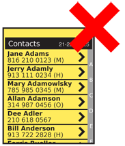
Use caution when placing items within a list. Do not allow critical labels to disappear under the position indicator. On touch devices, keep buttons and other interactive items away from the Location Jump controls side of the list.
Next: Search Within
Discuss & Add
Please do not change content above this line, as it's a perfect match with the printed book. Everything else you want to add goes down here.
Examples
If you want to add examples (and we occasionally do also) add them here.
Make a new section
Just like this. If, for example, you want to argue about the differences between, say, Tidwell's Vertical Stack, and our general concept of the List, then add a section to discuss. If we're successful, we'll get to make a new edition and will take all these discussions into account.
