Problem
When designing for a scroll-and-select device, and a Vertical List is called for, you discover that displaying small amounts of additional information for each line would provide additional value.
This function relies on a focus or hover state, so for mobiles is only really applicable to scroll-and-select devices. Many application frameworks support this feature natively. Web interaction will require scripting.

Solution
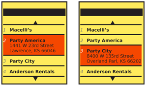
In a Fisheye List, items not in focus appear exactly as they do in any other type of Vertical List.
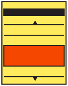
When a list item is in focus, but not selected, it will expand vertically. This additional room will be use to display more information about the list item.
The term refers to the "fisheye" lens, which has severe spherical distortion. Items in the center of the viewing area are much larger than those at the edges.
Variations
As with other list items, details of arrangement are almost unlimited, and are not considered variations in principle.
This only works with selection methods that allow focus (or hover state) separate from selection. Current touch and pen devices do not support a hover or focus state, so cannot use this. If you need something similar for those devices, or to preserve similarity of function on several device classes, the Windowshade pattern, or a Pop-Up may be applied to each line item instead.
Do note that hover state indication is possible on many devices with touch screens, if they also have a 5-way-pad directional control. The list on such a device would have to be designed to operate in both modes. If a Fisheye List is required, then one of the touch actions may need to cause different behaviors on the list.

Interaction Details
On hover (when an item is in focus) the line item will expand, pushing all those below it down. The new information will not over-write other items in the list. Any Pagination or Location Within indicators will have to take this into account, as the number of items displayed may change.
When technically feasible, you should make the line item expand by transitioning to the new size, and revealing the new information as an animation.
Selection of an expanded item may perform any action desired, as with all other lists.
Presentation Details
An expanded list item will open downward, leaving the top of the list item in the same place.
You should leave most or all of the layout and content visible before expansion unchanged, and in place. Add additional information in the space available below this information.
Additional information should generally be of lower-priority, so in smaller type or with lower contrast. Optionally, if truncation of the original list item information is a serious problem, such as with a book title, you may make the remaining information (at the same display type) wrap to another line. Rarely, when the point of the Fisheye List is to expand key information, the design may consider expansion to be from the middle, pushing any secondary information to the bottom of the list area, and using the newly expanded middle space to display the longer title.
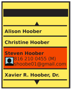
 You can also display other types information. For example, a text-only list may be expanded to include a thumbnail, either because not all information has images, or to provide for larger thumbnails than would otherwise be practical to display. An address book can expand to include call record information.
You should use care to assure the size of the expanded list item is clear, and it does not appear to be two items, or that it become confused with other list items.
Antipatterns
Images, when used as a Thumbnail List should generally not expand, or change size. This throws off the alignment of text and reduces the amount of text visible, significantly reducing user understanding of the state change and slowing responses.
Do not confuse this pattern with others, such as Pop-Up. The expanded state pushes following items down the page, and never overlaps them.
Whenever possible, provide transition animations. Avoid jumping to the open state, and never refresh the entire screen. Users will not see the relationship between the two states and the value of the pattern will become lost. If this cannot be done for technical reasons, use another pattern.
Next: Carousel
Discuss & Add
Please do not change content above this like, as it's a perfect match with the printed book. Everything else you want to add goes down here.
Examples
If you want to add examples (and we occasionally do also) add them here.
Make a new section
Just like this. If, for example, you want to argue about the differences between, say, Tidwell's Vertical Stack, and our general concept of the List, then add a section to discuss. If we're successful, we'll get to make a new edition and will take all these discussions into account.
