Problem
The user's location within a series of screens -- which continue display of a single set of content -- should be clearly communicated. You must provide easy access to other pages in the stack.
Pagination control can be implemented very simply in any type of interface. This does not mean that quite complex, graphical or interactive methods may not be used instead.

Solution
The many screens displayed serially for large amounts of content may be considered pages, as though they are part of a bound paper item.
You will then display page numbers, and a sense of the relative position within the total set. Integrated with the display is a method to move between pages easily and quickly. You may also want to offer methods to jump further than the immediately adjacent pages.
When building a system with large amounts of information, consider if a multi-page view is even correct. In many cases, Infinite List can solve the same display problem without building a pagination widget at all. Look at the OS standards as well; methods like Film Strip can be used to present a series of pages of content of any sort, and often should be the default method. Consider other methods of discovering information in large sets, such as the Search Within pattern, and do not just require users to scroll to find information.
Note that widgets which only present the location, but do not have any role in the interaction of moving between pages -- even when such interaction exists on the page -- are considered Location Within indicators, and not Pagination widgets. Please see that pattern for comparison.
Location Jump is a very similar type of interaction, but uses index points related to the content (such as dates or the first letter of a name) instead of the display methods (page numbers) used for Pagination.
Variations
Three basic variations exist:
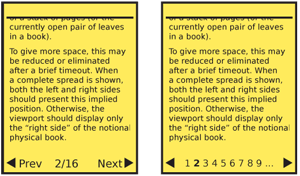
Widget-based - A section of the page is dedicated to the display and control of items concerning pagination.
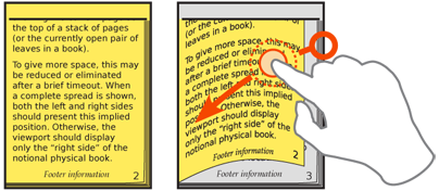
Organic - Natural displays are becoming more common now, especially on touch and pen devices. These simulate "machine-era" presentation methods to imply the same information as the widget view. The display methods and interaction is integral with the design of the entire page, and is not in a specific location.
Hardware - On devices with hardware keys, you may map some to key page functions when inside an application. Certain devices designed around page content, such as eReaders, may have dedicated page control buttons.

Interaction Details
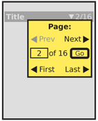
You should always present pagination controls as an integral part of the OS, application or site. Make all controls visible or immediately accessible, whenever possible. When needed, you may offer a larger "control panel" style of interface as well, which is opened into a Pop-Up dialogue by accessing a related component such as the current page.
A number of controls are available. Many are paired sets, and will be considered as a single entity. There are a large number, which must be prioritized for display and access; you wool almost certainly not want to use all of them. The following are listed in priority order for most uses, though yours may vary:
- Move "forward" and "back" to the immediately preceding and following pages.
- Jump to a specific nearby page. Aa many of the most nearby pages are listed as conveniently fit in the available space. Selecting a page number (or analogue such as an icon) will move to that page immediately.
- Jump to the next displayed set of nearby pages. While the key goal is to display a new set of pages from which to choose, this should also change the page view to the first or center page in the listed set.
- Jump a small number of pages forward and back. Typically 3 or 10, but depends on the type of information browsing problem being solved.
- Load the first or last page in the list. In some cases, the list is of arbitrary length, and there is no value in the last page (or it is technically infeasible to load) but the first page link may still be useful.
- Jump to an arbitrary page, by selection from a list or directly typing.
For each of these, you should only display pages that actually exist. Gray out those which are not accessible due to current context. For example "Back" or "First page" links should be visible but inaccessible when already on the first page.
The forward and back controls may be easily activated on touch and pen devices, either by tapping an indicated corner of the page (right is next, left is previous) or by gesturally "flipping" the pages, with a drag action. Details on a related drag action may be found in the Peel Away pattern, but that is for one page only, so should not otherwise be confused with this pattern.
Some of the more involved jump methods may also be initiated or carried out with gestures, and actions such as press-and-hold on the page flip section. However, these are not yet consistent and well-defined, so users will not understand or discover them without training.
Hardware key mapping may be similar to Accesskeys but is usually best mapped to the Directional Entry keys. When a 5-way pad is available, and not used for other purposes such as a cursor, Left and Right should map to "Previous" and "Next." Volume keys or other key pairs can also be used, but may be difficult to discover.

Presentation Details
The Pagination widget should be available wherever the user is most likely to need to change pages, or be aware of their location. Most often, the solution is to place the widget immediately above and below the content unique to the page. Another option is to anchor the widget (in the title bar, for example), so it is available at all points on the page. If the page does not scroll, a single fixed-location item logically becomes an anchored widget.
Labels should be clear, but must be as brief as possible to allow more items to be placed on the page. Usually, labels themselves can be eliminated. "1 of 16" is generally just as clear as "Page 1 of 16 pages," and is often much easier to scan and read.
Use caution with nomenclature. Due to the lack of an actual physical object, and the hypermedia nature of dropping into the middle of a stack, paired terms such as "Previous" and "Next" can be confusing for some users.
You can use arrows and page icons to good effect. Arrows right mean "forward" and left mean "back." Chapter jump icons from video players (an arrow pointing to a vertical line) are often encountered, but have not so far been consistently employed, so will require discovery and training.
Organic display of pagination can imply position by graphically showing the current page as the top of a stack of pages (or the currently open pair of leaves in a book). To give more space, this may be reduced or eliminated after a brief timeout. When a complete spread is shown, both the left and right sides should present this implied position. Otherwise, the viewport should display only the "right side" of the notional physical book.
Antipatterns
Pagination controls can easily get out of hand. In any reasonably complex system, it is easy to find justification for every method of page control. Avoid this, and attempt to only include the minimum set needed, so they can be placed on the page and be easy to find and use.
Realistic representations of pages must accurately reflect the information. For example, if a stack of pages is shown to the side, to indicate that more are available, the relative number shown must be of a plausible size to represent the number of pages, and must change the indicated size as pages are flipped. Do not always show ten pages, whether 320 or zero remain.
Avoid cumbersome entry or methods. For example, do not present pulldown lists of pages that are longer than about a dozen items, even on large screen devices. Offer typed entry, or some entirely other solution instead. See the Mechanical Style Controls for some useful widgets.
Avoid overdoing mapping of shortcuts to keys. For example, mapping "Beginning of document" to the Up key induces a risk that the user will accidentally perform this action, and cannot return to their previous location. There is no clear "undo" for navigation in a document like this, so it is not worth you trying to solve this by implementing such a control.
Next: Location Within
Discuss & Add
Please do not change content above this line, as it's a perfect match with the printed book. Everything else you want to add goes down here.
Examples
If you want to add examples (and we occasionally do also) add them here.
Make a new section
Just like this. If, for example, you want to argue about the differences between, say, Tidwell's Vertical Stack, and our general concept of the List, then add a section to discuss. If we're successful, we'll get to make a new edition and will take all these discussions into account.
