Problem
Finding specific items within a long list or other large page or data array is cumbersome. You must provide a method for the user to find and display this information.
Though search forms are very commonly built-in functions, live or component updating may not work, or not work well, on all platforms. This pattern is especially difficult to implement well and consistently on the web.

Solution
Even the most common of informational displays on interactive systems can contain impressive amounts of information. Even if a user knows that a particular piece of information is present -- from a web search or from memory -- it may be very difficult to find by simply browsing or scrolling through lists.
It is also implausible to assume that all information-finding may be solved by proper page design. Design of web pages, for just one example, are out of the hands of web browser designers. A method must then be provided to search for specific items within the displayed information set.
Search is in fact exactly what is used. You simply place a text search on the page, and the results of this search are jumped-to or filtered within the space of the default results list. For mobile devices requiring this feature, the search must more often than not be visible by default, and very often have focus on entry to the page. When of secondary importance, it may be a feature that is explicitly summoned from a menu.
Variations
Variations of this pattern are widely dependent on the pattern used to display the information itself.
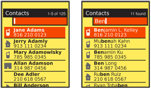
Live Jumping - The most common, and the oldest style of the Search Within pattern is especially suited to long lists such as address books, and for scroll-and-select devices. When the page is loaded, a search field is in focus. Typing will immediately result in a jump to the results.
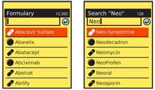
Explicit Filtering - Most often used as a replacement for the "live jumping," when explicitly revealed by the user, and very often for touch or pen interfaces. Due to the perception of a conventional search, and the familiarity of many users with web search, this behaves as a filter for the list data displayed, suppressing all other results. The search is typed in it's entirety, then submitted by the user. This may also be more suitable for Infinite List pages, where "live jumping" may have odd-looking delays in the display of some results.
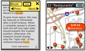
Highlight Results - This is a display method alone, though often explicitly operated, as opposed to being opened by default. The search method should display as live results whenever practical, but use explicit submission when needed, as when the results set is not loaded. These are commonly encountered when searching within web pages, documents or maps. The results only make sense when displayed in context, so are left as such, and indicated.
A key, and increasingly relevant variant of this is non-text faceted search. Other, pre-set parameters are offered for selection and may be used alone or in combination with a text search. This is particularly suitable for maps; a pre-selected list may include resturants, transit, and types of shopping.

Interaction Details
The "live jumping" style of list displays are loaded with a Search Within entry box anchored to the top of the viewport. On scroll-and-select devices, this has an unusual, almost unique sort of in-focus relationship with the list. The top item in the list is generally in focus, and displayed as such. Pressing "enter" (or sometimes using the Left and Right keys) will commit whichever action corresponds to the line item.
However, regardless of the list item in focus, typing from anywhere in the list, at any time, will enter characters into the Search Within field at the top of the viewport. Naturally, you have to disable Accesskeys for such interactions as the keys are dedicated to typing instead.
A variation is to make nothing appear in focus; the text field behaves in the same manner, but a down scroll is required to bring the first item in the list into focus. When this is used, the top item in any results is still presented as in focus. Yet a smaller subvariant of this -- usually specific to an existing OS standard -- is to have the same search either initiated by a dedicated search button, or be revealed when any text entry is made.
For the "highlight results" variation, when more than one result is found, a simple Pagination widget will be provided, with the total number found, the current position in the results and a method to move between individual results, such as "back" and "next" buttons.
Search methods -- which results are displayed from a particular entry -- are left to the specific implementation, and must consider the way the data set is most naturally used.

Presentation Details
Display of results must be immediate, and require as little additional user input as possible. Display the number of items found, and the total number of items in the data set, for all types of lists and results.
For the "live jumping" variation, the list is unchanged and simply scrolls so the first relevant result is at the top of the viewport. The remainder of the list is still there, and may be found by scrolling.
For the "highlighted results" display variant, each individually-found result will be indicated. Usually, as the namesake would indicate, they are highlighted with an underlying color which contrasts with the background and which allows the text to be readable.
The current result, when multiple highlighted results are available, will be highlighted in a unique manner, and must always be moved to appear within the viewport. Zooming, and other techniques may be automatically employed to assure the result is readable in context if it is not of a readable size or position when the search is initiated.
When the information found is not explicitly visible, or cannot be usefully displayed by simply zooming in, you can add a Tooltip or Annotation bubble to label the results. For multiple results, the small "pinpoint" is generally used; the item in focus is an expanded label.
Results are generally as close to instant as possible, as the information is already loaded. For certain uses, such as for Infinite List or Infinite Area displays, there may be a delay for some of the information. This may be confusing for "live jumping" type displays, so instead the "explicit filter" style should be used, and a suitable Wait Indicator used for any delays that cannot be avoided.
Antipatterns
Use the correct method for the information set available. Using an improper method can confuse the user or provide inappropriate or incomplete results.
Carefully consider what an "enter" key action performs during a "live jumping" search. If the user is not looking at the screen and does not notice the results are already displayed, they can assume an explicit search. If a result is in focus, pressing "enter" may commit an action the user did not intend or which is destructive.
Next: Sort & Filter
Discuss & Add
Please do not change content above this line, as it's a perfect match with the printed book. Everything else you want to add goes down here.
Examples
If you want to add examples (and we occasionally do also) add them here.
Make a new section
Just like this. If, for example, you want to argue about the differences between, say, Tidwell's Vertical Stack, and our general concept of the List, then add a section to discuss. If we're successful, we'll get to make a new edition and will take all these discussions into account.
