Problem
You must display a small amount of deeper information, or provide access to related controls or settings, in an organic manner.
Peel Away requires notable graphics processing, full-screen display, and gestural interaction to work well. Many modern OSs have such features built in or can support it. Websites generally should not use it, even if they support the underlying technology.

Solution
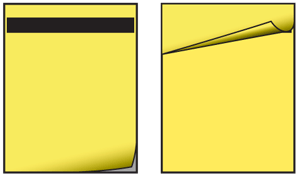
The Peel Away pattern is like the Tabs, and many others in this chapter, in that it simulates a real world interaction. Here, you use simulated 3D effects to pretend the page is a piece of paper, and the user can peel or flip it back to view a second page behind it. Compare to the Pagination pattern, especially the simulated paper effect versions.
This pattern only allows for a single page of additional information, often much less. You can think of it as comparable to presenting the same information in a Pop-Up. The value of this pattern is in the more direct relationship between the primary content on the front, and revealed content on the back, or the page behind. A distinct hierarchy of information or control is established, and the user feels they are in control of the experience more than clicking a Link to reveal a dialogue.
This pattern is not particularly suitable for scroll-and-select devices. Even if a virtual cursor is available, the action is not as natural. It is not worth using except on touch and pen devices.
Variations
This is a fairly singular pattern, with no real variations presenting themselves aside from details of the graphic design.
Refer to other patterns such as Simulated 3D Effects for similar methods.

Interaction Details
You can make a Peel Away operate in one of three ways. These are not precisely variations, as they should be largely driven by the interaction standards upon which the OS operates. For example, if drag and hold is not used otherwise in the OS, it should not be used in an individual application:
- Tap the peeled up corner (or an icon or other control) to reveal the back page.
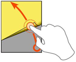
Drag back the peeled up corner to reveal the back page. The drag action will, much like the Filmstrip have to move a certain distance before it commits; releasing before this will snap back to the closed position. The dragging is a direct interaction, so must follow the user's drag speed, including inertia.
- If the back pack contains only content, and there is less information than a full screen, a drag-and-hold action may be used instead. The front page can be pulled away, but never "flipped over" so it sticks. As soon as the drag is released, the front page will fall back into place.
These variations also allow you to use the pattern for any touch or pen device. If your platform does not support dragging well, use the tapping interaction.
These may sometimes be combined. For example, dragging and tapping may both be supported. Closing the panel reverses the actions in all cases. Use the same method or methods to both open and close.
Except when impossible, because you are using the drag-and-hold method to reveal it, you may use any interactive methods on the back page. This allows you to use form controls or links, and reveal settings panels or help documentation with links to other sections.

Presentation Details
There is no point to using a Peel Away function if no one knows it's there. You must design an affordance, usually by being peeled back slightly from the lower right corner. If space is at a premium on the front page, this can be minimized, but you should never eliminate it, or the function will be difficult to discover. To encourage use, the effect can be exaggerated at page load, with the peeled back edge settling (animating) slowly in a second or two.
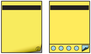
You can provide other hints, such as an icon as a translucent element over the folded back page, or on the part of the back page that is visible. This serves to indicate to the user what information is there. This is most useful when the icon is easily understood, such as if the back page provides help information.
When a Fixed Menu is used, and therefore blocks the bottom edge of the viewport, it may be necessary to use an icon in the lower left corner of the menu to activate the Peel Away function instead of allowing direct selection of the peeled-back front page. The Peel Away does not work well when not up against the edge of the viewport, so moving the "peeled part" up should be avoided.
Always animate the opening, so the front page peels back and progressively reveals the back page, though very rapidly. Without the transition, the relationship may not be clear to users. Use physics models, or set timing to simulate the actual behavior of paper.
When open, you will probably want to place an image of a page folded back, as though caught by a staple, in the upper right corner. This function is essentially the reverse of the closed state. The user can tap or drag on this to easily return to the front page.
The margins, type and general look of the back page should be similar to the front page, so there is a clear relationship between the two. A title should be presented on the back page, but may be in much smaller type than normal, as a note that the information is details, disclaimers or continued from the front page. Naturally, you may need to either place the title lower or allow some of it to be obscured by the peeled-back top page.
Antipatterns
Do not use the Peel Away pattern to display a second page of information that simply continues directly from the front page. Simply Scroll the page or use the conventional Pagination methods instead.
Unless explicitly an "Easter egg" and intended to be hidden, always show the peeled back edge. Do not make users guess or ask friends how to get additional useful information. Delight only comes when self-discovery is easy.
Do not mix interaction paradigms, only allowing dragging to open, and tapping to close, for example.
Do not use this pattern if the entire front or back page scrolls. Though subsidiary areas may, the pattern relies on simulating a piece of paper, and this does not work well if the edge of the paper can scroll off the viewport. Additionally, if scrolling is suitable, typically the additional information can simply be further down the page, and the Peel Away is not needed at all.
If the animations required for this cannot be supported, use a different pattern that does not require animation or 3D effects.
Next: Simulated 3D Effects
Discuss & Add
Please do not change content above this like, as it's a perfect match with the printed book. Everything else you want to add goes down here.
Examples
If you want to add examples (and we occasionally do also) add them here.
Make a new section
Just like this. If, for example, you want to argue about the differences between, say, Tidwell's Vertical Stack, and our general concept of the List, then add a section to discuss. If we're successful, we'll get to make a new edition and will take all these discussions into account.
