Problem
You must provide a method of text and numeric entry that is simple, easy, and should be so predictable in behavior it may be performed by any likely user with little or no instruction.
Keyboards and keypads are built into the device hardware, or provided by the OS. Many platforms, such as the web, cannot influence input methods, but all must support the available input devices correctly. For some devices, add-on virtual keyboards can be built as well. Some applications may demand a custom keyboard; a typical one is the Dialer covered separately.
Solution
The typewriter or computer keyboard, and the telephone keypad, have become so ubiquitous that they are, to most populations, the expected method of entering information. This extends even to devices which are on their surface unsuitable for such entry, such as membrane panels and on-screen displays.

Though several other input methods exist, none are remotely as common, and this is expected to remain true for the foreseeable future. Therefore, keyboards and keypads will continue to be key components of all interactive devices.
The details of any particular implementation must meet user expectations as closely as possible, within the technical limitations imposed by the device and it's interaction methods. A touch screen virtual keyboard on a small screen cannot faithfully reproduce a full-size physical keyboard, but adhering to the basic principles will generally impose sufficient order that users will be comfortable and able to enter information without any cognitive burden.
Be aware of regional and cultural norms. Avoid imposing unexpected keyboard or keypad layouts on your users. If you have a global product, make provisions for as many input types as possible. Recognize that some users will have wildly different layouts and character sets, and this can influence your interface in many ways. Accesskeys for example, if not modified for each language, may work unexpectedly or not at all.
Variations

Instead of variations, you can instead consider Keyboards and Keypads to have three axes of variation. Any one implementation combines the attributes from each axis to define the category. Most devices will use multiple modes, which are switched between as the state of the device changes. For more discussion on mode switching see the Input Method Indicator pattern. For additional details on keypad entry for telephony, see the Dialer pattern.
Hardware / Virtual - The keyboard or keypad may exist as a series of physical buttons, or be represented on the screen of the device. Devices with digitally re-labellable hardware keys fall in the middle of this axis and will use attributes of both.
Keyboard / Keypad - Keyboards are those with direct mapping to characters in the native alphabet. Keypads are for numeric entry. Chording keyboards, and some specialized key entry panels fall in the middle of this axis and may use attributes of both types.
Direct / Multi-tap - Keyboards allow typing words and phrases via (mostly) direct entry; an "a" is typed by pressing a key marked "a" (or "A"). Multi-tap is an indirect entry method; an "a" is typed by pressing the "2" key, which is also labeled "abc" sequentially until that letter appears. Certain keyboards combine attributes of both of these, but none are currently commercially important.
While these descriptions, and the remainder of this pattern, focus on the standard implementation, each axis is actually more of a continuum. A single implementation may fall in the middle, such as some non-standard keyboard/keypad combination layouts. This simply means that the same principles apply to even those implementations.
Predictive systems, while associated with 10-key entry, are actually just methods that can be applied to any input method. These are addressed in detail the Autocomplete & Prediction pattern.
You might think that virtual keyboards and keypads are purely for touch interfaces, but they can also be used on scroll-and-select devices. You may find this an especially useful solution if occasional text or character entry is required on devices with no dedicated keyboard or keypad, and no touch or pen input.
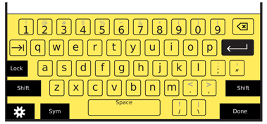
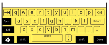
When a field which allows free input is selected, display the virtual keyboard largely as described in this pattern. One key or button is always in focus while the keyboard is visible, and scrolling with the 5-way Directional Entry pad will move the corresponding direction. Keys should be in a grid, not offset, so directional movement is more predictable. Selection will "press" the key and enter it in the field provided. The keyboard or keypad should be "circular" on both axes, so scrolling to the edge will move the selection to the opposite edge, to reduce the already large number of clicks to get to a character. A method must be provided (as shown on the samples here with the "Done" key) to complete entry and close the virtual keyboard.
Interaction Details

Interactivity of a key press is generally very straightforward. For hardware, the user simply presses the button. For pen and touch devices, each key is functionally a Button and should have hover and activated states when available. Some input methods may be more difficult. When Directional Entry or Remote Gestures is used, pointing and other focus or effect indicator standards from those patterns must be applied.
Hardware keys should comply with human factors standards for pressure, size and spacing. Virtual entry systems should have targets no smaller than 10 mm. Certain keys, especially enter, space and modifiers, may be placed along the edges of the viewport on flat bezel devices, to increase their effective size. High use keys, such as the spacebar, should be larger to make them easier to find and activate. Keys which can have consequences past a single entry, such as enter and modifiers, should have spacing around them to prevent accidental activation.
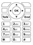
The layout and key arrangement should, whenever possible, use common and expected formats. For keypads, use regional standards promulgated by the local telecommunications authorities. In North America, for example, this does not just mean the layout is 1 at the top left, but that the 2 key has the letters "ABC" assigned to it.

You may have to compress your keyboard to fit into the available space, and combine the number row with the top row of letters. Make sure the numbers align to their normal location, so Q will also be 1 when a function modifier is used. Likewise, place all conventional symbols as close as possible to their typical location. The !@#$ symbols should be alternatives of the 1234 keys -- or the closest equivalent when compressed -- for US English keyboards.
While most keyboards are displayed or built as a single block, a sometimes seen variant is to provide a split in the middle. Sometimes, this is just a structural and visual break, which otherwise does little to the interface, while others may be so wide that the screen sits between the two halves. Virtual keyboards may also benefit from this, both for space considerations, and by considering the ergonomics of the device. It may be better for users to grasp the device firmly; if your device is very large, like many tablets, they will not be able to reach the center of the screen, so a split layout may have advantages.
Multi-tap keypads are capable of very high speed text entry for populations familiar with their use. They must be designed to follow standards and work without delay. Pressing a key will cause the first valid character to appear (see the Input Method Indicator pattern for more details). Pressing the same key within a short timeframe will display the next valid character in turn. This display is a circular list, and will eventually return to the first character. After a brief pause, when another key is pressed, or when a "next" key is used, the character displayed is committed and further keypresses will display in the same manner, for the next space in the field.

Only enable key repeat should on fairly high-fidelity devices. For smaller devices, and those expected to be used in difficult environments -- like most mobile devices -- do not allow pressing a key to make it enter multiple instances of the character. This will help prevent accidental multiple inputs due to the user being in a vibrating or bouncing environment, such as typing in a vehicle.
The behavior of mode switching keys is covered in the Shift & Function pattern. Despite being on the keyboard, they behave very differently so must be considered separately. Also be sure to see the Press and Hold pattern for details on another way to gain access to alternative entry for a particular key
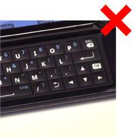
Directional Entry keys should almost always be included with any hardware keypad. A 5-way pad is naturally included in the device design for a typical keypad based device. For slide-out keyboards, directional keys, and an enter function should be included. This will allow users to scroll and submit entries without leaving the keypad. The enter function is often useful on even virtual keyboards, to prevent accidental inputs from the user shifting their grip or re-orienting to change the entry mode.
Be sure to accept input from hardware direction keys and enter keys, even for devices that are otherwise touch or pen driven. Don't be that one application that works differently, and confuses users.
Presentation Details
Key labels must be clear, large enough for users to read, and easy to read in all lighting conditions. Alternative labels (shift or Fn characters) should be in a different (less prominent) color, or a tint of the primary label color. Alternative labels should be above the primary label. There is no need to display capital letters as alternative labels to lower case letters.
On virtual keyboards, use the label for the current state, to assure the state is clear. Display lower-case labels unless the shift or shift-lock key is activated.
Keys must perform their labeled behavior. Note, for example, that backspace and delete are different functions. Users accustomed to Windows will think "del" means "forward delete" and not backspace as it is labeled on the Macintosh and some other devices.
Especially for hardware keyboards, the use of symbols may be useful for special keys, such as tab and enter. However, these icons are by no means universally recognized. Use caution selecting and designing labels, and use simple text descriptions of the function -- or text along with an icon -- whenever possible.

Antipatterns
Avoid accidental input:
- Lock keypads when sensors determine they are in pockets, against the user's face (on a call), etc.
In any context, if multiple adjacent keys are pressed within a few milliseconds, this can be assumed to be incorrect and only the most likely key -- by physical mapping or Autocomplete & Prediction -- should be accepted, or none.
- Staggered keyboard layouts can also help prevent accidental inputs or increase the accuracy of filtering.
Be careful placing functional keys on the keyboard, and provide sufficient space to avoid accidental input. If required, use Exit Guard to reduce risks of loosing user-entered data.
On the other hand, be careful going further to avoid accidental input, such as instituting lockout periods. It can be hard to differentiate fast typing from accidental input.
Use caution with backlight in marginal lighting. It is easy to have the backlight illumination match the key material reflectivity, and the label cannot be seen at all. Besides careful coordination of the backlight algorithm, using a color different from the key material for the label (e.g. yellow, instead of white light, on black keys) can alleviate this issue.
Do not use conventional insertion point indicators (such as pointers or vertical lines) during multi-tap, especially when a character is not committed, as it may not make it sufficiently clear where keypresses will take effect. Highlight, underline or otherwise indicate the actual character space being currently effected.
Be careful implementing layouts, labels or input methods that are not absolutely standard. Be sure to test robustly with users. Inertia (by users and operators) will still impede adoption, even if it is a superior idea.
For physical keyboards, a mode in which a 10-key pad is imposed over some of the keys rarely is well-understood by the user. When the keyboard is staggered, it is also difficult to use. Usually, the best solution when no dedicated number pad is provided is simply to use the number keys along the top row, and lock them on for the user during numeric entry, such as dialing a number. Be sure to inform the user with an appropriate Input Method Indicator.
Next: Pen Input
Discuss & Add
Please do not change content above this line, as it's a perfect match with the printed book. Everything else you want to add goes down here.
Fixed Keycaps
When I tossed off a comment about why Apple keeps their keycaps (labels on the keys) fixed for the iOS virtual keyboard, David Malouf responded that (among other things) it was a good thing in his user research. That users were not expecting the switch so they questioned the interface (if momentarily) instead of seamlessly continuing with their task.
This does not mirror my observations, but is certainly worth considering. There may be other pressures, or special cases that make one more suitable to a particular device or circumstance instead of changing to reflect the current condition always being the correct answer.
T9
http://gizmodo.com/5646477/how-t9-predictive-text-input-changed-mobile-phones http://www.bizjournals.com/seattle/blog/techflash/2010/09/martin_king_co-inventor_of_t9_text_input_software_dies.html http://www.validconcept.com/articles-t9.html
Examples
If you want to add examples (and we occasionally do also) add them here.
Make a new section
Just like this. If, for example, you want to argue about the differences between, say, Tidwell's Vertical Stack, and our general concept of the List, then add a section to discuss. If we're successful, we'll get to make a new edition and will take all these discussions into account.
