Problem
Exiting a screen, process or application could cause a catastrophic (unrecoverable) loss of data, or a break in the session.
Exit guards can be built into almost any process, though in some cases preservation of information can be difficult. Plan carefully to assure that the goal of keeping user data is well designed.
Solution
You should simply present a modal dialogue which delays the user from exiting immediately. The use of the Pop-Up keeps the app or function open in the background, so should preserve any information. The dialogue informs the user of the consequences of exiting (loss of data) and requires them to make choices, at least to confirm exit or return to session.
Be sure to build systems to prevent data loss even if exiting occurs. For example, auto-save all user entry, save draft messages, etc. In many cases, even critical entry systems may forgo an Exit Guard as long as recovery is simple and the process may be easily re-initiated. These concepts are discussed further under Cancel Protection.
For high security or time-sensitive entry, such as banking, you may find it implausible to auto-save information with sufficient security, or a break in the session may cause too much delay. In these cases, an explicit Exit Guard is useful.

Variations
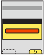
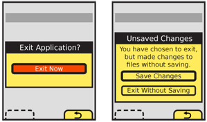
The most typical variant is a simple modal dialogue, informing the user of the risk of exiting, and presenting a choice to exit or return to the previous state.
Sometimes, you may also want to present additional options. These are usually special exit conditions, such as choosing to exit with or without saving, as discussed under the Confirmation pattern.
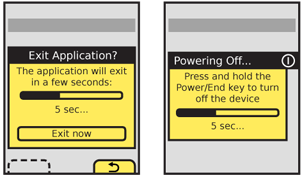
A variant uses the Wait Indicator and a delay timer to provide one-click exiting, as long as the user is willing to wait a short time. For immediate exit, provide an "Exit now" button for the user to select.
A sub-variant of the timer, used for high criticality applications, reverses the process. The user must select to exit in a short time (or continue pressing the exit button for a designated time period) or the process will not terminate and will return to the last state.
Interaction Details
 If additional selections are required, you may load them in any way needed, such as buttons in the Pop-Up, as a Select List or so on. Use any Softkeys or softkey-like buttons for primary supporting actions, such as Cancel. In the example of exiting with unsaved documents, the choices to exit without saving and save documents would be in the dialogue, and the option to return to the application would be labeled "Cancel" and be the Softkey conventionally used for this.
For devices with softkeys, even if the Pop-Up can be designed to hold all the required buttons, use softkeys for at least some expected actions. If "Back" is always on one of the Softkeys, use that function as the "cancel" function for this screen.
Keyboard and touch input buffers must be cleared the moment the exit selection is made. This will prevent accidental press-and-hold or multiple click buffered input from skipping past the Exit Guard dialogue. If there continue to be problems with this, add a brief delay (1/10th of a second or less is usually enough) before accepting new input.
You may also wish to have no function selected by default on scroll and select devices (requiring a deliberate scroll then select to make either choice). Touch and pen devices may wish to consider the location of the dialogue buttons relative to the original exit selection mechanism, to prevent accidental or too-easy input; requiring moving to a different part of the screen may provide a sufficiently deliberate action to avoid accidental activation.
Presentation Details
 Timed Exit Guard dialogues must notify the user using tones and/or vibration, to assure they are seen. This may also be useful for conventional Exit Guard dialogues, to assure the user does not assume the application or process exited, and then does not check back for some time. Use the system set volume or vibration settings in general, but always at least vibrate, even if set to no output at all. Remember, this only happens on user action, so is not a notification and should not be detectable to others.
Make sure the Title of your dialogue denotes the condition requested, usually something like "Confirm Exit," "Exit?" or another clear and actionable statement.
If this title is insufficient to explain the situation, because there are special conditions such as unsaved documents, a description should immediately follow the title. To explain a timed exit function, for example, a description might read "Hold the Power button for 5 seconds to turn off the device." Be sure to add functions to this as required to make it reflect the condition accurately. For example, countdown timers should usually change the number in the description as an active countdown so the user has a sense of how much time remains. If the button is released before the time required to exit, the dialogue should remain on the screen for several seconds so the first time user, more familiar with short presses and taps, has a chance to learn the process.
If a press-and-hold function can be initiated modelessly (such as powering off the device by holding the Power key, which works from any screen) you should make a dialogue appear as soon as the function is selected, to inform the user how to exit, or warn them of the action.
Button labels must not depend on the description or title. Never present selections such as "Yes" and "No." The best are along the lines of:
- "Exit"
- "Cancel"
Where "Cancel" is the OS default label or icon for canceling or going back from the current process, so should not be ambiguous. In this case, the process is the subset of the previous process, or the exit condition Pop-Up itself. The logic can get confusing if you think about it too much, so don't. If there is no clear default label for cancel, use something unambiguous such as "Continue editing."
When a choice is clearly the preferred one, that should be indicated. The OS standards should include a method of indicating button preference such as color, icon use or border treatment. This may or may not be the safest choice; you will have to determine this during design based on the criticality of the process being cancelled, and the expected most common use cases.
This dialogue may carry additional cues such as being associated with the location of the button being used, and having a graphic of the button associated with it, perhaps in the title bar. This can even extend to pointing at the location of hardware buttons.
For touch devices, the pop-up should spring from the virtual key being pressed, which should not itself move during this action.
Antipatterns
Do not use Exit Guard for all applications and processes. Limit to only those that must be explicitly protected. If the OS you are designing for does not really exit, but keeps applications running in the background, it will almost never be needed. Think about protecting user data, and only add them to the process after it has otherwise been designed, and you cannot solve the problem in other ways. See more about the concept under Cancel Protection.
Use only a single dialogue, with a single set of selections. Do not make exiting a process, where step one confirms exit, step two is deciding what to do with unsaved documents, and so forth.
Next: Cancel Protection
Discuss & Add
Please do not change content above this like, as it's a perfect match with the printed book. Everything else you want to add goes down here.
Examples
If you want to add examples (and we occasionally do also) add them here.
Make a new section
Just like this. If, for example, you want to argue about the differences between, say, Tidwell's Vertical Stack, and our general concept of the List, then add a section to discuss. If we're successful, we'll get to make a new edition and will take all these discussions into account.
