Problem
Whenever possible, you should build in assistive technology to reduce the users' text entry effort, and to reduce errors.
Even when provided by the OS, you may wish to build your own Autocomplete and Prediction methods, specific to the operation of your application, or due to the use of information outside of dictionaries, such as URLs in browser history.

Solution
Autocomplete, predictive entry and related technologies such as spelling correction have become well-established, highly expected, assistive technologies for day to day computing. For mobile, they have proven especially valuable due to the relative difficulty and reduced speed of text entry, and especially for complex, technical character entry such as URLs.
Though many current, high-end devices either disregard these features, or do not consistently implement them, the same pressures apply to any mobile device. At least one method of assistive entry should be employed universally, across the entire device. If not available on the OS targeted, consider if adding this feature is possible, if it would assist or distract the user due to the different interface, and determine the best method for the type of entry taking place.
The actual functionality of any of these features, such as the algorithms used to actually perform the prediction, is outside the scope of this pattern, but is also crucial to it's good operation.

Variations
A range of related functions, associated with all types of text entry, can be considered under the Autocomplete & Prediction pattern.
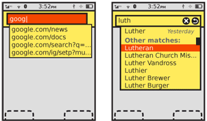
Completion - Entry is automatically completed or modified with the goal to create valid entry with as few keystrokes as possible. Common in search or URL history, when a list of recent or common results is presented during typing.
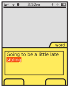
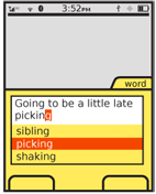
Suggestion - One or several suggestions are displayed for an entry. An action is available to change to the suggestion, often by picking from a list. Encountered in triple-tap text-entry (a "Next" key is provided to scroll through options).
Replacement - A word or phrase which is recognized as likely to be a mis-spelling of an entry in a dictionary will be replaced with the correct version shortly after user entry has been completed. No options are offered.
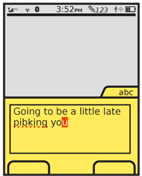
Error notation – A word or phrase which is not recognized as an item in the dictionary, or does not meet the input criteria (e.g. a URL without a TLD) is indicated as such inline. The most common is underlining mis-spelled words in free-form text entry. Alternatives may be offered after manual selection (at which point it switches to being functionally a "suggestion" variation), but no automatic action is taken by the system.
In some cases, multiple variations may be encountered at once. This is especially common when an entry is completed in the field with the best match, but suggestions are offered adjacent to the field.
Coupled with this variety of functions are a number of interactive methods. This pattern outlines some of the more fixed points, and provides general guidelines, but cannot be prescriptive about all aspects due to the degree of variation.

Interaction Details
The "suggestion" variation requires explicit acceptance by the user. A selection must be made from the list of candidates for any to be applied. No selection will simply used the characters as typed.
Multiple candidate matches should be offered whenever possible. Allow the user to scroll through them, usually by presenting as a drop-down style list, and by using On-Screen Gesture or with the up and down Directional Entry keys. In some cases, and most notably with multi-tap text entry methods, a key is dedicated (while in the mode) to displaying the next available candidate.
2 October 2012: I think expressing a drop-down in the above description was probably a mistake. A common method, and maybe now the most common, is a single strip of suggestions, which the user can scroll through with gesture sideways, or select from. I have no solid data, but have some anecdotal worries that since this is not a typical interaction (atypical or no indication that a candidate is in focus) it may not be working as intended. But, efficient use of space.
Lists of candidates should often be circular, so scrolling past the end will load the first item again. This is especially critical when a single key is used to display the next option. For certain result sets, such as predictive search or URL completion, the results may be too large for this, or a circular list may imply too few results found. For these, use some principles of the Infinite List to present the arbitrarily-large, remotely-fetched data. Remember it's still a Vertical List, even if a very small one.
For lists, a method to select the candidate in focus must be made available. Avoid using methods that have other meanings when a selection is not being made. For example, if OK/Enter is used to submit the form, it may be confusing or lead to errors if it is used for selection of suggested words also.
"Completion" is an implicit method, and any exit of the word, phrase or field will commit the last candidate displayed. This includes simply pressing the spacebar, period or comma at the end of a word, or submitting the entry to a field. On the other hand, if the user keeps typing, their character entry will be used instead, and the completion disregarded, or switched to the next best match.

Presentation Details
All automatic behaviors, even inline items like replacement, must take a brief time to take effect, and have a visual cue to attract the user to the behavior. Many of these behaviors, while helpful, are also destructive and may change the intent of the user entry. You must be careful to inform the user of the change.
Selectable completion text may appear in one of two basic places:
In place - Text is automatically entered and modified in the actual field where entry occurs. This is almost always used with multi-tap keypad text entry, but is also the way that auto-correction works.
Adjacent - The suggestion appears adjacent to the word, either right below the entered text, or within the input panel itself. Suggestions for search, and matching candidates for Pen Input systems are typical examples.
A rare variation is to complete "in place," but in a field, or location in the current field outside of the current focus or cursor location. this is best exemplified by code completion, but can be encountered in certain types of form filling. For example, an appointment creator with start, end and length-of-event fields will find the three closely coupled; completing any two will automatically fill the third. This may seem to be a simple, one-off interaction trick, but must in fact follow the principles outlined in this pattern to assure the user observes the behavior and gets the benefit from the auto-entry.
"In place" display should be highlighted while still a candidate, such as for multi-tap text entry. The entire word is still being changed by the user's character entry so this highlighting is a sort of extension of the text insertion point.
Candidate options displayed adjacent are typically offered as multiple selections. One item is always in focus, but others may be made available. These may be presented as a list, which can be scrolled through, or only one may be visible as a "bubble" (much like a Tooltip, or Annotation if directly selectable) before selection is made.
Error notifications, such as spell checks, should appear as an dashed or dotted underline in a very contrasting color. Red has become the typical color, but avoid this if the background, text or overall theme uses red routinely, and especially if it is used as a link color.
Antipatterns
Avoid automatic replacement without a method for the user to opt-out or disable the feature, session or device-wide.
Do not violate the principles of Cancel Protection and allow destructive automatic behaviors without a method to revert or correct the change. For example, whenever automatic replacement is used, be sure to allow a method to revert to the spelling as typed. This may be as simple as automatically disabling auto-correction for any second entry of the same word in the same field (or location in the field), so the user may simply re-key the phrase as intended. This is sub-optimal as it requires additional typing, but better than rejecting the second entry as well, and frustrating the user further.
Next: General Interactive Controls
Discuss & Add
Please do not change content above this line, as it's a perfect match with the printed book. Everything else you want to add goes down here.
Examples
If you want to add examples (and we occasionally do also) add them here.
Make a new section
Just like this. If, for example, you want to argue about the differences between, say, Tidwell's Vertical Stack, and our general concept of the List, then add a section to discuss. If we're successful, we'll get to make a new edition and will take all these discussions into account.
