Problem
You have a set of images, or similar pieces of graphical information, which must be viewed in detail.
Large-area display of graphics is easy and common, though there may be limits to the ability of some platforms such as web pages to display truly full-screen.

Solution
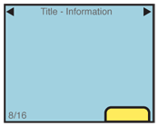
The core of the Slideshow is that each image is presented full-screen, with a function to transition to the previous or next image in the series.
You will find this very often used exactly as its namesake, the slideshow. Much like presenting a series of vacation photos in the past, this allows the user a way to view a series of photos or other images. It can be used to view other types of information summaries, such as consolidated sports scores.
Transitions between slides may be of any type, such as a cross-fade. This makes it suitable for most devices, which may have technical difficulties with other types of patterns. If presented as though the images are on a continuous strip, this pattern becomes the Film Strip instead.
Do not confuse this with a Carousel, which presents all images in a continuous and visible series. The two are closely, and often may be switched between within a single interaction.
Variations
Variability in Slide Shows are really only in the degree of control which may be imparted to each slide. Some will be simple viewers, and no individual control is available. Some will allow, for example, editing of the images. Controls may be presented on screen, or under option menus.

Interaction Details
You should make sure that the ability to switch between slides complies with the application or OS standards surrounding it. Gesture, directional keys, or selection of "next" and "back" functions on the screen are all suitable.
For image slideshows, and some other types of data, additional options should be available, such as randomization, or ordering by various types of information. These may of course be available only under menus.
For certain types of data, or certain interaction models on the device (e.g. especially scroll-and-select devices) you will want to include a Pagination widget to allow jumping to specific locations in the list. This may be visible at all times, made to be visible via an option, or only visible when scroll has otherwise been initiated.
A Revealable Menu should be made available via the expected (or an easy-to-discover) method, to offer additional information or functions for the entire slideshow, or for individual slides. Even if the OS paradigm is for a Fixed Menu, they should be hidden by default to grant as much space in the viewport as possible to the slide information.
Circular scrolling is encouraged, but may not apply to certain types of data. It may be important, for example with date-ordered information, that the set have a distinct start and proceed from there.
Presentation Details
The amount of extraneous information presented depends on the intended use of the slide information. Pure slideshows will specifically have no text, icons or other items on the screen. You may even wish to suppress most or all of the Annunciator Rows. This will become especially important as more devices have high-quality video-out capabilities, and mobile devices may be used as the source for large, projected presentations.
Design supporting information -- such as filename, dates, and the links to options -- to be non-intrusive, and obscure as little of the slide image as possible. While specific implementations will vary based on user needs, you may find it useful to restrict the information presentation to when some selection is made (such as a tap on the screen) or after a several second pause on a single image.
OS-level Notifications should usually be hidden by default, to give as much space in the viewport to the slide image. When other information is presented (such as option menus, or image meta-data) these may be presented also, in their normal location and style.
If any additional information is presented as an on-screen overlay, a Location Within widget should be employed.
Antipatterns
Slideshows are not suitable for significant interaction with items within the individual slide. While charts, graphs, text or tabular data can be displayed as a slide, you will find that allowing selection of a single component, such as a link from part of the data, is not easy with the slideshow. If required, use another pattern, such as the Film Strip, for interacting with individual screens, or Infinite Area for interacting with arbitrarily large sets of graphical data.
Care must be taken to find the correct balance between information presentation and clutter. When you start to add all the useful controls, metadata and indicators of position, you will rapidly run out of space, and begin obscuring the image displayed. Consider the use of the product and the users. Push less-used items that have to be retained into options menus.
Do not develop new types of OS level displays in order to save space. If battery level, notifications and so forth are possibly important information within the Slideshow, use the normal icons from the Annunciator Row, and hide the rest, or hide everything non-critical, to save space and avoid distracting the user.
Next: Infinite Area
Discuss & Add
Please do not change content above this like, as it's a perfect match with the printed book. Everything else you want to add goes down here.
Examples
If you want to add examples (and we occasionally do also) add them here.
Make a new section
Just like this. If, for example, you want to argue about the differences between, say, Tidwell's Vertical Stack, and our general concept of the List, then add a section to discuss. If we're successful, we'll get to make a new edition and will take all these discussions into account.
