Problem
You must provide a method for users to change the level of detail in dense information arrays, such as charts, graphs and maps. Design a zooming function or metaphor to provide this control.
Certain platforms, especially gesture-driven OSs and those built for display of map data, will have built-in zoom controls which should be used when available. Custom zoom widgets are easy to build and interact with, but retrieval of information in a seamless manner, especially from remote sources, can be more challenging.

Solution
High density information, such as that in charts, graphs and maps, can be especially difficult to use on small screen devices. Showing a sense of the whole space can preclude viewing sufficient details for analysis and other uses.
Zooming into (and out of) the information is the general solution. As this is similar to changing the depth of view, it is a different axis than scrolling, so requires a unique control set.
In coordination with changing the zoom level, you must also communicate a sense of scale, whether relative or absolute.
Variations
On-screen buttons - Buttons are very often used to zoom in and out by single steps. There is no indication how large the step is, or how many are available. You may placed these at the corner of the view area, within a menu, or within an Annotation for a single point on the map or chart.
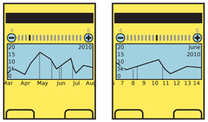
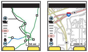
Interactive scale - You may provide a bar for direct control, that indicates the whole range of zoom; generally, icons are used at the top and bottom of the bar to indicate the range of the control, such as (for a map) the country for the maximum zoom out, and a house to indicate block-level for zooming in. These controls may support direct selection of a zoom level, or direct control of the zoom level by moving the slider dynamically. They are also often combined with on-screen buttons to offer all options.
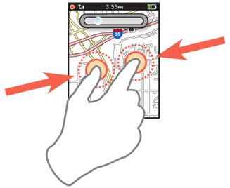
Screen gestures - The most common of these is the two-finger "pinch to zoom" gesture. Other on-screen gestures also exist, including single-finger spinning actions (clockwise to zoom in, counter-clockwise to zoom out). You may find these useful for systems that cannot (for technical or user needs) support multi-touch interactions.
Hardware buttons - Devices that present such information a lot, like a GPS navigation tool, will often have dedicated zoom buttons. You can also repurpose temporarily unused hardware keys; if the 5-way pad is used to scroll along the x/y axes (and select points) the volume rocker can be repurposed to control the z-axis and be a zoom control.
Additional methods may emerge in the future, such as the use of sensors to change detail level as the device is moved towards the viewer's eye.
Some or all of these may be combined, for interfaces that work on multiple devices without change, to appeal to different user types, or to surmount lack of affordance in screen gestures.
For controls that do not integrate a scale, you should provide some sense of scale. This may be an explicit scale (labeling axes or a bar of distances) or implicit, by showing items of a well-understood size.

Interaction Details
Consider zoom to be a third axis of movement about the screen. Like the x- and y-axes are along the edges of the screen, the z-axis sticks straight out from the screen. You can think of the zoom control as moving to layers or levels along this axis.
The z-axis must be directly related to the request method, so the zoom does not break the user's expectations. There are two basic methods to establish this center point:
View Center - The zoom axis is about the center of the displayed graphic, usually the center of the viewport.
Activity Centroid - The zoom axis is centered on the indicator, pointer or gesture used to indicate the zoom.
Zoom actions taken with no particular item in focus, without an on-screen cursor and without controls attached (visually or by use of gesture) to a specific point on the screen, use the "view center" method. All others use the "activity centroid" model, with the axis centered along the in focus item or the gesture centroid. Note that these are not fixed conditions based on the device hardware or the overall interaction model. They may be switched between conditionally. Zoom buttons (whether on screen or hardware) will use the "view center" method when nothing is in focus, and switch to the "activity centroid" method when a virtual cursor is moved onto the screen, or an item is in focus.
Any effect requested should show an effect immediately. Whenever possible, load a few additional zoom levels in advance, in much the manner as described in the Infinite Area pattern.
For devices with keyboards, and without dedicated zoom keys, Accesskey functions (and their corresponding labels) should be provided for at least the zoom in and out controls.
Disregard input to zoom over the limits of the current information set, either too high or too low. Do not display errors that, for example, there is insufficient information available for the zoom level. The user will simply have to initiate another zoom control to back out until the information is again useful.
Presentation Details
Regardless of the interaction variation, you must display a zoom indicator on the screen whenever the zoom level is changing. This indicator must immediately reflect the current zoom level setting; if there is a delay in loading the new data, display the requested setting, not the previous one. The indicator should remain visible for a short time after the zoom level has completed loading.
If there will be delays in loading, be sure to follow the principles in the Infinite Area pattern, and display a Wait Indicator, either for the entire application or for each frame of information being loaded.
 Whenever practical, display a scale on top of the displayed information. For maps, this is a simple distance scale. The scale must automatically adjust to fit the available space, both in size and units used. On maps, you may switch from hundreds of miles to hundreds of feet as the zoom rate increases.
When a zoom level is unavailable, such as when the end of the range has been reached, "gray out" the control to make it clear it is inaccessible. This is generally preferable to simply suppressing the control, as it may be confusing if it is usually present.
When there is a choice (such as on maps, vs. labeling individual axes of a graph) the scale bar should be horizontal. The scale bar should be large enough to be easily visible, so that numeric labels are readable, and small enough that it takes up no more than about 1/3rd of the width of the screen.
Label units of measure, and use standard abbreviations to label them. See the Ordered Data pattern for more discussion along these lines.
For gestural actions, such as pinch to zoom, use live transitions so the user may see the effect of their gesture and adequately control the request.
For all zoom methods, if full-resolution imagery cannot be pre-loaded, a variation of the Ghost method described under the Wait Indicator should be used. The available imagery can be scaled to match the requested panel size, giving a sense of the requested scale and information.
Antipatterns
Avoid delays in loading new zoom levels. Do not assume Wait Indicators will solve the issue, but if needed use them as the Infinite Area pattern does when loading new data. Use the Ghost method instead of explicit indicators such as Short Wait, whenever delays cannot be avoided.
Don't use a toggle between two levels of zoom because your only convenient interaction does not support steps or graduations. Zooming via double-tap, for example, has value in some cases but is not a typical zoom and does not cover the majority of the needs for zooming into data.
Next: Location Jump
Discuss & Add
Please do not change content above this line, as it's a perfect match with the printed book. Everything else you want to add goes down here.
Examples
If you want to add examples (and we occasionally do also) add them here.
Make a new section
Just like this. If, for example, you want to argue about the differences between, say, Tidwell's Vertical Stack, and our general concept of the List, then add a section to discuss. If we're successful, we'll get to make a new edition and will take all these discussions into account.
