Problem
Functions on the device, and in the interface, are controlled by a series of keys arrayed around the periphery of the device. Users must be able to understand, learn and control their behavior.
Hardware is part of the device, but the control can often be over-ridden, modified or simply ignored by individual applications, or even web pages.

Solution
Setting aside Keyboards & Keypads, and Directional Entry controls, practically all mobile devices have numerous additional keys. Even the increasingly button-free devices generally have volume rockers, lock keys, power buttons, rotation control buttons and so forth.
Regardless of the number of keys, or their individual functions, all of these must comply with some basic behavioral standards in order to be useful, usable and valuable to the user.
Variations
There are two basic types of hardware keys, based on their effect.
Hardware -- The effect effect is to device hardware. Any on-screen, interactive display is incidental to the function. These are functions like volume, and radio toggles.
Interaction -- The primary effect is only to interactive, software driven elements, generally resulting in a principle, unmistakable interaction. Back, search or camera keys are representative of this type.
In either case, the attributes and behaviors discussed in this pattern are applied in the same manner.
Interaction Details
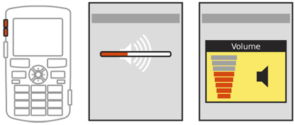
You must make sure that the use of any hardware key has an immediate, noticeable response, regardless of the type of function being performed. This applies even if the action takes some time to take effect, such as time to load the camera application.
There should always be a visible effect. Generally, this should be an on-screen display of some sort. If the primary effect is either not an interactive element, or cannot be launched within about 1/10th of second, and secondary display must be used. Though many options are available, some frequently-used variations are:
Pop-up dialogue, sometimes a variation which is for display only, has no opaque bounding box or background field, and cannot be interacted with.
An Annunicator Row icon change, or other Notification indication. An icon can be added, or change in an obvious manner.
- Pre-launch the application. If camera hardware takes a few seconds to load, the camera application can still begin launching immediately, and open in a state that indicates this delay.
Pop-Ups will generally disappear after a few seconds. Annunciator or Notification icons may need to remain in place, to indicate the change of state permanently, such as enabling Bluetooth features, which displays the Bluetooth icon in the Annunciator Row.
You can also use direct responses when they are technically feasible. If individual-key backlight is available, the backlight should dim momentarily during keypress. Rarely, this may be used successfully as an indicator with all key backlighting changing based on certain keypresses.
 Haptic Output or Tones are also valuable as a way for the user to confirm the key has been activated, or for multi-step keys (such as volume) to give a better sense of the number of steps entered. Subtle clicks, whether through vibration or the speaker, can serve this need.
Don't forget that every key can perform at least two functions. Enable Press-and-Hold actions, or double-click behaviors as detailed in the Mode Switches pattern. This may be difficult to explain or learn, so should be used sparingly, and only when relevant to the original key label. Holding the "Home" key, for example, may load a list of currently running applications.
However, most of these are not common. The only relatively regular uses involve power.
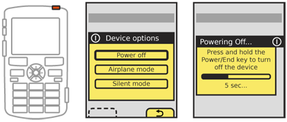
- Devices with Talk and End keys tend to place the power toggle on the End key. A press and hold of the End key will activate the power-off function.
- Devices without an End key tend to have a dedicated power key, which acts as a lock function when pressed. To power off the device, a long-press is required.
Actions like power should be protected from accidental activation by an Exit Guard or similar function, such as revealing a menu of options, only one of which is the power off function.
Presentation Details
The key must be unambiguously labeled with the function. Volume keys may get a pass as they are expected, so any single key pair may be understood to be volume controls. However, the difference between the camera and power buttons -- for example -- should be made clear by labels.
Labels should be visible in all conditions. See the Mode Switches pattern for additional details on this, and especially for risks of backlight under certain lighting conditions.
labels and descriptions for on-screen effects such as notification icons should comply with the hardware label to draw a clear parallel between the two.
Key position should considered carefully. Keys should meet established best practice whenever possible. Camera buttons are very often arranged like a shutter, so are at the right side of the top edge when in conventional (landscape) orientation.
On-screen behaviors and their keys should be adjacent to each other whenever possible. Softkeys, for example, must be near the bottom edge of the screen, and aligned near the left and right edges. If the position of more obscure keys is known to the software, it may be pointed to as an aide to the user, either routinely or during first-run tutorials or help topics.
Secondary functions, such as power toggle on the End key, should also be labeled on or adjacent to the key. Typically, these are smaller, and above the primary label as for hardware Keyboards & Keypads.

Antipatterns
Do not block informational dialogues about a key press for any reason. Even in video playback, where other status messages or Notifications may be suppressed, hardware key presses should almost always display the results on screen.
Do not cast labels into keys without highlighting with color and/or providing a backlight. Impressed keys labels are unreadable under all but the best lighting conditions, and will not be understandable by the user.
Do not make up new symbols to denote key functions. Use common, universally-recognized icons or other labels.
Preserve relative key functions when switching modes. For example, when in portrait mode the top key of the volume rocker increases volume. When switching to landscape, make sure the same key performs the same function. When a secondary set of keys is provided for the new mode (such as another set of Softkeys to align with the screen location), both should function at the same time, to support habituation or eyes-off use.
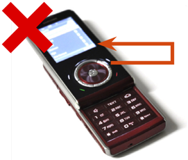
Do not attempt to use lines or other guides to make up for softkeys far-removed from the screen. If this cannot be surmounted, users will eventually learn it, but guides do not tend to help.
Avoid using multi-key combinations for routine controls. Despite their prevalence on desktop computing, they are poorly understood and difficult to label. This does not preclude their use for obscure functions. In fact, the lack of any reason for users to routinely use multi-key combinations means they are a good way to support highly specialized or technical functions, such as for system resets.
Next: Accesskeys
Discuss & Add
Please do not change content above this like, as it's a perfect match with the printed book. Everything else you want to add goes down here.
Examples
If you want to add examples (and we occasionally do also) add them here.
Make a new section
Just like this. If, for example, you want to argue about the differences between, say, Tidwell's Vertical Stack, and our general concept of the List, then add a section to discuss. If we're successful, we'll get to make a new edition and will take all these discussions into account.
