|
Size: 6276
Comment:
|
← Revision 24 as of 2011-07-31 20:52:09 ⇥
Size: 6309
Comment:
|
| Deletions are marked like this. | Additions are marked like this. |
| Line 50: | Line 50: |
| Next: '''[[Drilldown]]''' ---- |
Problem
You must describe the location within a series of screens which contain alternate views, or which continue the display of a set of content.
Whether text or graphics, the Location Within can easily be implemented on any interface. Some OSs will have a built-in style for at least some cases, which should be used.

Solution
When several screens of similar or continuous information are presented with an organic access method, an indicator is usually required so the user understands their position within the system. Two very common uses for this widget are to show position within a Slideshow or Film Strip]. These each have the inter-frame interaction integrated with the basic pattern.
This overlaps heavily with the Pagination widget, to the degree where it may be unclear which is being applied. If the indicator is integral with the method of changing pages it is a Pagination widget, and if a static component it is a Location Within indicator.
See Location Jump for another variation of providing access using a similar presentation method.
Variations
Location Within widgets are used to convey the specific context of a page within a series. The method used depends on the amount and type of information being presented. There are two basic types.
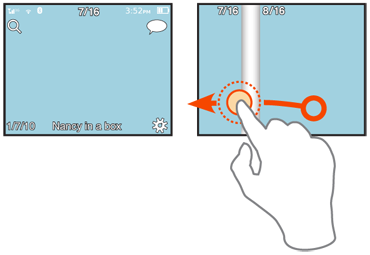
Text widgets list the current page, of a set of pages. "1 of 16," for example. This is often encountered in slideshows, or other contexts where much other meta-data is often displayed. These are suitable for any number of screens; numbers are very space-efficient ways of displaying the information up to sets of hundreds or thousands of items.
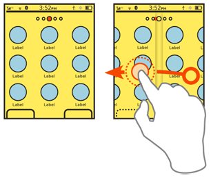
Graphic widgets indicate the position as a single item among a field. This may overlap with certain implementations of the Tabs pattern, but the entire set of pages must be visible on the page, and may not overflow. The dot and bar indicators to show position within the Home screens is a typical use for these indicators.
You can also combine the two variations above, such as when a graphic indicator cannot fit all the graphics on the screen; the graphics are used for indicating transitions between individual pages, and a text indicator may used to provide overall context. Graphic indicators may also have numeric values attached to them.

Interaction Details
There are no direct interaction details with the indicate-only Location Within pattern.
Presentation Details
For text items, labels should be clear, but must be as brief as possible to not make the element too prominent, and to allow more items to be placed on the page. Usually, labels themselves can be eliminated. "1 of 16" (or even "1/16") is generally just as clear as "Page 1 of 16 pages," and is often much easier to scan and read. Remember, your users are probably moving between the items, so the change will make things clear.
Graphic indicators may be any shape, but should not imply action or activity. Triangles, for example, may imply direction or action which is not necessarily true. The indicators must be in the orientation of the page transitions. For a horizontal sliding Slideshow, for example, the indicator must be horizontally aligned also.
The current position must be clearly indicated. A color, size and/or contrast change must be clearly different from the other page indicators, and must be prominent enough to stand out from the background or other elements on the page. Use shadows or other effects to make the indicators stand out, or appear to be on a layer over the page content.
Any indicators may disappear when the screen is not transitioning. After a few seconds, fade the indicators. Use this carefully, and allow a method to easily reveal the indicators, so there is a sense of location available at all times.
Make sure any graphic indicators are visible when transitions between pages occur. The indicator must transition, by sliding between positions, instead of simply changing the focus item. Alternatively, text indicators may change to label each visible item during the transition.
You may find yourself integrating other components, such as previous/next arrows, then thinking they should also be selectable, and then realizing you are making a Pagination widget. This is not always true. It may be instead that you have just decided to place the indicator and control items for the underlying Slideshow or Film Strip adjacent to the Location Within. Such design license is always acceptable, and will happen all the time. Just be sure you recognize it, so you are always using the correct components, in the correct manner.
Antipatterns
The key risk with this pattern is not using it at all. Do not avoid using indicator patterns in an attempt to prevent page clutter. Many implementations are very clean, simple and do not interfere with use of the screen otherwise.
Next: Drilldown
Discuss & Add
Please do not change content above this like, as it's a perfect match with the printed book. Everything else you want to add goes down here.
Examples
If you want to add examples (and we occasionally do also) add them here.
Make a new section
Just like this. If, for example, you want to argue about the differences between, say, Tidwell's Vertical Stack, and our general concept of the List, then add a section to discuss. If we're successful, we'll get to make a new edition and will take all these discussions into account.
