The Weilers, Version 1
Jack, Maggie, and their 5-year-old, Melissa, approach the entrance to the brand-new shopping mall that recently opened in their hometown. Melissa, thrilled with the opportunity to finally go to a Build-A-Bear Workshop, skips ahead in pure excitement.
Just inside the main walkway Jack sees the large vertical store directory and map. Rather than getting lost in such a large place through exploratory wandering, he decides to use the directory to figure out exactly where in the mall the Build-A-Bear store is.
The directory in front of him is typical. A floor plan is illustrated that labels each store using apparently arbitrary numbers. Those numbers are referenced and sorted by category to comprise the store directory.
Immediately, Jack’s frustration begins to build. He struggles to determine what category Build-A-Bear falls into; he’s looking under Gifts, then Baby, both without luck. Maggie chimes in and finally finds the store under Fun & Games with a label of “L34.”
Once again, frustration builds when the family members can’t find their current location, or determine where L34 is. They do not see a “You are here” indicator. Annoyed by this barrier, Jack and the family give up, and walk farther into the mall in hopes of eventually coming across the store.
The Weilers, Version 2
Jack, Maggie, and Melissa are excited about visiting the Build-A-Bear Workshop in the new shopping mall. As they enter the mall for the first time, they see a crowd of people gathering at the story directory kiosk.
As they walk toward the crowd, they are amused to see that the mall uses a multitouch in- teractive table to display its layout and directory. Jack places his fingers on a portion of the screen to begin. That portion of the interface lights up and generates a pop up with an option to locate a store or to begin a video chat with the mall’s customer service department.
Jack is presented the option to filter his search by general category, with proxemics to his current location, or by alphabetized store name. Jack selects the alpha search, which reveals a vertical list of stores with location jump controls, as well as a text field with a touch keyboard.
Excited about this experience, Melissa engages with the table and uses the location jump control to find the stores that begin with the letter B. The “Build-A-Bear Workshop” label displays within the list. As she selects the name, an interactive floor plan of the mall immediately populates, illuminating the store’s location.
The floor plan at first shows the entire mall’s layout with callouts to the family’s current location and the Build-A-Bear location. Then the display slowly zooms and reorients to the family’s current position and animates an eye-level view of the walking route from their location to the Build-A-Bear store.
Having visually seen that the store is located on the second level next to the Food Court, one level above them and slightly to the right, the family heads in that direction, still excited by the engaging user experience.
The Difference
The two different scenarios provide polar examples of how a common task of locating information can lead to a frustrating user experience, or an enriching one. The solution was not just the power of the technology. It was also, and more importantly, how the content was organized, displayed, and made available to the user, in a manner useful to the user’s immediate needs and current context.
In the first scenario, all the information was presented at one tier, without the user’s ability to use controls to drill down, sort, and filter information for his current needs. This lack of control placed too much burden on the user, and resulted in a failed experience.
In the second scenario, the Weilers had access to a variety of information controls, such as location jump, search within, zoom and scale, and sort and filter, which made searching for relevant information much quicker. Each particular control provided a unique way of revealing different types of information.
Information Controls in the Mobile Space
In the mobile space, where limited display sizes constrain the amount of information presented at a given time, a user will require affordable functions that provide quick access to her intended goals.
The following are some guidelines for providing information controls in the mobile space: Provide controls that afford their functionality by resembling their intended function
- A control using a + or – button will be understood to zoom in and out, as opposed to using controls with arbitrary labels such as “A” and “B.”
Make the controls visible
- Users need to be immediately aware that controls exist to access and control the amount of information visible. Keep the control placement consistent across the OS or application. Because mobile screen real estate is valuable, consider using the Revealable Menu or Fixed Menu pattern.
Use appropriate metaphors to establish learnability through familiarity
- As Dan Saffer explains, “Metaphor is not just about language; it’s really about thought. We conceive of things in terms of other things” (Saffer 2005). When using metaphors, be aware that they may have various meanings across cultures, and match the meta- phor to the content, not the content to the metaphor. Consider how we understand the use of a magnifying glass to see detail. Some zoom and scale controls use this metaphor to communicate one’s ability to see more or less information.
Provide immediate and appropriate feedback
- A control must produce immediate feedback to communicate a change of state (contrast, color, shape, size, sound) that is measurably different from its initial state. Delaying feedback can result in the user performing other actions in the belief that the intended action failed.
Provide constraints
- Provide only the control functionality that is needed to complete the user’s task. Use a control for its purpose only. Do not assign it multiple, unrelated functionalities.
Follow wayfinding principles
- Make sure your users know where they are in the control’s current state, while pro- viding information to communicate its range of control. For example, when using an alphabetical Location Jump widget, ensure that the selected letter is visible within the range of letters, while also communicating its relationship to other letters.
For more information on designing controls for people, refer back to Chapter 4. For a book on the subject, consider The Design of Everyday Things by Donald Norman (Basic Books).
Patterns for Information Controls
Using the information control widgets allows users to quickly access the type and amount of information within the current state of the device. In this chapter, we will discuss the following patterns:
- Provides the ability to adjust the level of detail of high-density information by chang- ing the levels of zoom and scale
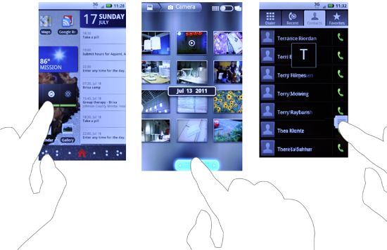
- Allows the user to quickly jump to a specific location within a list of information (see Figure 8-2)
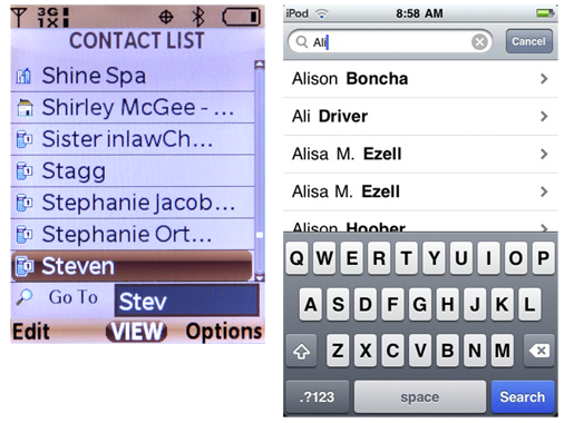
- Allows the user, via a search field, to quickly filter or jump to specific information the user knows exists within the page (see Figure 8-1)
- A method to aid exploratory search by progressively disclosing search options to nar- row the relevant results
Discuss & Add
Please do not change content above this line, as it's a perfect match with the printed book. Everything else you want to add goes down here.
Examples
If you want to add examples (and we occasionally do also) add them here.
Make a new section
Just like this. If, for example, you want to argue about the differences between, say, Tidwell's Vertical Stack, and our general concept of the List, then add a section to discuss. If we're successful, we'll get to make a new edition and will take all these discussions into account.


