Problem
You must allow the user to make a selection -- or several of them -- from any of the large, ordered datasets discussed in this chapter.
The applications of this are essentially limitless, and can be applied to the simplest and the most complex of representations, so can be used one way or the other for any type of implementation.

Solution
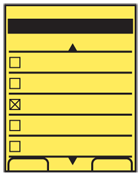
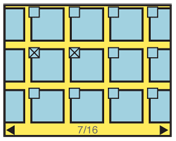
You can turn any of the other patterns within this chapter, but especially the Vertical List and Grid, into a selection mechanism by simply adding a checkbox, or other explicit and visible selection component.
For many selection methods, simply tapping or pressing the "OK/Enter" key on hover will serve to meet the needs of single selection. The checkbox pattern is used for multiple selections (more than one item may be checked) or when the selection may involve investigation and confirmation before committing to the selection.
Variations
There are two variations to the select list. Single select only allows one item to be selected, and then forbids subsequent selection, or deselects previous selections.
Multi-select allows checking more than one item in the set. The limit is set by the application, or the requesting application, or may include the entire set.
Many select lists allow switching between these modes. This is useful when you cannot predict how many selections need to be made, but a typical number is just one, such as for selecting recipients of an email.

Interaction Details
The Select List pattern is likely to be implemented as a mode of another list. This mode may be entered contextually, due to a request from another application, or explicitly, via user action within the list view. Very often, you will be re-using a list that already exists for another purpose.
Most single-select lists perform the selection and commitment of the selection as one action. Once the item is selected, you should take the user to the next step in the process without forcing them to select a "Next" button.
For multi-select lists, when the user selects an item, the indicator will change immediately. When the selection method is made again, the indicator will change to the deselected state. If details are available for an item, such as viewing an image or selecting, the checkbox should have to be hit with some precision, and all other areas may result in viewing details.
Depending on the function, there may be a need for a "select all" function. Even if functions against all items an already be performed with a dedicated function (e.g. a "Delete all" option menu item, separate from a "Select to Delete" function) it can be useful for alternative selection modes. The user may want to select most items, and shorten time by selecting all, then deselecting the few items they want to keep.
For all multi-select methods, you will have to provide a "Done" function to determine when to move to the next step. This should be contextual, and carry a label associated with the larger task. "Delete selected items," "Send message to selected recipients," and so on.
Especially for large data sets, the selection process may be involved, so you should consider it as a set of user-entered data. If the list is exited before commitment -- such as if the Back button is selected by accident -- you should preserve the selection information. The exit may have been accidental, and when next carrying out the same task (e.g. adding recipients to that same draft message) presenting the last selections instead of an empty selection state may be perceived as helpful. This concept is discussed further under Cancel Protection.
Since some uses of back are deliberate, do not force the user to accept previous selections. See the Clear Entry pattern for some methods of removing user-entered data without placing undue burden on the interface.

Presentation Details
Selector items should be overlaid on the list items. Within a grid view, for example, the checkbox should be over the image itself, or otherwise not take space from the interface. You will also enjoy doing this as it reduces the changes needed to make a Select List variant of your existing lists or views.
A variation of the Location Within widget may be employed to indicate the number of selections. This is especially valuable when there is an easily-reached limit on the number of selections. You may also choose to use this conditionally; when the selection limit is high, the indicator can appear only as the limit is approached.
To prevent errors, commitment of the selections should be prevented until at least one selection is made. This may be either by hiding or by "graying out" the relevant functions. You should always try to reduce explicit errors by making them impossible to reach.
Antipatterns
Do not overthink the selector or indicator. Checkboxes work well. Radio buttons may seem to be the best choice for single select items, but the web form paradigm is not well understood by many users. Novices are very common on mobile devices. Use checkboxes or similar-looking interactive elements for all selections.
Don't let styling of the checkboxes get out of hand. The selected and unselected states should be not just differentiable, but identifiable without comparison, to all users regardless of the vision, and in all lighting conditions.
Do not impose burdensome errors. If the user must be forbidden from making another selection, simply disallow. If a message is required, place it prominently, but away from the focus, and do not make it a dismissal-required modal dialog box.
Be sure the selection method is well-associated with the item being selected. Do not place checkboxes by floating meta-data, for example, but on the image itself.
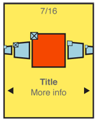
Always show selection state, even when it cannot be selected. If a Carousel is used as a Select List (and it generally should not be) then only the item in focus can be checked. However, make sure to show the checkbox for all items in view.
Next: Control and Confirmation
Discuss & Add
Please do not change content above this like, as it's a perfect match with the printed book. Everything else you want to add goes down here.
Examples
If you want to add examples (and we occasionally do also) add them here.
Make a new section
Just like this. If, for example, you want to argue about the differences between, say, Tidwell's Vertical Stack, and our general concept of the List, then add a section to discuss. If we're successful, we'll get to make a new edition and will take all these discussions into account.
