Problem
You have created a process which includes points where the user must confirm an action, or choose between a small number of disparate (and usually exclusive) choices.
Confirmation steps are simple, logical parts of many processes, and can be easily implemented in any number of ways. These patterns discuss the best ways to do so on mobile devices.

Solution
Whenever possible, you should use information from current and previous user behavior, sensors and any other sources, to try to present the correct option to the user. When that is not possible, or likely, present the most likely choice, and give options to switch to others.
For example, when opening a Messaging compose screen, instead of presenting a Confirmation dialog asking whether they intend to compose an MMS or SMS, just open a compose screen with attachment options. If an attachment is chosen, it becomes an MMS. Else, it's an SMS. The choice is still made by the user, but implicitly by actions and choices (selection of the attachments) they needed to make anyway.
Except for error or guard conditions such as Exit Guard, systems can often be designed for avoid explicit choices.
When the step cannot be avoided, and user input cannot be divined contextually, then you must present the choices contextually, as choices related to the task or screen that preceded the Confirmation screen. Always communicate the consequences of the choices simply and clearly.
Variations
Though many display methods are possible, all will be modal dialogues of some sort. For more details on these, see variations under Pop-Up.
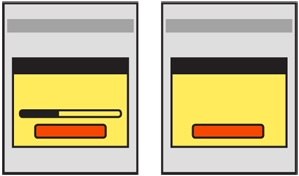
 Three key variations exist: A single choice is only used to inform the user. For example, a fatal error has occurred, and the handset must be restarted. Instead of just doing it for them without warning, it may be helpful to tell the user that the condition has been reached, so you should present a Confirmation dialogue, with a single "Restart" button. In cases where the condition is not catastrophic (such as a dropped call) you may choose to have the dialogue disappear after a brief time. Including a button then simply allows the user to dismiss the dialogue that much faster.
When you automatically dismiss messages, it is usually best to have some other method display the same message. Load the call log, with the item visible, or add an item to the Notifications area. You can determine the best method by examining the OS or application standards.
A variant of the single choice includes a Wait Indicator to denote that a process -- usually a user-initated one -- has begun and they must wait to perform other tasks. When possible, include a "Cancel" button. If not, this may become a sort of "no choice" confirmation box, with nothing but messaging and the Wait Indicator widget in a Pop-Up.
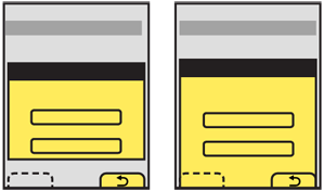
By far the most common is the "two or three choices" variant. This is the maximum number of choices that a user can readily comprehended at a glance, while also presenting enough options for most required decisions. Examples of three choices are when exiting with unsaved documents:
- Keep working on the document
- Save the document and exit
- Exit without saving the document
Though these are not ideal labels. See Exit Guard for more discussion of these sorts of conditions.
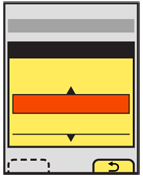
In some cases, a larger number of choices must be presented. These will generally be offered as a single Select List in the dialogue. Avoid scrolling, but this may be unavoidable.
Interaction Details
 The Confirmation pattern involves an error or choice that stops the process. Such choices should not be avoidable, but should be contextual to make it clear what application, or process they will effect. These should therefore be modal Pop-Up dialogues almost always. See that pattern for additional details.
Whether two or three choices is convenient or requires a non-standard UI is dependent on the OS paradigms. If the device OS you are designing for uses Softkeys or softkey-like on-screen buttons, then two choices with the dialogue docked to the edge with the buttons is the simplest way to present a small number of options. However, it (usually) limits the options to two.
If additional selections are required, they may be loaded in any way needed, such as buttons in the Pop-Up, as pick lists, etc. Use any Softkeys or on-screen buttons for primary supporting actions, such as Cancel. In the example above of exiting with unsaved documents, the choices to exit without saving and save documents would be in the dialogue, and the option to return to the application would be labeled "Cancel" and be the Softkey conventionally used for this.
When working with such devices, avoid disregarding Softkeys entirely, for consistency of the interface.
When designing for other interfaces, especially for touch and pen input, selections should usually be buttons.
Presentation Details
When the Pop-Up appears, use other methods to notify the user of the stop in process, such as audio and/or vibration. Follow current system volume settings for the notification. Mobiles are used in quick glances, so the user may not notice such a stop in process for minutes or hours unless informed via a non-visual channel.
 If the Confirmation action occurs while an application is running in the background, use any available notification method installed with the OS to bring this to the front. If the only method is a Pop-Up dialogue interrupting the in-focus process, use this carefully. Trivial processes, such as your game crashing, do not need to interrupt phone calls.
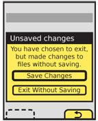
The Title of the dialogue must clearly denote the choice to be made. Do not label it as "Error," with codes or jargon, or with the name of the parent application. For the example used above of exiting with unsaved work, "Unsaved work" would be a suitable title.
A description should usually be provided. If the choices are clear or simple enough, this may sometimes be left out. For the same example a suitable description would be "You have chosen to exit but have made changes to files without saving." The description and title may or may not be questions, as the choices will often serve this role.
Button labels must not depend on the description or title. Never present selections such as "Yes" and "No." Do not try to fix these by adding a question such as "Save these changes?" Users will not read the whole thing, but just glance at the options, and will become confused by your vague buttons.
At the same time, do not let options be too long, or they may not be readable, or may not look like selections. Options like "Delete" and "Save" are much more suitable. For the relatively complex example used previously, options might be:
- "Save changes"
- "Exit without save"
- "Cancel"
 "Cancel" may not seem the most clear label. It is instead a placeholder for the common term or symbol used in the OS to denote canceling or going back from the current action. In this case, the action is the presence of the Confirmation dialogue, so the application will be returned to.
When a choice is clearly the preferred one, or is the safest (e.g. preserves user data), that should be indicated. The OS standards should include a method of indicating button preference such as color, icon use or border treatment.
Antipatterns
Reduce clicks whenever possible. When a selection is made, it should immediately commit the change and proceed to the next step. Never force the user to make the choice, then press some sort of "Submit" button.
Do not over use the "single choice" variation. For example, if an application must quit and a Confirmation dialogue is useful, a dual choice would usually be better. Offer options to just quit or to quit and restart the same application immediately.
Carefully consider whether a Confirmation dialogue is the right pattern any time more than three choices are offered. It may be a natural part of the process. The use of the modal dialogue implies exceptional conditions or errors so should only be used when needed.
Unless the standard and exclusive way of canceling a process, do not provide a "Close" button for the Pop-Up dialogue. Even if the behavior can be mapped to both the "Close" and "Cancel" functions, the Confirmation dialogue presents options as a set of required choices. Closing the dialogue implies it is optional and can be avoided.
Do not develop new terminology, or use new or non-standard icons for simple behaviors like "Cancel" or "Back." Use the OS standard labels or iconic representations.
Next: Sign On
Discuss & Add
Please do not change content above this like, as it's a perfect match with the printed book. Everything else you want to add goes down here.
Examples
If you want to add examples (and we occasionally do also) add them here.
Make a new section
Just like this. If, for example, you want to argue about the differences between, say, Tidwell's Vertical Stack, and our general concept of the List, then add a section to discuss. If we're successful, we'll get to make a new edition and will take all these discussions into account.
