Problem
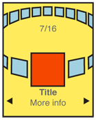 You need to present a set of information, most or all of which are unique images, for selection.
Carousels are graphically intensive, so may not be easy to implement on devices without built-in support. Web implementations will need scripting or advanced HTML and CSS support.
Solution
A Carousel displays a set of selectable images, not all of which can fit in the available space. It simulates a continuous strip, stack, pile or other arrangement of images, only some of which can be seen at once due to the limited size of the device viewport.
The images presented should be similar in size and aspect ratio. You can include a small amount of additional information about each image can be displayed adjacent to the image as it becomes in focus. In general, the in-focus item is larger, clearly has focus or actions attached to it, etc.
The user can scroll through the set via any number of methods. Indicators should be present, but may not be based on OS standards. Scrolling brings more things in from the sides (or wherever), and changes the item in focus -- must always be live so the items move instead of appearing or jumping.
Do not confuse this with a Slideshow, which only presents one image at a time, full-screen. The two are closely, and often may be switched between within a single interaction. If a Carousel cannot be implemented for technical reasons, use a Slideshow instead, or in combination with a simpler display method such as Grid or Thumbnail List.
Variations
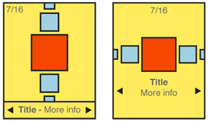
You can design a Carousel to be presented either vertically or horizontally. Which one to use depends on the space available in the layout, device display or interaction paradigms, the nature of the items being displayed, OS conventions, and user expectations. Sometimes, you may even wish to switch within a single implementation, due to device orientation changes.
Two dimensional carousels use use size differences to create a simple but false sense of perspective. Two dimensional carousels may overlap the items not in focus slightly, to save space. Images should always be identifiable from the partially exposed image.
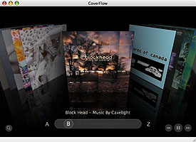
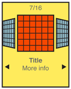
Three dimensional carousels usually make the entire circle of the collection visible by using perspective. When oriented horizontally, the back of the circle is tipped toward the viewer. And contrary to the physical metaphor, the items along the back edge of the display are shown as if the image was on the back of the card, or as if the image was two-sided. Presenting the back of the image doesn't seem to work.
Note that three dimensional carousels can present a more engaging interface, but you can rapidly run into issues with density and complexity of information. They tend to be more expensive in terms of screen real estate for the display and in processing needed for any image conversion or animation.
Interaction Details
The item in the front-middle of the Carousel is the item in focus. You will make this item subject to the conventional interaction criteria for any ion-focus item. For example, when the user makes menu selections, or presses OK/Enter, the actions will affect this item.
For touch or pen devices, any visible image may be selected. You may choose whether the result of selecting an image not in focus is to bring it into focus, or to immediately carry out a selection action. This is dependent on the context and process in which the carousel is being used.
Scrolling may be by gesture, directional keys, or selection of scroll functions on the screen. Scrolling must always be "live" or show the items moving on the screen. If this cannot be done, do not use the pattern and select another method. Be sure to support multiple methods, so that touchscreen devices with directional pads work with all input devices.
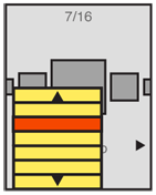
You can identify position in the list with a conventional Pagination or other type of Position Within widget. The total number of items should be easily obtainable or shown, but other features of these widgets may not apply to the particular data set, or presentation.
If it makes sense for your information set, a Location Jump widget may be applied. For example, a photo gallery may use this to avoid putting images in folders, and allow jumping to dates images were taken instead.
In many cases, the action on first selecting an image in the Carousel is to display it full-screen, for a better look. You should always switch to a Slideshow at this point, and not require the user to go back to the carousel to select another image. The user may want to compare several images to select one for sending, or deletion. Do not make anything difficult by excessively sticking to a specific interaction paradigm.
Presentation Details
The item in focus is centered in the screen (or in the array, if the array is off-center for dimensional simulation). You should also indicate this by size, by adding a border, or with other indicators. A common addition is the inclusion of text labels, such as the name, to only the item in focus.
Images not in focus should have attributes other than position to indicate they are in a secondary position in the list. Size and angle (skew to simulate not-facing) are the most used.
The last image not in focus, but visible, should imply there are additional images outside the viewport. This may be via size (shrinking to infinity), angle (tilting "up" to become perfectly thin), or by having part of the image not on the screen. Each of these should lead the user to believe there is addition information if they scroll.
You should use additional scroll indicators whenever you can. Simply add arrow/triangle indicators to the sides, or immediately to either side of labels for the item in focus. If selectable directly, the indicators should change when selected and while the carousel is moving to indicate their activity.
Antipatterns
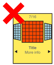
Preserve the integrity of the image used. Do not use programmatic shortcuts visible to the user:
- If the image is skewed to create perspective, skew the entire image. Don’t clip off corners of the image to simulate a the skew.
- Do not squish the image to change aspect ratio. If needed, add black bars or crop the image to fit a consistent space.
- Do not flip the image when displaying the back of a card, as in 3-dimensional carousels.
Never use cheats, and come up with a different display method, or switch to another pattern such as a Grid or Slideshow.
Next: Grid
Discuss & Add
Please do not change content above this line, as it's a perfect match with the printed book. Everything else you want to add goes down here.
Carousels Are Terrible
Okay, to be clear we mean the standard flat type that shows 1 or very few items and the rest either auto-rotate or have to be clicked on. The ones that display lots of graphical things with most visible at once... may not be as bad. Anyway, we've got this increasing body of research that those suck. A lot. This summarizes it nicely:
Examples
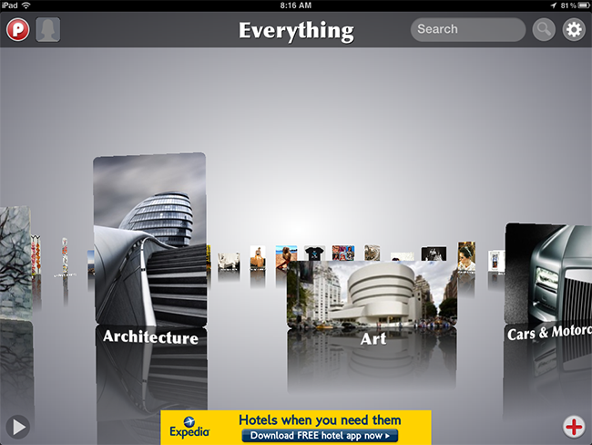
App for iPad. This is a truly great carousel implementation.
Springboard
|
|
• Many items on screen. |
• Position and skew (perspective) only. |
||
• Position indicator at bottom. |
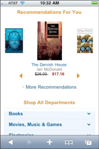
Amazon
|
|
• Horizontal. |
• Linear. |
||
• Scaled. |
||
• No distortion. |
||
• Scroll indicators below. |
||
• Bad: No pagination. |
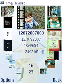
S60 Album
|
|
• Many items on screen. |
• Scale and position only. |
||
• Position indicator at bottom. |
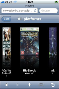
Playfire
|
|
• Images to either side are badly distorted. |
• Lack of perspective makes this unconvincing. |
Make a new section
Just like this. If, for example, you want to argue about the differences between, say, Tidwell's Vertical Stack, and our general concept of the List, then add a section to discuss. If we're successful, we'll get to make a new edition and will take all these discussions into account.

