|
Size: 7984
Comment:
|
Size: 7987
Comment:
|
| Deletions are marked like this. | Additions are marked like this. |
| Line 34: | Line 34: |
| See the and '''[[Interstitial Screen]]''', '''[[Infinite Area]], and '''[[Reload, Refresh, Stop]]''' patterns for the most common interaction implementations. | See the and '''[[Interstitial Screen]]''', '''[[Infinite Area]]''', and '''[[Reload, Refresh, Stop]]''' patterns for the most common interaction implementations. |
Problem
Processing, loading, remote network submissions and other delays must be clearly communicated to the user.

Solution
A variety of Wait Indicators are used to inform users of delays which are imposed by technical constraints.
Some of the indicators described here are used almost exclusively on an Interstitial Screen. Read that pattern for implementation details, such as cancel functions, not considered here. Others may appear as portions of an interface, to communicate loading of modules, or individual images.
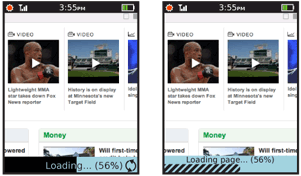
Another common implementation is the loading bar, often used for web browsers, which may not disable the existing page until some or all of the new page has been retrieved. The Wait Indicator occupies a space along the edge of the screen, and does not interfere with use of the old (or new) page.
This widget may be used in many ways, as it best serves the needs of the user and the constraints of the design.

Variations
There are a number of variations on this basic theme, all of which will be considered here as they address the same basic issue.
- Short wait - A one part indicator, used when the wait is very short, or when the length of the delay is unknown. Consists of an animated, endless graphic.
- Long wait - A two part indicator, usually using a horizontal bar to indicate percentage complete and a text counter of size, percent and/or time until completion. The long wait is used only for processes that take a reasonably measurable amount of time. This cutoff is almost infinitely variable, and depends entirely on the user's perception of the speed of the system. Sometimes even 5 seconds, when the user is highly focused on the system, will seem too long for a unit-less Short wait indicator.
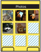
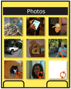
- Ghost - This is part of the lazy load concept, heavily used with images, where the content itself acts as the indicator. Think of an image loading slowly, going from fuzzy to sharp, or loading top to bottom.
The entire practice of loading web pages as the content is received is a sort of lazy loading implementation. Consider how slow loading of your page (or of many pages if designing a browser-based system) can influence the user, and may need to be optimized to communicate the delay better.
These may sometimes be used in conjunction. If, for example, Ghost loading of an image is not entirely clear (and it often is not), a Short wait indicator may be used on top of the image until it has completed loading. Or a Long wait indicator may be used along the edge of the image until it has completed loading.

Interaction Details
The Wait Indicator is the widget that informs the use of status only. It has no direct interactivity itself, though may be used with buttons, softkeys or other interactive elements.
See the and Interstitial Screen, Infinite Area, and Reload, Refresh, Stop patterns for the most common interaction implementations.
Presentation Details
All indicators must remain moving or have some other sense of movement imparted if the load speed is too slow. Bars with internal animation are a very common solution to this.
Display the units any displayed measurements are in. Do not just display "67" but "67%," for example. Times may be unitless if the format is clear, and individual seconds are counted. Units should accurately map to percent of task complete. Ideally, timing benchmarks should be made and the indicator updated with percentages in relation to time remaining for the task, rather than tasks pending in the execution queue.
 Space may be saved by having it appear in the same space as the indicator bar. However, assure it is visible at all times. Consider reversing the text color pixel by pixel as the bar progresses, for maximum contrast.
When a Wait Indicator is used alongside of a content area, or in-conjunction with the content (overlaid), the indicator will disappear when loading is completed. In some cases, if the indicator is alongside so does not interfere with using the content, the "fully loaded" indicator state may persist for a brief time (up to about 2 seconds) to better communicate the loading has completed.
In some cases, another indicator may be needed to indicate there is no loading. This will usually appear in a permanent status bar, which is where the loading bar would appear. Typical messages are "Idle," "Completed," "100%," and the like. Make sure the message is clear, contextually-relevant and does not rely on jargon or excess familiarity with the system.
Long delays, especially on mobile, may cause the user to not be paying attention to the screen when the task is completed. It may sometimes be helpful for the end of the delay to announce itself with:
- LED blink
- Backlight on
- Vibrate
- Tone
Or a combination of these. If these are used, generally a "completion" message must be made available, to make it clear what has happened, and what the annunciator is indicating.
Antipatterns
Do not use the unit-less Short indicator just because the delay is unknown. Do whatever is possible to get an estimated time to completion. If impossible, be very clear in text descriptions that it will take approximately a certain time (e.g. two minutes) and alleviate the wait in some other way, such as with a tone.
Do not mix paradigms. Develop a system of wait indicators, and use like indicators for like waits. Users recognize the distinctions made above, and will base expectations on the typically-used graphic design patterns, so may be mislead by poorly-selected indicators.
Do not allow indicators to stop animating. Users will perceive lack of movement as locking up or taking so long they will not wait for it and will abandon the process.
Do not imply completion by the use of the wrong indicator graphic. Bars imply completion, and repeatedly filling a bar is simply misleading to the customer. Rotating items must not appear to be pie charts, filling in, or the same can happen.
Avoid using Wait Indicators as mouse pointers, or otherwise mimicking modes from desktop computing platforms. Do not use the Wait Indicator as an error message; errors should be separate and distinct from fatal error messaging. As an example, the "Spinning Beach-ball of Death," which indicates all system resources are used up, is not a suitable way to communicate this situation, especially on a mobile device.
