Problem
You must display a small amount of directly related information, provide access to related controls or settings, or provide an alternative view of the same information, in an organic manner.
Simulated 3D Effects do not always require a 3D display, but do generally require significant graphics processing power, and may require access to sensors (which browsers often cannot get).

Solution
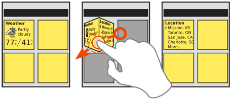
Extending the physical-simulation conceits of the Tabs and Peel Away, other types of Simulated 3D Effects can be used to pretend the screen, or items on it, are dimensional, physical objects. The user can see the sides, rotate or flip, move them aside or look around, all by changing point of view or interacting with the objects directly.
Note that this is labeled as "Simulated," as it is displayed on a flat screen. It also does not require actual 3D display technology, and surprisingly dimensional results can be achieved with conventional 2D displays and very careful design. Some display methods can even be simulated without particularly involved graphics processors. If the pattern seems useful for your design, investigate ways to accommodate it with the technology available.
This pattern works best when direct manipulation of the screen or the device is used. See On-screen Gestures, Kinesthetic Gestures, or Remote Gestures, for more details on direct interactions. It will rarely work well on scroll-and-select devices without accelerometers.
Variations
To use Simulated 3D Effects, you will pick one of three methods of interaction, and the associated methods:
Screen gesture - Items, or the whole screen, will react to drag actions.
The selected item may be flipped to another side. Usually, these are represented as rectangular prisms, flipping 90° at a time.
The items may be moved around the screen. This should not be confused with Stack of Items which allows actually manipulating the items selected, but may be similar looking.
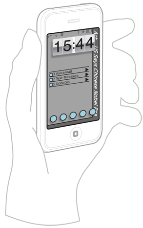
Device gesture - The device senses position relative to the viewer, using accelerometers, machine vision (cameras) and other sensors. The screen simulates an environment in which items live and are affected by movements of the device.
Viewing point - Using machine vision, or a 3D display, when the user moves relative to the screen, items declared to be above others may simulate parallax and allow looking under them to other items or the background.
In the event your device has two screens, such as one on each side, you can develop a device gesture that rotates from one side to the other, to display related information on each screen, without using simulated 3D effects at all.

Interaction Details
When the user selects and directly manipulates items, they will be rotated to view information or controls on another face of the element, or slid away to see past, to the top of another item or the background. You should restrict actions to only one of these types of movement for each object. Generally, it's a good idea to use one type of movement for any class of item, across the whole OS or application.
Make sure that all interactions on a movable element do not interfere with any other gestures. For example, only allow clicking on items within the element, and any drag actions will rotate or move it. This means you cannot have things like Scroll within the 3D element, or even allow the use of Mechanical Style Controls like the spinning date selector.
When device gestures or viewer movements are used, any items affected will follow the presumed physics or correctly represent the space they occupy. Common uses are:
- Seeing around or behind items in the front.
- Observing the side of an item.
- Revealing items off the side of the viewport, such as under the edge, or which themselves form the frame.
When first used, and after major changes, the frame of reference is typically reset to assume the backdrop is level; subtle changes will then allow items to either react to the movement (fall to the "downhill" side) or stay in place and allow the user's head movement to view "past" the item.
Presentation Details
Details of the presentation are almost unlimited, offering you more scope to explore than any other interactive patterns. From geometric shapes to natural scenes with leaves and grass, anything is possible. Make sure the style used matches the OS, or the brand of the product or service, and that it is still understandable and usable.
These may settle down once the pattern is used more widely, and user expectations become more set, and best practices are established. But for now, you have room to develop those standards.
Any shapes you display must "look 3D," so the user expects to find additional information with an interaction, even when closed. This may be as subtle as providing a shadow to indicate the item has height. Since many items have these visual effects, try to add additional details, such as movement, or build imperfections into any machine-vision or accelerometer-based systems so minor actions will cause the other faces or items behind to peek out.
Any items you place on the screen which are not directly related to the interaction reveal method should also generally exist within the simulated 3D environment. Lighting changes will fall on them, items which move must pass over or under them, or bump into or bounce off them, and so forth.
Antipatterns
3D interfaces require commitment, and cannot be well-implemented with half measures. Do not implement some 3D features if conventional layout elements will interfere with the illusion. For example, if items move about the screen, then the typical grid of icons must also exist within the simulated space, and interact with the simulated physical world. The icons must not simply be painted onto the backdrop, act static, and be ignored by other objects.
Avoid using secondary interactive methods such as menus to change the on-page elements. Selecting a menu to "Rotate" does not work the same as a gesture. If support for scroll-and-select devices is required, include the basic functions under options or via accesskeys instead.
Avoid use of multiple types of interaction methods. Movement via On-screen Gestures will tend to change the user's frame of reference enough they may tilt the device. If Kinesthetic Gestures are also employed, the user will rapidly loose control.
Next: Pagination
Discuss & Add
Please do not change content above this line, as it's a perfect match with the printed book. Everything else you want to add goes down here.
Examples
- Omnia cube, etc.
- Almost anything TAT does.
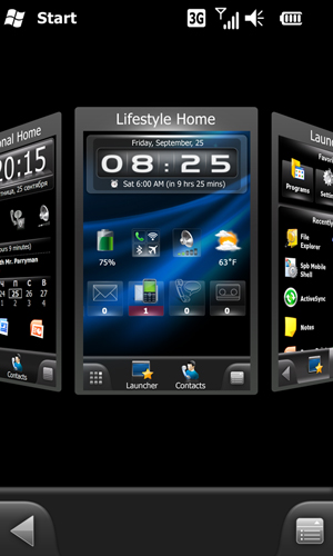
- SPB Software Shell 3D Tablet Edition. Glasses-free simulated 3D. As shown below:

Make a new section
Just like this. If, for example, you want to argue about the differences between, say, Tidwell's Vertical Stack, and our general concept of the List, then add a section to discuss. If we're successful, we'll get to make a new edition and will take all these discussions into account.