Problem
You must provide method to allow only authorized individuals access to a device, or a site, service or application on the device.
Authentication is built into the security model of most devices, but you may want or need to provide additional security for any application, service or site accessed from the device.
Solution
Security is very often over-used. Do not automatically implement it, and consider whether your specific situation requires explicit authentication. Mobiles are personal, so should only require authentication for first time entry, or for very high security situations. Mobile-like multi-user devices such as kiosks will also require authentication.
Personal mobile devices also all have built in security methods, so users can lock them if security conscious. During setup, you may remind users of these features instead of adding additional security to your application or website.
User identity, whenever known, should be used and as much information in the system displayed as possible before authentication gateways are passed. Authentication may then only require the password.
Authentication must be presented in context, so it is clear what system the user is gaining access to, and why the level of security is needed. Entry methods must be designed to encourage ease of access, and prevent miskeying. Users are justifiably un-trusting of vague, general or inappropriate requests for authentication.
This is an excellent example where common practices are often not just difficult to use, but actually insecure. Use confirmed best practices, and follow the intent and letter of all security laws and regulations that apply to you. Also be aware that some regulations, such as current U.S. CPNI requirements are not fixed in time, and presume you will improve security as threats change over time.
Variations
The most common method is to extend desktop paradigms and accept input via form fields, as text or numeric entry using the conventional input methods provided with the device and/or OS: hardware or virtual keyboards and keypads. This works on all devices and platforms, but is not ideal. The difficulty of entering text is exacerbated with the non-word nature of passwords.
Text/numeric entry, using conventional input methods, whether hardware or virtual on-screen keyboards or keypads.
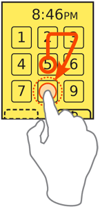
For on-screen, virtual Keyboards & Keypads, you may find it helpful to develop a custom keypad, which the user may tap or drag across in a pattern, for increased security or additional ease of entry.
Additional entry methods, such as biometrics, are not yet established enough to have best practices in the general mobile space, and therefore no design patterns exist. Fingerprint readers are the most likely to become common, and generally work as a single factor (identity), providing most access, but requiring a short password be entered for higher security actions.
Remember that entry of credentials is not enough to count as a full security methodology. Recovery, reset and out-of-channel notifications are also required, but are systematic approaches outside the scope of this document. For very high security applications, multi-factor authentication, biometrics and token-based security systems (such as RSA SecureID) must also be considered.
Interaction Details
When you present a Sign On dialogue, it is usually best to make it the only accessible item to avoid confusing entry with other behaviors. This makes it either a complete page or state, or a modal Pop-Up.
When using a form field to enter passwords, you must restrict entry methods to those allowed. If the password is only numeric, disregard alpha or symbol entry on hardware keyboards, and only display the virtual numeric keypad.
For small, personal-sized devices like phones, MIDs, and tablets, you should generally not obscure or "mask" passwords. This is the common practice of replacing the characters with dots or asterisks. "Shoulder surfing" on mobiles is extremely difficult due to the scale and viewing angles. In addition, the user may be relied on to move to a more private area or simply turn around, behaviors that desktop users cannot exercise. Displaying the entire field will greatly speed entry and reduce errors on entry, all of which not only reduce user frustration, but increase security by reducing time on entry and reducing use of recovery methods.
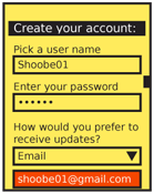
When the password field may be on the page for a while -- such as account creation -- the password may be obscured when the entire field is not in focus, or after a brief time. You can also give the user a selection, such as a checkbox, to hide the password. You may appreciate this during demonstrations, so you may hide it while projecting your cool new product at a conference.
An excellent method to enter a passcode, for touch and pen devices, is to provide a custom keypad. This may use conventional characters, such as numbers, or special symbols to add a layer of obscurity. These are most used as an increased security method; the order of the items changes each time, preventing observers from determining the passcode string by looking at finger patterns or examining the screen for marks.
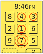 Another method, especially useful for securing device lock screens, is to provide a pattern entry. A grid of numbers or symbols is provided, and a series of adjacent items must be selected as a single gesture, such as an L or U. While fewer combinations are possible, this can be done with minimal visual input, and may also be configured to learn specifics of the approved user's gesture speed and accuracy. Gestures outside established bounds, though good enough for typing, may require entry of conventional passwords as a backup confirmation method.
You should always consider the entire method of access, and provide links to seek help on entry, get more information on security of the system, and to recovery and/or reset methods. For many applications and tools, unusual conditions like these can simply load your website to complete these processes. However, be sure to weigh the extra complexity, delay, risk of the site not loading, and other factors. This might be best as a stopgap, for the first release, but need an integrated solution for later on.
When creating usernames and passwords, for account creation systems, use tools to check that the username is available and the password sufficiently secure as soon as the user moves to the next field. Avoid displaying errors after submission.
You should always provide a "Cancel" function in case the user cannot recall their credentials, or must perform some other task instead. Even for device authentication, there must be a way to revert to the sleep state without an error being induced.
Presentation Details
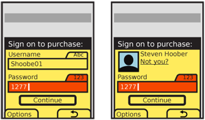
 You must always label password entry screens and Pop-Up dialogues in the context of the process or portion of the process. Explain the reason for the authentication specifically. Do not say "Sign on to our store," but "Sign on to complete purchase." If the title is insufficient, add a description, but keep it brief; users are unlikely to read much, and will gravitate to the entry fields.
Label each field, and be sure to use the same terms each time they are presented, throughout the entire experience. Use parallel labels. "Sign on" and "Sign off" go together. "Sign on" and "Log out" do not, and will be confusing.
Indicate the allowable input methods, and the current input method, for each field. You may have to add hint text in or under the field, or may be able to simple lock the keypad into the allowable mode. Be sure to indicate locked entry with an Input Method Indicator. Do not needlessly duplicate information. If entry is locked to numeric values, do not also say "Enter numbers only."
If the user has been identified by device ID, cookies, or so on, provide the known and non-secret user information, such as their avatar photo and name on any Sign On screens. Although all you know is the password, do not just ask for it with no supporting information. Of course, avoid demanding the user enter the username when this is already known, or has actually been printed on previous screens (or in the header of the Sign On screen).
Buttons to submit Sign On forms must, whenever possible, be contextually labeled. Use terms such as "Continue" to remind the user they are in a process, and avoid "Sign On" and the even more generic and technical "Submit" whenever possible. If completing the Sign On process will submit another action, make that clear. "Sign on and submit order" for example.
When two buttons of equivalent visual weight are presented the "Submit" choice should be designated as the preferred selection; the OS standards should include a method of indicating button preference such as color, icon use or border treatment.
The label for the "Cancel" function should always use the common term or symbol designated by the OS to denote canceling or going back from the current action. For devices with Softkeys, or OSs with Softkey-like buttons, the Cancel function at least should be displayed as a Softkey button. When the "Submit" button is presented as a more prominent on-screen button this can entirely alleviate any concerns over prominence of the preferred method.
Antipatterns
If your use case demands hidden fields, use caution when coding or specifying. Do not assume that the default password method built into the OS is secure. Most still reveal the character being typed, and this is basically required in triple-tap text entry modes. If an obscured entry is required due to use as a kiosk, while attached to a projected device or in other shared situations, be sure to specify how obscured it must be. This may require custom fields to be coded.
Avoid using any desktop paradigms without considering the consequences. For example, do not use dual fields to attempt to solve the entry problems associated with obscured entry. The difficulty of entry on a mobile will make a large percentage of users simply incapable of creating a password with this method.
Be careful to use terminology absolutely consistently throughout the process. If all your documentation refers to a "passcode" (because it is a number) do not suddenly use the term "Password" on the Sign On screen. Also try to use correct terms when possible. Enough users are used to authentication systems many of them understand the difference between recovery and reset. Do not conflate or confuse the terms.
Next: Exit Guard
Discuss & Add
Please do not change content above this like, as it's a perfect match with the printed book. Everything else you want to add goes down here.
Examples
If you want to add examples (and we occasionally do also) add them here.
Make a new section
Just like this. If, for example, you want to argue about the differences between, say, Tidwell's Vertical Stack, and our general concept of the List, then add a section to discuss. If we're successful, we'll get to make a new edition and will take all these discussions into account.