The Relationship
Let’s travel down memory lane. Take a moment to think back to your first date. Stop! Just kidding; that’s outside the scope of this book. But do take a moment to remember when you bought your first cell phone. Even though I bought mine some time ago, I clearly remember the exact year, model, and reason I bought it in the first place.
The year: 1997, while in college.
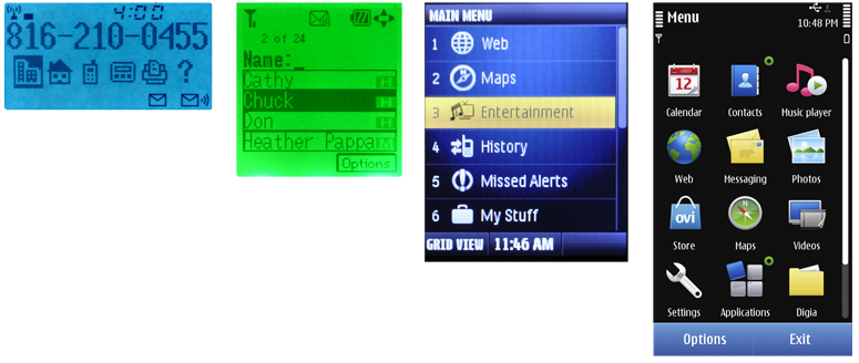
The model: Motorola StarTAC, 2G GSM; 4 x 15 character, monochrome graphic display (see Figure 13-1).
The reason: Cool factor! A flip phone and the smallest cell phone available. I could send and receive calls, SMS, and store up to 100 contacts. And I could show it off ever so smoothly when I clamped it onto my belt. Back then, that was all the functionality I could ever want! It was love at first sight!
The Breakup
Well, I’m sad to say that that phone is no longer with me. I’ve had to keep up with the times and the technology. Since that StarTAC, I’ve gone through an extensive number of mobile phones. I believe the count total now is eight. That number seems reasonable, considering the rate at which people upgrade their mobile phones today—once every 18 months, according to Gizmodo.com. Today, my mobile requirements consist of greater interactive control and highly visible functionality on a powerfully crisp and color display. That original 4 x 15 monochrome graphic display, if used today, would be quite limiting and unsatisfying.
I’m Not "Everyman"
Not everyone needs what I need in a mobile phone. Mobile design is never about you and me. It’s about all the other people who are using a range of multiple devices, with varying needs in limitless contexts.
Here are the things we must consider in terms of screens, lights, and sensors in order to create an enriching user experience while considering everyone:
- Context of use
- Display size
- Display resolution
- Display technology
Context of Use
One of the mobile design principles centered on in this book is that mobile devices must work in all contexts. They must function properly and behave appropriately in a variety of environments. Let’s consider the following contexts that can affect the way we interact with a mobile display.
Outdoors
The outdoors is the most complicated environment to design around. It’s highly unpre- dictable, constantly dynamic, and uncontrollable. External stimuli such as bright sunlight, cloudy days, moonlight, darkness, and street lights aren’t controlled by the user. We can’t just switch on and off the sun or blow the clouds away. All of these stimuli can make it more difficult to view the screen, thereby affecting the way our users interact with the device.
Indoors
The indoor environment may be more predictable, less dynamic, and more controllable than the outdoors, but it is still highly complicated. External stimuli present may include natural light from windows, doors, or skylights, or generated light from bulbs, fluorescent light, incandescent light, LEDs, halogens, and high-pressure sodium lamps.
Both
Mobile users are constantly transient, which changes their environment. They may be using their device outside in daylight to read the news, and then walk inside a public building with dim lighting.
This change affects the amount of time it takes our rod receptors in the back of our retina to respond to light differences. The greater the difference between the two environments, the longer it will take our eyes to appropriately adjust. This affects our ability to quickly detect and identify details in that time—such as text, small images, and even controls.
Imagine this scenario: a user takes his mobile smartphone into a movie theater. The lights inside are very dim. He wakes his phone to check the time. The screen display is excessively bright, causing him to look away. This is not just a screen display technology issue; it’s a UI design problem. Here are two solutions:
- 1) Have the automatic brightness sensor pick up the ambient light around the user and the phone (not the user’s face which is what typically occurs). The sensor recognizes the low level of light and automatically dims the screen to an appropriate level to minimize eye strain and maximize viewability.
But not all users like automatic brightness on, partly as it can rapidly drain the device’s battery.
- 2) Provide immediate access to brightness controls. Rather than have them buried in a system setting, consider using the physical keys (e.g., volume) that can open a menu to control the display settings. These physical controls have eyes-off functionality and the user can interact with them without even looking at the device.
Displays
Mobile device displays can range in size, resolution, and pixel density (ppi). As a mobile designer and developer, it’s helpful to become familiar with these differences so that you can make appropriate decisions throughout the design process. Depending on the re- quirements of the project, you may be designing for one particular device or for multiple devices with varying displays.
Screen Sizes
Display sizes vary with the type of mobile device. They are measured diagonally from the display’s corners. Typically, smartphones have larger screen sizes than feature phones. A common misconception with mobile devices is that the screen size limits the user’s ability to see the screen.
However, people automatically adjust the visual angle between the device and their eyes. Entirely aside from phones being handheld, they get moved to the right distance to see things correctly.
Broadly speaking, video display ends up occupying the same field of view regardless of the device size. If we watch a movie on a 46-inch HDTV, we will distance ourselves enough so that we are able to see the entire TV in our visual field. That visual angle can be similar when we view a movie on a phone. This is why people actually do watch video on phones, and will continue to do so.
Other factors that affect how we automatically adjust our visual angle to see the screen include:
- Vision impairments a person might have
- The size of the display content, such as images, text, buttons, and indicators
- The amount of light the device is giving off (illuminance)
- The amount of light reflected from the light’s surface (luminance)
Screen Resolutions
The screen resolution is determined by the total number of physical pixels on a screen. Note that the actual size of a pixel varies across devices as well as the type of technology being used in the display. So it can be very misleading when people say to design an object with a minimum touch target size of 44 pixels. Across devices with different screen resolutions, this touch target size will not be consistent. Therefore, when designing for appropriate touch target sizes, use unit measures that aren’t variable. For more informa- tion on proper use of touch target size, refer to the section “General Touch Interaction Guidelines” in Appendix D.
Here are common screen resolutions (pixels) across mobile devices, including feature phones, smartphones, and tablets:
Small: 128, 176, 208, 220
Medium: 240, 320
Large: 320, 360, 480+
Tablet: 600, 800, 768, 1,024
Pixel Density
Pixel density (ppi) is based on the screen resolution. It equals the number of pixels within an area, such as a square inch (units do vary, so refer to numbers you find very carefully).
A screen with a lower pixel density has fewer available pixels spread across the screen width and height. A screen with a higher density has more pixels spread across the same area.
When designing for mobile displays it’s important to be aware of the targeted device’s pixel density. Images and components that are designed in a particular height and width in screen pixels appear larger on the lower-density screen and smaller on the higher-density screen. Objects that become too small will affect legibility, readability, and detail detection.
Mobile Display Technologies
Mobile devices use a range of display technology. Some devices may use multiple types of hardware within a single device. Each technology can serve a unique purpose in functionality—backlight, primary display, and flashing indicators.
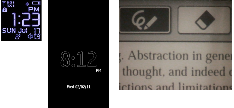
As a designer and developer, it’s important to understand that each of these technologies has limitations in terms of the device’s battery life, the device’s lifespan, creation of glare, or restriction of orientation modes (see Figure 13-2). Therefore, we need to create UIs that can maximize the user experience around these limitations. Here are descriptions of some common types of display technology:
LED
- Light-emitting diodes are a superconductor light source. When the diode is switched on, the electrons move within the device and recombine with electron holes. This causes a release of photons.
- Used in annunciator illumination.
- Benefits include low power consumption, small size, and efficient and fast operation.
- Limitations include the ability to communicate only one piece of information at a time; also, they are single-channel, single-bit devices.
OLED
- Organic light-emitting diodes contain an organic semiconductor film which emits light in response to an electrical current.
- Used in the primary display.
- Benefits include the ability to function without a backlight, thin width, the abil- ity to achieve a high contrast ratio, and when inactive does not produce light or use power.
- Limitations include the fact that it uses a lot of power to display an image (such as black text) with a white background, and may develop screen burns over time.
AMOLED
- Active-matrix OLED is a technology that stacks cathode, organic, and anode layers on top of a thin-film transistor. This allows for line-scanning control of pixels.
- Used in the primary display.
- Benefits include the ability to function without a backlight and the ability to be used for large-screen displays.
- Limitations include known problems with viewability in glare and direct sunlight.
ePaper
- ePaper generally relies on reflected light, not emitted light, by suspending particles in a liquid; a charge causes the dark particles to rise and be visible, or bicolor particles to rotate from light to dark (technologies vary) and display dark areas on a lighter surface, much like ink on paper.
- Used in the primary display.
- Benefits include low power consumption, reduced glare, and high contrast ratio.
- Limitations include slow refresh rates, and the fact that color technologies are just emerging.
OLED and AMOLED displays are lit-pixel displays (without a backlight). White text on black will, unlike a backlit display, use much less power than black text on white. This may be a key design consideration for those devices.
Retro-reflectivity
Retroreflective displays include a reflective layer behind the backlight layer. Ambient light coming into the display is dispersed across the surface and reflected back to provide passive, power-free illumination of the display content. This can be used to save power, to provide some view of the display when the device is in sleep mode, or to boost the performance of the display in bright light; instead of fighting the sun with high-power backlight, it is simply reflected back.
In some displays, this is the primary or only method to illuminate the display, and there is no backlight. In this case, the layer is located immediately behind the backplane.
Transflective layers are similar in concept, but use a transmissive/reflective layer which can be placed in front of the backlight. The key problem with these two technologies is that high-density color screens with touch overlays limit the amount of light passing through. Placing the reflective layer as far forward as possible increases the efficiency.
This works only for pixel masking displays, such as LCDs. Lit-pixel displays, such as OLED, cannot use it as they have no backlight—all pixels are opaque and must provide their own illumination. Although ePaper uses this concept, some technologies also cannot use it directly, and the reflectivity is integral to the “white” component of the display.
Display illumination on devices with reflective layers must take this into account to provide the most suitable illumination, and to extend battery life when not needed. In sleep states, the lock screen must continue to display useful information since it can be read at any time.
Input Overlays
If the display includes a touch or other input function, this is generally attached as a separate layer on top of the display screen. This is a problem in two ways. First, every layer over the display plane adds depth, which increases the parallax.
Second, nothing is truly transparent. Stacking several layers, with different indexes of refraction as well, can significantly reduce the brightness the user is able to perceive. Any touchscreen will be dimmer than the same hardware without a touchscreen.
Touch and other input layers are frequently sold as an integrated package by component manufacturers. Therefore, solutions such as Super AMOLED are available which allow the sensing layer to be thinner and more optically integrated than separately developed components.
Sensors
Another important concept that we will discuss later in this chapter is location-based services used by operators and GPS satellites. These services identify tracking sensors in your mobile device to determine your location with varying degrees of precision and accuracy. Location services can provide an enriching user experience for a multitude of reasons.
They can work tangentially with your device’s OS and existing applications to trigger noti- fications or create appropriate device state changes without compulsory user interaction.
For example, say you are driving to the airport to catch a flight. Your mobile “Itinerary travel application” has you scheduled for a 3:00 p.m. departure at ORD.
As you get within a particular range of the airport, location services identify your current location and proximity to the airport. After you send that information to your Itinerary application, a notification pops up mentioning the latest departure time, and any occurring gate changes.
Patterns for Screens, Lights & Sensors
The patterns in this chapter describe how you can use screens, lights, and sensors to in- crease visual and device performance, provide additional notifications, and incorporate location-based services with native applications. We will discuss the following patterns in this chapter:
- Notice of status should have a visual component that does not require use of the primary display.
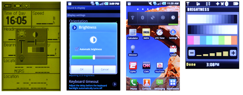
- Displays are the most critical output on smartphones. A method to control the dis- play settings must be easy to access, be easy to use, and allow for manual adjustments. See Figure 13-3.
- Devices must allow for orientation changes to display content in the manner most readable and comfortable to the user.
- Availability of a location-based service, and the actual location of the handset, must be easily and accurately communicated.
Discuss & Add
Please do not change content above this line, as it's a perfect match with the printed book. Everything else you want to add goes down here.
How Stuff Works
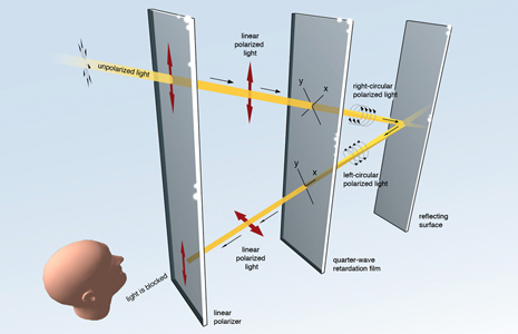
A key reason we had to put the above together is that this stuff isn't talked about much. And when it is, it's really, really obscure and obtuse. But occasionally, someone is super-clear about things. Recently, Nokia explained their ClearBlack displays.<<br>> http://conversations.nokia.com/2012/02/02/clear-black-and-super-bright/<<BR>> I also borred this image from the article, for archival purposes, let's say:

Solar Panels on Displays
This is just neat, and when I bring it up no one has heard of it.
http://www.wysips.com/<<BR>> Plenty of articles, so just google the product names and you can get stuff other than the company website.
Examples
If you want to add examples (and we occasionally do also) add them here.
Make a new section
Just like this. If, for example, you want to argue about the differences between, say, Tidwell's Vertical Stack, and our general concept of the List, then add a section to discuss. If we're successful, we'll get to make a new edition and will take all these discussions into account.


