Problem
You must clearly communicate the availability of location services, and use these location services to make services more personalized and relevant.
Aside from the many dedicated navigation devices, GPS is ubiquitous in many other devices, and other location technologies can extend this capability to almost any connected device. Access to is sometimes restricted for websites, and some application types, but there are workarounds.

Solution
Mobile devices have numerous methods of retrieving location information. These include:
- Cell
- Sector
- Triangulation
- GPS Telemetry
- WAAS
- AGPS
WLANs & PANs
Note that only one method is the use of GPS. You should try to understand at least the basics of each technology, and their capabilities and limitations. Each is detailed in the Appendix, under the Introduction to Location Technologies section.
One more key method of retrieving information is of course, to ask. People often know where they are. If you cannot get any location, or there's a reason they might want to over-ride it (even as simple as that the data is bad) let your users enter a location. If you do this, allow lots of methods. Only accepting ZIP or postal code is not useful for travellers, who do not generally know such details.
It is also important that you understand the difference between precision and accuracy. In brief: precision is the number of decimal places you measure something to; accuracy is how correct it is. The less accurate you think your measurement is, the less precisely you should report it.
Privacy and security concerns are beyond the scope of this book, but must be considered when designing location based services. In many countries, there are legislative or regulatory restrictions on enabling and using location, so notification of background tracking is a legal requirement, not just best practice.
Location is not the same as Orientation or other types of position information. When these must be communicated -- as for augmented reality -- they are generally deeply integral to the visualization and interactive design of the application. No distinct patterns yet exist for these behaviors, but best practices from aviation may serve to guide designs.
Variations
Location service is often used as a background service, as a way to enable smarter ambient computing,. When directly referred to, it may only be momentarily switched to while other tasks occupy the remaining time. Therefore, both explicit and background indicators cases may be present not just in the same system, but at the same time.
Explicit - Location services are currently mostly used for explicit location applications, such as mapping, directions, local information and augmented reality. These explicit representations of location are discussed in detail below.
Background - Location services can also be used as a trigger to initiate notifications, or change behaviors of the device. Geofencing, location-driven advertising and location based profile changes (e.g. silent when in a meeting room) have all been trialled, but are not widely adopted.
Settings, including installation of applications using location services, must also take into account these principles, especially those of privacy and awareness.
Though this pattern discusses such behaviors and features on a mobile device, they may also be used for remote devices in much the same manner. "Child trackers" and similar functions may be used from another mobile device or from desktop computers to track a remote mobile device. In this case, both the viewing terminal and the mobile device must both consider the display and behavior attributes of this pattern.

Interaction Details
You should present indicators of state only in the Annunciator Row so the user cannot interact with it. Make a system setting available to control the use of GPS, WiFi and other controls, as well as to set privacy controls for sharing and how much automatic (vs. manual) control is allowed over these systems.
Provide an easy method for the user to gain access this control, without drilling into multiple sub-menus. Whenever possible, add this control shortcut to any application that uses location services. Another good method, when technically feasible, is to ass the control as an interactive Icon on the Idle Screen. In this way, the user can simply pop back to the home screen and change the setting before using any application.
Whenever possible, applications or services which are best with location should automatically enable the required hardware. OS level restrictions or user settings may interfere with this behavior, and require user intervention each time. If so, an interstitial Pop-Up, despite the intrusive nature, will end up being the best way to request this access.
When the Pop-Up itself is restricted from offering a function to enable the GPS (or other hardware), use it sparingly, as a reminder to the user instead, and provide a link to the appropriate settings panel. When settings are changed, always return the user to the originally-requested application.
Only use the precision required for the task at hand. Weather, for example, rarely requires more than city-level precision. The GPS is not required for basic conditions and forecast information, so if other location services are providing sufficient detail, do not enable the always power-hungry GPS.
On the other hand, always present the most relevant details for each view. If the user chooses to view a local radar map, they should not be required to know their location but should be presented it systematically. This example weather application may have to turn on and off various location services as the application is used, and should not enable all services when it is opened, or get by with only the minimal set and present less than optimal information.
![]()
Presentation Details
When location service is enabled, be sure to display an icon in the Annunciator Row. The location icon (crosshair) has come to mean GPS is enabled, so there may be challenges in communicating other types of location services. GPS specifically can use other types of icons, such as a satellite dish. GPS requires a short time to find position, and can loose position due to interference, clutter or other conditions, and must display the current status. Generally, animating the satellite dish (implying "scanning for service") works well.
Avoid duplicating indicators. If in the Annunciator Row, there is generally no need to also include such indicators within an application. This is another good reason to preserve the Annunciator Row bar, instead of loading applications full-screen.
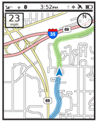
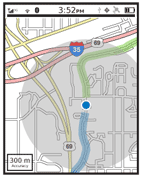
For explicit graphic display of location, such as on a map, use a cursor to denote the current position. Note that this is actually the centroid of the CEP or circular error of probability. A probability threshold is programmatically established; based on the technology used to determine location, the device is almost certainly located within this circle. (Note, it is impossible to absolutely determine location, hence the "probability" prhasing, but this is not terribly important for general discussions).
Display this CEP circle with the cursor at the center, as a visual method of communicating the precision of the location technology. Unless additional precision is needed, but is currently unavailable, the default view should hide the CEP circle from the user. For a weather map, for example, the default zoom level should be large enough that a 100 m CEP is smaller than the cursor, so disappears under it. Good selection of map zoom levels itself can help communicate the degree of precision available.

When the display is zoomed such that the CEP circle is at least 10 times the size of the cursor, or the edge is partly or entirely outside the viewport, print an explicit display of precision adjacent to the cursor.
An even greater pitfall in the display of precision information is with printed location, especially in coordinate systems. Whenever possible, use standard, well-understood nomenclature. Avoid printing the location when not useful; lat/long is difficult to interpret and very few general users will understand it.
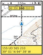
Account for precision in the display of coordinates and other printed locations. For this example, the MGRS coordinate system will be employed as it is based on simple measurements (meters from a regional baseline). This is unlikely to be employed in general consumer applications, but is convenient as an example. A complete location to 1 meter precision is listed as:
15S UD 12345 67890
(The ten numbers at the end show the position in meters vertically from the equator, and horizontally from a point too complex to explain here)
However, most location technologies, in most instances, cannot give such precision. To correct for this, remove digits until only the correct level of precision is shown. For example, if using cell sector, with precision in the 100 m range, only display:
15S UD 123 678
The last digit will always be of less precision than the others, and even when displayed digitally can be used like that on a dial or scale. Simply restrict the display to only the 5 or 0 digits.
Precision should be explicitly displayed when coordinates are printed. Use the existing settings for units of measure, but scale them appropriately. In the following examples, the user has set their navigation tool to use miles.
"Accuracy 19 ft" - Correct. Appropriate scale (vs. yards or miles) for the size, and in the same system.
"Accuracy 6 m" - Incorrect. In the wrong system of measure.
"Accuracy 0.004 mi" - Incorrect. Too large a measure, so many decimals, and not easily understood.
Note that the term "precision" is not well understood, so is often replaced with "accuracy" in general communications, as in the examples above, although it is not strictly true.
Addresses, likewise, should only be displayed when that level of precision is available. Otherwise use existing best practices for general location:
- 5600 Russell Ave, Mission, Kansas 66202
56th Street & Russell Ave, Mission, Kansas 66202 - Street or Intersection
West Crossland, Mission, Kansas 66202 - Neighborhood
Mission, Kansas 66202 - City
10 miles west of downtown Kansas City, MO - Relative Location
Near Kansas City, MO - Area
Only display the larger scale information such as state and country when needed. When moving between two areas only a few miles apart, the default location display should probably just be the street address portion. The same filtering logic should be used for coordinate systems, when applicable. While Lat/Long is a global system, UTM and MGRS are divided into regions; the "15S UD" portion in the example above can be made much less prominent, as most precision navigation is not also global navigation, so it will not be used as much as the remainder of the displayed coordinates.
Only display the device's direction of travel when available, and just like the location, only display it to the degree known. Generally, the cursor can simply become a pointer. For free standing displays, when users will get value from it, display the current bearing in degrees, and by named directions (north-east) but degrade to cardinal directions as the system's understanding becomes more poor.
Cardinal directions (e.g. "North") can imply precision if simply printed on the screen; use graphic displays (either dials or circular Tapes) to communicate the degree of precision available, make small changes in bearing angle visible to the user and make the display more glanceable.
When direction of travel cannot be determined (there is no compass and the device is not moving), display no direction of travel indicator, or an icon indicating it is unknown. The cursor may change to a circle, or otherwise become blunted to reduce or remove the implication that direction is known. Do not display the last direction, as this is likely to be spurious data arising from loss of signal, or coming to a stop.
When direction of travel is available, orient the map so direction of travel is forward, or up. If there is a specific reason not to do this by default, provide a function so the user can switch to this mode.
Antipatterns
Never equate "location" with "GPS," especially to the degree that a location aware service or application may only launch when the GPS is enabled.
Never display or imply precision that is not available. Avoid the use of crosshairs and other implied attributes, even if a CEP circle is displayed as well.
Next: Input and Output Wrapup
Discuss & Add
Please do not change content above this line, as it's a perfect match with the printed book. Everything else you want to add goes down here.
Examples
If you want to add examples (and we occasionally do also) add them here.
Make a new section
Just like this. If, for example, you want to argue about the differences between, say, Tidwell's Vertical Stack, and our general concept of the List, then add a section to discuss. If we're successful, we'll get to make a new edition and will take all these discussions into account.
