Problem
You often will not be able to fit all functions for a page on the screen. A method must be provided to access these optional functions.
The general style of the menu structure should often be dictated by the OS, if only because users will become familiar with the style of interaction. However, there is generally much leeway in implementation, if variation from this is desired or called for.

Solution
When the user selects a key, a small on-screen element, or performs a gesture, an option menu is displayed with content relevant to the current state of the application.
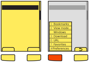
Softkeys (hardware buttons tied to on-screen labels, typically on featurephones) are the archetypical version of this. Single actions that take place from a softkey (such as "Cancel") are not a Revealable Menu since they are visible, and might be considered a Fixed Menu. There are many cases where the two menu access systems overlap, or switch back and forth depending on context.
Note that some devices use more than one menu scheme, for different purposes. For example, one may present options for the current application, and another may provide access to the running-applications list for the entire device.
Do not confuse display of this menu with the display of a Notifications list, and be sure the two do not conflict with each other.
Variations
Several variations of this pattern exist:

- The Softkey style uses one or more hardware buttons (or a portion of the touch/pen area outside the display) to reveal an option menu. They may or may not display a tab and label indicating the presence of this menu when closed.
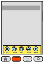
- Softkey-like on-screen displays always display a tab or button, usually along the bottom edge of the viewport. The closed state is always visible as this is the method used to access the function
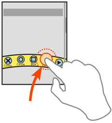
- Gestural menus generally have no on-screen visibility. When the user swipes from an edge, the menu acts as if it accompanies them. This is generally non-persistent, and when the pen or finger leaves the screen, the menu collapses. Selections must be made in the same pen/finger-down gesture as the original reveal. Releasing while an action is in focus selects that action.
A fourth variation combines gestural menu reveal methods with the on-screen button. When activated, the menu appears via another action such as sliding in from one side, or being revealed to be behind another component (such as by hiding an otherwise-present virtual keyboard). Other methods such as the Peel Away can also be used, but may be difficult to communicate to the user.
Items within the menu often reveal submenus, or lists of additional features. These may either follow the same principles as the top level of menu, and appear as an attached subset, or may appear as a free-standing menu, usually as a Select List or Grid of items in a Pop-Up dialogue.
Interaction Details
Treat opened menus as modal dialogues. For touch and pen devices, selection outside the menu area may, if desired, clear the menu instead of being ignored. This is especially true if the menu when open does not obscure the background. However, you should not allow selection of items in the parent window while the option menu remains open.
 All opened menus must have a method to be exited. The typical methods are:
- Using the dedicated hardware "back" key. When present, this is the preferred method, as the user will be accustomed to using it for similar functions.
- A spare Softkey or on-screen tab (even if normally another key, or even another selectable menu) will change to "Cancel." This key must be included in the items available for selection, and is not locked out due to the modality of the option menu itself.
- A close function may be added to the menu, either as a selectable menu option (usually the last one) or as a desktop-like close button in the corner. Both have certain pitfalls. The menu item must be clearly different, using a common icon. A dedicated close button must be carefully placed to avoid accidental activation of it, or adjacent items.
- The function that launched the menu may be used as a toggle. When it is available, and not obscured by the opened menu, selection when the menu is open will close the menu.
- Lastly, for touch or pen devices, you may make it so selection outside the menu may dismiss the menu.
For devices with 5-way pads, opened menus should be able to be scrolled through. Regardless of the input mechanism, selection of a single item will close the menu and initiate the action, which may change states, cause a different modal dialogue to appear, load an entirely new page or even exit the application. For vertical menus, see the Vertical List pattern for additional details on interaction and presentation.
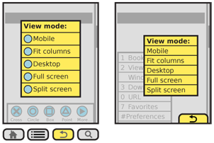
If the selected item itself has options, a subsidiary menu will be opened. For vertically-scrolling menus, this is usually presented as a visible child, adjacent to the primary menu, and is itself a modal dialogue; the previous menu cannot be directly selected. For scroll-and-select devices, sub-menus can also be entered by scrolling right. For horizontally-arranged icon menus, typically there is only one "More..." type of option which opens a Pop-Up dialogue with a Vertical List, usually a Thumbnail List where the thumbnails are also icons.
To exit a sub-menu, scroll left or press the "back" button or "Cancel" tab, whichever is available. This key will only close the submenu, returning focus to the parent selection item, and not the entire option menu.
For any hardware menu keys or Softkeys, pressing and holding the key can perform a different action. This action is usually a different kind of reveal menu, and may be associated with a Softkey which normally does not open a Revealable Menu, and should have a relationship to the original key label to aid in discovery and recall. For example, within a browser, a softkey labeled "Back" could open a history menu when held down a few seconds.

Presentation Details
In almost all cases, you should make the closed menu initiators or indicators, such as Softkey tabs, locked to the viewport. Do not allow them to scroll off the page. Visible tabs should always be visible, but may be hidden temporarily for media playback or otherwise to give more room to the primary content.
If your design has no on-screen menu visibility, and no dedicated button is provided, consider adding a visible component at page load, or during a training period when the device is first accessed, to train the user that the feature exists.
Options menus, however they are initiated, must immediately appear. If animation is used to open the menu (e.g. it slides in) the beginning of the animation must start immediately. Since the menu may be partly obscured by the user, especially for touch and pen devices, Haptic Output (vibration feedback) of the action should also be considered. The menu should appear to emerge from the tab or button, over-writing the area.
Within the opened menu, displayed items as text, and use supporting iconic elements only when there is room. See the Indicator pattern for more details on using icons along with text in lists.. Most Softkey-like menus are vertical and designed for text density, so do not work well displaying an Icon for each item, but this is very suitable for other menu types.
Options that cannot be used should be "grayed out" to make them appear inaccessible. Leaving them in the list is helpful as it teaches the user what sort of actions are available in the list, and preserves the position for additional consistency.
Display Accesskey (keyboard shortcut) indicators for each item with an associated Accesskey. Do not display these for devices that do not have hardware keyboards or keypads.
You should place indicators of some sort next to items which can reveal additional menu items. Sub-menus may occlude the main menu if space is limited, or may hang off to the side. They should usually obscure the main menu in some manner to make the focus item more clear. Sub-menus should contain a Title, or the selected parent element must be highlighted and point to the sub-menu to serve as a label for the menu.
Antipatterns
Modal design, such as the entire principle of a Revealable Menu can be difficult to communicate, especially if OS standard implementations are not used, or the user is not accustomed to the platform. Carefully consider the whole concept, how to assure the menu can be launched, and how many controls can be modeless instead.
Within the menu, only allow access to options that can be used. If all options are selectable, then error messages will be displayed which could otherwise be avoided.
Softkey orientation, or which side gets which key, should follow the standards of the OS or the operator. These are usually not set at the device level, but are univeral for all devices using the OS, or all devices the operator overlays. Most application frameworks allow specifying something like "primary" and "secondary" as softkey identifiers; use these instead of left and right, to assure your application complies with the standards of the device on which it resides.
Avoid too many levels of menu. Generally, due to size of screen and complexity, only one sub-menu level should be provided.
Next: Fixed Menu
Discuss & Add
Hamburger Menu
I hate this term, and rarely use the three-line icon anyway for various reasons, but it's a name. I think it's time to start talking about this as a pattern as it's getting pretty heavily used, and we're getting data on it. A couple notes and questions:
- Is it a pattern, or just a variation of this?
- We know it works equally well when on the left or right side. Really! You thought it was a left-aligned thing, but there is research (not general, but for specific products) indicating it works just as well on the right.
- I don't have research on this, but have done some products with TWO of them. One left, one right. That'll be neat to see how that works.
- It better be a small, icon-centric button. Big default OS submit-looking buttons don't work. Again, some research to back this.
- Menus are more complex than we've previously understood. Many successful ones have not just a single list, but groups of information, or mix functions with navigation. There are only a few patterns of this emerging, so that's a good sign for writing it up.
- A few are getting into mini-megamenus. Mini, because they are on small screens, but they have a lot of stuff in them. Is this a thing yet?
- Is there, for the love of god, a better name?
Examples
If you want to add examples (and we occasionally do also) add them here.
Make a new section
Just like this. If, for example, you want to argue about the differences between, say, Tidwell's Vertical Stack, and our general concept of the List, then add a section to discuss. If we're successful, we'll get to make a new edition and will take all these discussions into account.