Problem
You must present a large set of information. The information is hierarchically ordered, and this structure is relevant to the user.
Arrangement of information is a purely design task, and except for some interactive methods which may be difficult to accomplish on non-scripting browsers, this may be used anywhere.
Solution
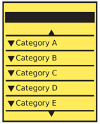 A Hierarchical List can display hierarchically-ordered information in a comprehensible and quickly-accessed manner. The parent/child relationships are exposed visually, and users may fold and unfold the list to view only the relevant parts needed.
Displays of this type can be supported by even very simple interactions, with vertical scrolling only, and in surprisingly narrow spaces.
The depth of the list (the number of tiers included) is arbitrary, but depends greatly on the size of the display area, and the complexity the user is willing to endure. Typically, more than three tiers is quite complex, and may be worth considering redesigning just from an architectural point of view.
The user's exploration of this hierarchy, by opening and closing items, is critical to their understanding of the relationships. Do not reveal too much for them, and allow exploration. When expanding and collapsing items is not available for technical reasons, consider other methods to display the information.
Variations
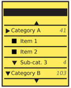 You may load a Hierarchical List either closed or open when first displayed to the user.
Closed lists only display the top tier, as a simple vertical list. Selection must be made of a parent item to reveal any children within.
Open lists reveal a portion of the list when first loaded. This may be the expected location, the current location within a system, the last location used, or other relevant sections. Do not reveal arbitrary sections just to communicate that the list opens.
A key variation is in the methods of revealing (or hiding) child list items. This will have serious impacts on design and the information architecture (and sometimes even the organization of the data repository). These options are discussed in detail in the following sections.
Interaction Details
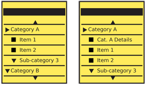 Hierarchical Lists are types of lists, and usually are variants of the Vertical List. They may encompass most any other subvariant, and include features from the Select List, Thumbnail List and so on, as needed.
You should consider ordering the list so any item which is a parent to others is displayed "twice." An example might help make this clearer:
Trees
All Trees
- Deciduous
- Coniferous
- Shrubs
- Grasses
Here, the bold items are currently-selected items. By selecting "Trees" I have opened the subsidiary categories so they may be selected as well. However, there is sometimes confusion over which tier is selected when the level below is opened. This solves that by giving a landing page, or default selection of "All Trees."
Indicating a parent category like this is not always required or possible, depending on the data set, and the second listing of the parent element is not needed. For example, if selecting a U.S. state, and the list is by regions, there is no value in selecting a region alone. The region parents may, on selection, only open or close to reveal the child states.
An interaction commonly used when not including parent items at subsidiary levels is to use dedicated reveal functions and allow the user to fold and unfold the list items directly. This decouples the opening and selection, but can induce other issues with comprehension. Consider the data set and users carefully.
In this case, selection of a parent again will collapse or hide the child listing of that parent.
For lists where the "reveal" action is separate from the list item itself, selection of the item title will typically select or load more information (depending on the user task). Selection of the reveal item will immediately display the children of that item.
Selection of the "hide" action (the reveal becomes a hide when open) will collapse or hide the indicated child listing.
Presentation Details
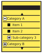
Make sure you have a good understanding of the hierarchical relationship of all items before beginning design. Use position as the primary indicator of the hierarchical relationship between items. Top tier items will be left-aligned, the second tier indented slightly, and so on.
Indicators should be present to make clear that the list may be opened. Arrows or plus symbols are most common. In many cases, the indicator will reside in the left column, and indenting will correspond to the width of the indicator. Text indicators like "more..." can be useful in small quantities, but take up much more room than graphics for small screens, and for larger quantities the repetitiveness can make them difficult to scan.
Indicators of position and action in the Hierarchical List are basically just a repeated, very well ordered version of the Indicator pattern. See that for guidelines of position, shape and interaction details.
A count of items within a parent category can be very useful to both indicate there are additional items, and -- for some data sets -- to help the user decide which categories to explore. These line level counters are not quite the same as Pagination or Location Within widgets, and are more like yet another Indicator of the "content beyond" type.
When a set of child pages is revealed, the indicator should change state to indicate it can be used to close or hide the list.
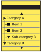 Additional indicators of hierarchy may be useful, such as type weight (bold for parents, especially when not selectable), color and size. An optional but well-used method is to provide guidelines among and between list items at different tiers.
Antipatterns
Use caution with excessively complex interaction methods. Simple devices which require option menu selection, or difficult to discover interactions such as unique gestures, may impede use of the list.
Likewise, avoid trying to express overly-complex lists hierarchies of information with simple lists like this. Generally, after more than about three tiers of information, the relationships between the levels of information become too complex to be immediately understood.
Avoid opening too much of the list on entry. On smaller screens, especially, it may be unclear how the list is ordered, or the parent/child relationships may be unclear at first glance.
Consider the task at hand, and the user's need to understand the system. Many data repositories are hierarchical, but the architecture may be unimportant to the user. Do not reveal internal process, organization or jargon unless needed by the end user.
Do not force an informational hierarchy upon a data set just to use this display method. The user will adopt a mental model of the system or information that is incorrect, or will never understand the information at any level.
Avoid using too many interaction methods alongside the Hierarchical List. For example, a Fisheye List may seem a way to provide some extra information, before opening, but will likely add confusion. Items, like this that act in another axis, are especially prone to adding confusion.
Next: Returned Results
Discuss & Add
Please do not change content above this like, as it's a perfect match with the printed book. Everything else you want to add goes down here.
Examples
If you want to add examples (and we occasionally do also) add them here.
Make a new section
Just like this. If, for example, you want to argue about the differences between, say, Tidwell's Vertical Stack, and our general concept of the List, then add a section to discuss. If we're successful, we'll get to make a new edition and will take all these discussions into account.