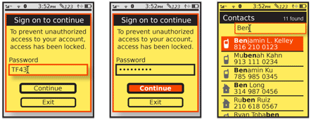
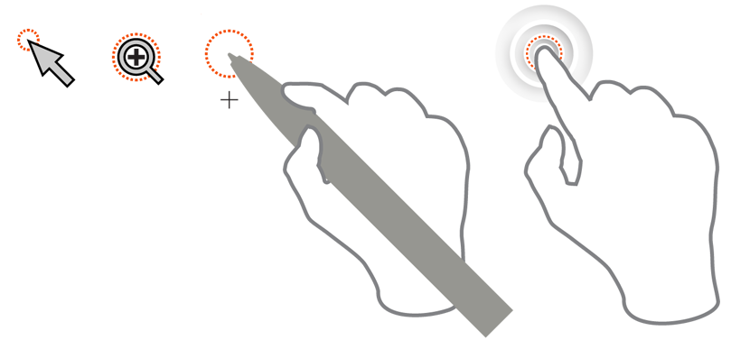
Problem
You must always clearly communicate the position of current and future input behaviors to the user. Within the screen, inputs may often occur at any number of locations, and especially for text entry the current insertion point must be clearly communicated at all times.
Focus & Cursors are built in to every OS, but there are many opportunities to use them inappropriately. Be sure to use the correct methods, and to actually design easily-perceived indicator states in your application or website
Solution
Generally, you must allow the user to only immediately interact with one element of the screen at a time. Areas and items for which immediate interaction is possible are considered "in focus." When an exact point is in use within this area, this is indicated by a cursor.
Expressions of focus and cursors serve to indicate the area and exact position so the user is aware their Directional Entry took effect correctly, and so they may take appropriate actions based on the item to be effected.
You can use a similar indicator is used to indicate certain types of connection. This can be seen with charge indicator LEDs which are adjacent to the port, and should be more common with near-field communications such as mobile payment schemes. A light, icon change or other effect either on screen or not, occurs at or adjacent to the point of communication to indicate successful linking. This overlaps heavily with the LED pattern; more clarity should emerge as these are implemented more.

Variations
The most basic type of focus indicator or cursor simply indicates position. The specificity with which this is communicated can vary widely. Focus is general, and area or item-level, while a cursor indicates down to the pixel level.
Cursors always indicate position, but may also indicate the current state, as described in the Input Method Indicator pattern.
Though these two indicators are similar, they are perceived as different by users, so may be inconsistently employed, with position-only focus indication and state-indicating cursors.
Pointing cursors indicate position in two dimensions. Text entry cursors are almost a mix of focus and pointing; precision on the vertical axis is only to the line level, whereas in the horizontal it is to the pixel.
While scrolling input devices of all sorts are "relative," and all input starts from the coordinates of the last input, most of the purely touch and pen devices are different. They are instead "absolute" pointing devices. When the finger or pen is not in contact, there is no focus point or area. Any point may be selected and then immediately becomes the cursor point, and the area it is in is within focus. There are certain exceptions, such as modal dialogues, which may restrict this "arbitrary" selection to specific areas.
Interaction Details
Focus indicators and cursors are purely display elements. They react to changes made as a result of general interaction, but are not themselves interactive element.
Devices that have both touch screens and other Directional Entry methods such as a 5-way pad, will need to support focus and cursor pointing at all times. Even if not displayed, the system must have an internally-declared location for the focus and cursor at all times.
One exception to the relative pointing discussed above is that you will usually impose a cursor position on the interface when a page change is implemented. This is unlike a desktop system, where the mouse pointer generally does not move about the page without user input.
The focus model, on the other hand, is very similar to the desktop application or website. New applications or pages automatically seize focus, and you may control this to the point of placing focus within a specific scrolling area, or text field, allowing entry without any use of a Directional Entry device.
For a related discussion of state changes based on position cursors, and interactivity with these changes, see the Press & Hold pattern.

Presentation Details
Focus indicators and cursors must always be contextual, and reside not just within the interface but work with the existing design.
You should almost always represent focus by changing either the background or the border of the element. For the background, use a color or saturation change, with the item in focus getting the highest contrast state. Sometimes, additional effects are useful, and only the item in focus has gradients to make it appear dimensional or shinier. Borders may change color, saturation or weight. Both borders and backgrounds may be changed together, of course.
You can use additional effects, such as shadows, but be careful not to make the focus element float off the page, or it may look like a modal dialogue instead. Any number of other variations may also be used, but should always be in conjunction with borders or backgrounds.
Don't forget to take advantage of other elements or widgets. State indicators may also be used to emphasize the element is in-focus. If the Input Mode Indicator is attached only to the side of the field in focus (and no other fields), this can help clarify the focus, and attract attention to the field or area. Understanding how the page will actually be presented may save you from having to too work hard to express focus.
State indicators, aside from indicating focus, are often attached to focus areas or cursors to provide additional, highly contextual information about the current state.
Cursors must be able to indicate to pixel-level precision. The position pointed at is usually the pixel immediately under or adjacent to the tip of the pointer; avoid obscuring user inputs with the cursor. Text entry cursors are derived directly from typewriters (and Linotype machines, and so forth); the next character entered will begin to be entered at the current cursor location, and extend to the right. The cursor will then move to the right side of the character just entered.
Make sure cursors are visible, regardless of the background. Use shadows and/or contrasting borders to assure this. Cursors are typically white, with a black hairline border. Some text cursors for controlled areas such as form fields can be solid hairlines, as long as you make sure the field background is a solid, contrasting color. Use the "I-beam" shape to make the cursor easier to pick out from the surroundings, with the crossbars above any ascenders and below any descenders. Text cursors must never fall outside the bounds of the text entry fields.
Scroll and select devices, with only a 5-way pad and no other pointing device, often have no cursor pointer. These rely on line-by-line or other item level focus. Naturally, the cursor exists during text entry as a subset of the field in focus.

Text cursors are at the insertion point for character entry, and highlight the affected area much like a focus area, when in predictive text modes. State changes should be depicted to indicate when a Mode Switch such as caps lock has been activated. These indicators may be vague, and require learning such as adding to or modifying the shape of the cursor, or may be specific and indicate the Mode Switch symbolically.
Arbitrary modifications to the cursor may be sufficient to indicate a state change when an Input Mode Indicator is displayed elsewhere, but otherwise you should try to make it understandable by itself, or at least have a related visual language. This minor change, especially if some user-deciphering is required, may seem to not be worth the effort, especially when another indicator may already exist. However, users are often very focused on the cursor and areas immediately around it, so are very likely to see changes in this, which they may otherwise become aware of immediately.
Position cursors should always be used for pen input devices. Due to the precision of the pointer, small parallax changes may induce errors, and presenting a cursor will help avoid this.
Position cursors are rarely used persistently for touch, but may sometimes appear to indicate single contacts have occurred. This can be especially helpful to assure the device has accepted the input, such as in sleep states, or where the device may otherwise not respond immediately, but a Wait Indicator would be unsuitable or intrusive.
Devices that have both touch screens and other Directional Entry methods such as a 5-way pad, may choose to not show the cursor when in touch or pen mode. However, as soon as a directional key is used, the focus area and cursor (if applicable) must appear. This should generally not require a keypress to "activate" the mode; the first keypress will move the focus or cursor in the direction selected.
Antipatterns
Avoid expressing focus only by pointing to the area or field, such as with an arrow in the left column. While such indicators may help guide step-by-step processes, they are insufficiently contextual to be the only method of indicating focus.
Avoid under-indicating. Focus and cursors work hand in hand. Make the focus area clear, to draw the user's eye to the cursor or text insertion point, even for touch or pen devices which may seem to not need traditional focus indication.
Do not follow desktop cursor examples strictly. For example, avoid the use of the "hourglass" pointer mode, and use the more mobile-appropriate Wait Indicator instead.
Next: Other Hardware Keys
Discuss & Add
Please do not change content above this line, as it's a perfect match with the printed book. Everything else you want to add goes down here.
Examples
If you want to add examples (and we occasionally do also) add them here.
Make a new section
Just like this. If, for example, you want to argue about the differences between, say, Tidwell's Vertical Stack, and our general concept of the List, then add a section to discuss. If we're successful, we'll get to make a new edition and will take all these discussions into account.
