Problem
You are displaying an element that must be able to easily reveal a small or medium amount of additional information, without leaving the current context or page.
While Windowshade is built in to many application frameworks, it will require scripting in web browsers, so will not work in some older or low end devices.
These are all too often called "expand/collapse" or other clunky terms, but "accordion" is becoming a relatively common term, so you may know it as that also.
Solution
 Items are provided with an indicator that more information is available, generally by defining upper and lower bounds, or enclosing in a box. When selected, this area expands vertically to display additional information or interactive elements, including additional links and input or form areas.
The term "windowshade" implies that there is a small container that expands downward. Like a roll-up window shade in a house. There are other terms used to describe these, but this one is unique and the least ambiguous.
Do not confuse this with the Fisheye List. Windowshade requires an explicit action from the user to open. It may be used as an alternative to the Fisheye List for devices without a hover state, such as those where touch/pen is the primary or only interface.
Variations
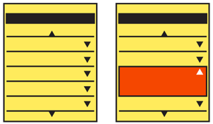
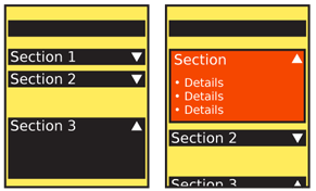
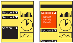
 The basic interaction is very simple, and limited. The available variation is in the selection of the bounding area and indicators of the action itself. Three basic types exist:
The title of a section may be used as the only visible item. When expanded, this becomes a Title bar forming the top of the expanded area.
- For pages or other areas that are relatively strictly vertically oriented, top and bottom bounds can be defined around an area. Any number of summary items may be in this area, and when selected the bottom bound slides down to reveal even more information.
- Similarly, for design purposes or because the whole width is not occupied by the content, the summary information is in a complete box of some sort. When expanded, the bottom of the box slides open downward. When open, the box is still complete, and contains the entire expanded content.
You must explicitly and deliberately select a model during design of either one-open (all others close when one windowshade is selected and opened) or all-open (the user can open or close as many as they want). There is no absolute answer; it depends on the type of information, and how the user interacts with it. Lists, for example, should usually be one-open, but the visually-similar faceted search options list should be all-open.
Horizontally-expanding items are plausible, but should only be used when the overall design of the element -- or preferably of the entire OS -- is arranged along this axis. Some desktop websites use vertical labels along the sides, and when selected they open to reveal the content of that section. A mobile interface could operate in the same manner.

Interaction Details
Interacting with a Windowshade should be very simple. Selecting the closed area using whichever method is available and preferred by the user will expand it.
If you have placed several elements in the closed state, the expansion function must be a clearly-defined single Icon, Link, or Button. Selection of other items in the closed state will therefore still be allowed, such as going straight to a new page from another link in the closed state. Use this carefully, and leave plenty of room around the controls to avoid accidental activation.
You should always make a control available to close the expanded area. This should almost always be the same control as the open control. It may be an explicit control, or when a bounded area such as the Title bar the closed content are at the top of the expanded area.
No automatic scrolling should take place during opening. The area will expand downward, even if it goes out of the viewport. An exception should be made if almost none of the expanded area is visible. To make it clear the action has occurred, the page may scroll up enough to reveal that additional information has been made available.
Presentation Details
The expanded area should never be larger than the viewport.
Except as described above, do not scroll or move the title or other elements visible in the closed state when the area expands. This acts as an anchor for the user to understand what has happened to the display. For this reason, most Windowshade areas use a title alone for the closed state label.
An indicator should be adjacent to the title or integrated into the closed state label. Down arrows and "Expand" text are typical. These indicators (whether graphic or text) will change to indicate the state. When open, you should change the state, to an up arrow or "Hide" text, for example.
Design any bounded areas, whether lines or boxes, to be clearly perceived as boundaries, and not just background design elements. They must function this way both when expanded and collapsed.
Antipatterns
 Avoid use of this pattern without sufficient bounding of the labeled area. Do not simply expand titles, links, images or other general areas.
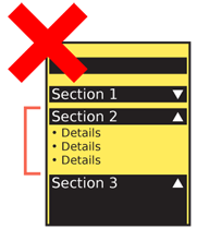
Don't break bounds when opening an area. If a box expands, make sure there are sides for the entire vertical space, not just the closed state, then gaps, then a bottom.
Use iconography or other indicators to make it clear the item will expand in place. Generic link or ""more info"" indicators may cause confusion as to the expected action, and will either reduce the rate of clicking items, or users will not immediately understand they are on the same page.
When possible, use animation of any sort to indicate the opening action. Even if this is a stand-in, and displays only an empty box during the opening (then fills with content when open), this is better than the entire box simply appearing. Users may otherwise believe they are viewing a different page, or a *Pop-Up*.
Try to avoid areas that expand to be larger than the viewport. If larger expanded areas are used, this may cause confusion regarding what section of the page is revealed, especially if the windowshaded items are routinely opened and closed.
Next: Pop-Up
Discuss & Add
Please do not change content above this line, as it's a perfect match with the printed book. Everything else you want to add goes down here.
Bounded Areas?
Above I refer to always bounding the area when expanding. On handset sized devices it has been proposed that the device itself (well, the edge of the viewport) can act as the boundary. Boxes that extend full width can be a little information-dense, and may not even be visible (well, readable). I am hoping to get a user test to study this soon and will post the findings.
Examples
If you want to add examples (and we occasionally do also) add them here.
Make a new section
Just like this. If, for example, you want to argue about the differences between, say, Tidwell's Vertical Stack, and our general concept of the List, then add a section to discuss. If we're successful, we'll get to make a new edition and will take all these discussions into account.
