Problem
In certain contexts, you must provide an alternative function centered around the cursor or focus area. A simple, universal method of applying this mode switch should be provided.
Press-and-hold is built in to many OSs as a standard method for some interactions. It can generally be detected, even by web pages, so can be built into almost any interaction if desired.

Solution
No matter how cool, gestural and interactive your new mobile application is, most of the interactions are still relatively simple, and are about pointing and selection. In some situations, you will find an alternative selection method to be useful. In many cases, a mode switch on the keypad or in an on-screen menu is unsuitable due to space or in order to preserve the contextual function of the pointing and selection behavior.
In the desktop computing world you might be familiar with the "right click" on the mouse, by the use of buttons on the pen, or by using keyboard Mode Switches to change the pointer effects.
In mobile, none of these are really very suitable. There is insufficient space on the input area for alternative inputs, and touch devices cannot provide a secondary button on user's fingers. Meta keys work poorly in all platforms, due to the need to educate users, but are particularly unsuitable on mobiles for ergonomic reasons; it's easy to drop the phone while messing with keys at the same time as tapping the screen.
If conventional click actions take effect on "mouse up" (on release of the button or removing the finger from the screen) then Press & Hold of the selection mechanism can be used to initiate an alternative interaction. Within this pattern the web conventions of "mouse up" and "mouse down" will be used to refer to these conditions regardless of the pointing device.
Variations
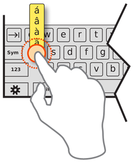
By far the most common use of Press-and-Hold behaviors is to present a contextual menu of options, or other contextually-relevant optional selections. For example, pressing and holding a the keys for virtual Keyboards & Keypads offers a list of special characters such as accented versions that cannot be easily accessed via Mode Switches.
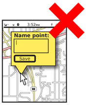
The same behavior may be used for other functions such as a temporary zoom to aid in selection of a text insertion point, or placing a pinpoint on a map. These behaviors are generally either immediate actions (although a confirmation or undo may be provided) or they only function while the mouse is down. These behaviors are not entirely settled so the remainder of this pattern will discuss only the functionality and appearance of the contextual selection variation.

Interaction Details
Press & Hold works equally well with any selection hardware. Buttons, pens and fingers all may press and hold equally well.
The length of time needed to hold before the action occurs should be about 1/2 second. This can be varied greatly based on testing user behaviors with the interface. The menu or other function must appear immediately after this timing is reached, and with absolute consistency in all locations.
For direct entry methods especially, you have to allow for a certain amount of jitter (or inadvertent movement by the user), instead of detecting the mouse-down time as all in-motion. This should be around 10-20% of the minimum target size for touch devices.
Your menu may work in one of two modes:
- The mouse is kept down while scrolling to the item to be selected. Selection is made by mouse up when the desired selection is in focus, at which point the action occurs and the menu is dismissed. Releasing the mouse without moving after the menu appears, or by mouse up outside the menu area entirely will dismiss the menu without selection.
- Once the menu appears, the mouse is released and the menu remains in place as a semi-modal dialogue. The user performs conventional scroll or point and selection activities. Once a selection is made, it is committed and the dialogue is dismissed. If no selection is to be made, the user may select any area outside the menu; this first selection will not activate any items, and just dismissed the dialogue. The use of a close function is acceptable, but not suggested due to space concerns, and the additional risk of accidental activation, on most devices.
For semi-modal dialogues, actions outside the menu will dismiss the dialogue, but not perform any other action, either from within the menu or on the parent screen.
The decision as to which to use should be based on the manner in which the remainder of the OS functions generally. Avoid mixing the two methods within a single interface.
Menus should follow the patterns already established, and will usually appear similar to any other second tier menu, as described in Fixed Menu or Revealable Menu. They may follow the principles of the Annotation instead, and offer selectable buttons or icons, instead of a Vertical List.

Presentation Details
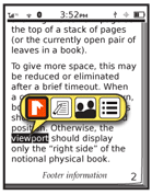
Before the hold time has been reached, and the alternative action occurs, show indicator that Press & Hold is about to take place. The timing when this appears is variable, but about halfway through the time is a reasonable starting point. The indication must be visible past any on-screen indicators. If a touch screen, it must be larger than the finger, or presented adjacent to it.
This indicator should indicate progress to count down to the activation time. A common symbol is to animate the drawing of a circle around the current in-focus item or the centroid of the contact area. This is timed so the context menu appears as the circle is completed. Even though this countdown timer appears halfway through the true time, consider the moment it appears as the start of the clock.
Make the timing indicator disappear as soon as the context menu appears.
Menus resulting from Press & Hold behaviors must appear adjacent to the in focus item or the contact point. Ideally, the menu will emerging directly from the option selected, such as an Annotation. If there is no distinct item on selection, you should usually also create an object from which it may emerge.
The menu must visually be clearly separate from the rest of the interface, so it cannot be confused with any objects in the parent, no matter how complex or interactive they appear. Use border and shadow effects to indicate the menu is associated with the pointing device, and not just the screen. Typically, these will appear to be floating above the interface.
Antipatterns
Avoid overly complex dialogues offered via Press & Hold behaviors. Stick with individual selectable items, and about complex selectors, text entry and submit buttons. If such dialogues are needed, present them via a Revealable Menu, Fixed Menu, or link within an Annotation.
Do not absolutely rely on use of a Press & Hold behavior. As it has no affordance, the function may not be discovered or remembered by users. Attempt to instruct the users in some manner as to this functionality, or provide other paths to presenting this same information. Those methods may go ahead and use the same display method (of a layered menu) in order to try to instruct the user that there is contextually-relevant functionality they are missing.
In addition, assure this function works in all included input methods. If a touch device also has hardware Directional Entry keys, make sure the function works as well for both input methods.
Use these behaviors consistently, and as pervasively through the device UI as possible. Once learned, if it fails irregularly, this will violate the user's mental model and may lead to general disuse of the feature.
Next: Focus & Cursors
Discuss & Add
Please do not change content above this lnke, as it's a perfect match with the printed book. Everything else you want to add goes down here.
How About Some Anti-Patterns
This article on <a href="http://lifehacker.com/5879239/all-the-awesome-things-you-can-do-with-a-long-press-on-your-iphone-ipad-or-ipad-touch">All the Awesome Things You Can Do with a Long Press on Your iPhone, iPad, or iPad touch</a> actually strikes me as a list of the several different ways that press-and-hold works on iOS. Forget apps, even things that came from the factory with the device have different behaviors. Sometimes they offer options, sometimes they immediately perform an action, sometimes they activate zoom. And, it's not always clear what happened unless you know. The fact that you need LifeHacker articles is a good sign this is true.
Make a new section
Just like this. If, for example, you want to argue about the differences between, say, Tidwell's Vertical Stack, and our general concept of the List, then add a section to discuss. If we're successful, we'll get to make a new edition and will take all these discussions into account.
