|
Size: 5983
Comment:
|
← Revision 32 as of 2011-07-31 21:01:28 ⇥
Size: 6627
Comment:
|
| Deletions are marked like this. | Additions are marked like this. |
| Line 3: | Line 3: |
| Within any context, an action must be initiated, information submitted, a link followed to more information, or a state change carried out on the current page. | You must allow the user to initiate actions, submit information, or force a state change, from within any context. An '''Indicator''' is simply a link with an adjacent graphic (or text icon). They can be easily implemented on any platform. |
| Line 7: | Line 9: |
| The '''Indicator''' pattern is a type of action initiator between a '''[[Link]]''' and a '''[[Button]]'''. Indicators are always used with text labels, and may perform any action: linking, state changes, and commit actions. | The '''Indicator''' pattern is a type of action initiator between a '''[[Link]]''' and a '''[[Button]]'''. You always use Indicators with text labels, and may perform any action: linking, state changes, and commit actions. |
| Line 16: | Line 18: |
| Indicators are expressed in a limited number of manners, but can express three different types of meaning. '''Content beyond''' - Explains what type of content will be loaded if the link is followed. This is typically an icon in front of the text label. Examples are the file type (e.g. Acrobat, Word) or types of objects to be viewed (e.g. photos, videos). '''Type of action''' - Describes the type of activity that will occur when the link is selected. This will usually reinforce the wording, instead of adding additional information, to assist with glanceability. For example, a "Refresh" label can be accompanied with a revolving refresh icon. '''Manner of action''' - Describes the way the action will be carried out. This is typically in addition to label, adding to the description. The icon should indicate that the action goes forward or backwards in the process, opens a '''[[Pop-Up]]''' or performs some other type of action. |
Indicators are expressed in a limited number of ways, but can indicate three different types of meaning. * '''Content beyond''' - Explains what type of content will be loaded if the link is followed. This is typically an icon in front of the text label. Examples are the file type (e.g. Acrobat, Word) or types of objects to be viewed (e.g. photos, videos). * '''Type of action''' - Describes the type of activity that will occur when the link is selected. This will usually reinforce the wording, instead of adding additional information, to assist with glanceability. For example, a "Refresh" label can be accompanied with a revolving icon indicating reload or refresh. * '''Manner of action''' - Describes the way the action will be carried out. This is typically in addition to the label, so adds to the description. The icon should indicate that the action goes forward or backwards in the process, opens a '''[[Pop-Up]]''' or performs some other type of specific action. |
| Line 28: | Line 27: |
| Whenever technically feasible, the indicator icon should also be selectable. As long as the text label indicates focus, on hover-state interfaces, there is no need for the icon to change also, though it may. | Whenever technically feasible, the indicator icon should also be selectable. As long as the text label indicates focus, on hover-state interfaces, there is no need for you to make the icon change also, although you may if it would assist in clarity or improve the interactivity of the product. |
| Line 33: | Line 32: |
| '''Indicators''' are almost entirely associated with text. Even when the text is positioned alone, or as a part of a list, the should be inline with the text, and therefore immediately to the left or right of the text. | '''Indicators''' are almost entirely associated with text. Even when the text is positioned alone, or as a part of a list, the graphic should be inline with the text, and therefore immediately to the left or right of the text. |
| Line 37: | Line 36: |
| Graphic icons arc the most common type of '''Indicator''' used. When used without a text label, or when the icon becomes the most prominent item (with text supporting) this becomes an '''[[Icon]]''' pattern instead. For this pattern, the supporting icon should not be much larger than the vertical height of the text. | Graphic icons are the most common type of '''Indicator''' used. When used without a text label, or when the icon becomes the most prominent item (with text supporting) this becomes an '''[[Icon]]''' pattern instead. For the '''Indicator''' pattern, the supporting icon should not be much larger than the vertical height of the text. |
| Line 39: | Line 38: |
| Icons may be of any style, but like the text must be consistent, and match the brand and other design guidelines ofthe site, application or OS. | For use of the '''Indicator''' in lists, also compare to the '''[[Thumbnail List]]''' pattern. |
| Line 41: | Line 40: |
| Indicator icons may be special text characters in constrained environments. See the list in the '''[[Button]]''' pattern for some useful text items. | Icons may be of any style, but like the text must be consistent, and match the brand and other design guidelines of the site, application, or OS. Indicator icons may be special text characters, when working in constrained environments.. See the list in the '''[[Button]]''' pattern for some useful, universally-available text items. If special typefaces can be loaded, you can use more interesting text icons, often with great efficiency in space, speed and complexity of the code. |
| Line 45: | Line 46: |
| Avoid placing indicators above or below the text. Centered below the text, for example, may appear to be the most space-efficient location, but in fact is likely to be perceived as on another line, and either nonsensical or associated with other items on the second line. | Avoid placing indicators above or below the text. Centered below the text, for example, may appear to be the most space-efficient location, but in fact is likely to be perceived as on another line, and either nonsensical or associated with other items on the second line. If this layout is needed, instead use an '''[[Icon]]'''. |
| Line 47: | Line 48: |
| Do not use an icon or indicator just to be consistent, or add visual flair. Assure all indicators are accurate,truthful and clearly explain themselves. | Do not use an '''[[Icon]]''' or '''Indicator''' just to be consistent, or to add visual flair. Assure all indicators are accurate, truthful and clearly explain themselves. |
| Line 49: | Line 50: |
| Do not use indicators with a clear meaning which they too not actually carry out. A common error is the use of the right arrow to mean "more" when the specific item lords as a '''[[Pop-Up]]''', or loads a new application entirely. This should, instead, only be used when a "next" page is loaded, preferably by visibly sliding to the right. | Do not use '''Indicators'''' with a clear meaning which they too not actually carry out. A common error is the use of the right arrow to mean "more" when the specific item loads as a '''[[Pop-Up]]''', or loads a new application entirely. This should, instead, only be used when a "next" page is loaded, preferably by visibly sliding in as a '''[[Film Strip]]''' item. |
| Line 54: | Line 55: |
| ---- Next: '''[[Icon]]''' |

Problem
You must allow the user to initiate actions, submit information, or force a state change, from within any context.
An Indicator is simply a link with an adjacent graphic (or text icon). They can be easily implemented on any platform.
Solution
The Indicator pattern is a type of action initiator between a Link and a Button. You always use Indicators with text labels, and may perform any action: linking, state changes, and commit actions.
There is significant overlap between these three patterns, and the Icon pattern; there are some cases where the decision as to which to use is up to consistency and style.
This pattern may be used to express a hierarchical relationship between items. The Indicator would be considered more important than a conventional underlined Link and less important than a typical Button. Use caution with this, and try to use parallel controls for similar types of actions as much as possible. See the Button pattern for some additional discussion of this.

Variations
Indicators are expressed in a limited number of ways, but can indicate three different types of meaning.
Content beyond - Explains what type of content will be loaded if the link is followed. This is typically an icon in front of the text label. Examples are the file type (e.g. Acrobat, Word) or types of objects to be viewed (e.g. photos, videos).
Type of action - Describes the type of activity that will occur when the link is selected. This will usually reinforce the wording, instead of adding additional information, to assist with glanceability. For example, a "Refresh" label can be accompanied with a revolving icon indicating reload or refresh.
Manner of action - Describes the way the action will be carried out. This is typically in addition to the label, so adds to the description. The icon should indicate that the action goes forward or backwards in the process, opens a Pop-Up or performs some other type of specific action.
Interaction Details
There are few special or innovative interaction methods available for this pattern. The text will be selectable, usually in the exact some manner as the Link.
Whenever technically feasible, the indicator icon should also be selectable. As long as the text label indicates focus, on hover-state interfaces, there is no need for you to make the icon change also, although you may if it would assist in clarity or improve the interactivity of the product.

Presentation Details
Indicators are almost entirely associated with text. Even when the text is positioned alone, or as a part of a list, the graphic should be inline with the text, and therefore immediately to the left or right of the text.
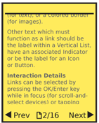
Which position is used will often carry meaning, so should be carefully considered. If the function is "forward" or "next," for example, then the Indicator icon will be facing right. It may be a good idea to place the indicator to the right of the text in this case. The "next" and "back" indicators used alongside text labels in the Pagination pattern are a good example.
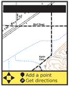
Graphic icons are the most common type of Indicator used. When used without a text label, or when the icon becomes the most prominent item (with text supporting) this becomes an Icon pattern instead. For the Indicator pattern, the supporting icon should not be much larger than the vertical height of the text.
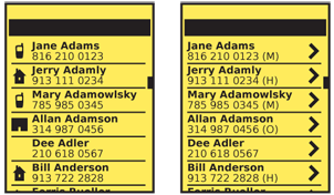
For use of the Indicator in lists, also compare to the Thumbnail List pattern.
Icons may be of any style, but like the text must be consistent, and match the brand and other design guidelines of the site, application, or OS.
Indicator icons may be special text characters, when working in constrained environments.. See the list in the Button pattern for some useful, universally-available text items. If special typefaces can be loaded, you can use more interesting text icons, often with great efficiency in space, speed and complexity of the code.
Antipatterns
Avoid placing indicators above or below the text. Centered below the text, for example, may appear to be the most space-efficient location, but in fact is likely to be perceived as on another line, and either nonsensical or associated with other items on the second line. If this layout is needed, instead use an Icon.
Do not use an Icon or Indicator just to be consistent, or to add visual flair. Assure all indicators are accurate, truthful and clearly explain themselves.
Do not use Indicators' with a clear meaning which they too not actually carry out. A common error is the use of the right arrow to mean "more" when the specific item loads as a Pop-Up, or loads a new application entirely. This should, instead, only be used when a "next" page is loaded, preferably by visibly sliding in as a Film Strip item.
Next: Icon
Discuss & Add
Please do not change content above this like, as it's a perfect match with the printed book. Everything else you want to add goes down here.
Examples
If you want to add examples (and we occasionally do also) add them here.
Make a new section
Just like this. If, for example, you want to argue about the differences between, say, Tidwell's Vertical Stack, and our general concept of the List, then add a section to discuss. If we're successful, we'll get to make a new edition and will take all these discussions into account.
