|
Size: 6133
Comment:
|
Size: 6123
Comment:
|
| Deletions are marked like this. | Additions are marked like this. |
| Line 1: | Line 1: |
| {{attachment:||align="right"}} {{attachment:||align="right"}} {{attachment:||align="right"}} HomeIdle-TwoTypes.png HomeIdle-MultiHome.png HomeIdle-Menus.png |
|
| Line 13: | Line 5: |
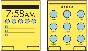
| {{attachment:HomeIdle-TwoTypes.png||align="right"}} | |
| Line 21: | Line 14: |
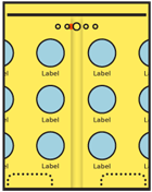
| {{attachment:HomeIdle-MultiHome.png||align="right"}} | |
| Line 39: | Line 33: |
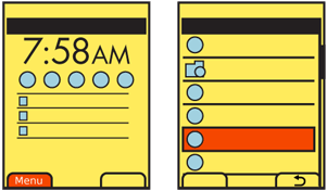
| {{attachment:HomeIdle-Menus.png||align="right"}} |
Problem
A default condition must be available for display once the device has started, and to return to when all other processes and applications have exited.

Solution
All mobile devices have an Idle Screen, originally when the device is not doing anything (it is idle). This is used as a launching point or when the user is not specifically asking anything of the device. This is akin to the desktop on a computer, and provides a method to access all the applications, services and and information stored on the device.
Kiosks and similar constrained interfaces, which present a small number of fixed options are not different and still can be considered Idle Screens. They are simplified due to the regular influx of new users and the relatively low number of options offered.
Do not confuse the Idle Screen with Lock Screen or any other seemingly default screen if it does not provide the same immediate access to available functions.

Variations
Most devices mix several design methods, in order to achieve all the needed goals.
The Idle Screen is the single screen which is loaded when the device is powered on, or when all applications are exited.
The Home Screens encompass all the device-level menus that contain links to the applications. The Idle Screen is invariably one of these Home Screens.
Idle Screens generally follow one of two patterns:
- The Idle Screen is largely occupied with status information and may have little or no direct access to applications.
The Idle Screen is the center one of a series of related screens with iconic representations of many or all of the applications loaded onto the device, generally displayed as a Grid with the Film Strip pattern used to move to and between other Home Pages.
Additional information is almost always available via a list of all applications on the device. These are most often vertical Thumbnail Lists, but may continue using icons as the primary label, in a Grid format. Items should be hierarchically ordered, ideally with user control over folder names and contents, to organize the information as needed.
Status on the Idle Screen has traditionally used fixed elements, or those with only limited customization. "Widgets" are now supported on many devices, which may vary from interactive Icons to display or interactive elements that occupy a large portion of the screen.
Some applications may appear to be continuous with the drilldown method of access. Settings, for example, should usually be considered an application, but the interface and interaction may be so seamless the user is unaware they have left the Home Screen drilldown and entered the Settings application.

Interaction Details
Idle screens with status information are mostly for viewing. There may be no direct interaction. Many devices with a 5-way pad assign key directions to actions or to launch applications. The defaults are often printed on the face of the device, but may be changed in settings. For these scroll-and-select devices, the 5-way pad has no scrolling functions on the Idle Screen.
Other devices with this type of Idle Screen are generally arranged so vertical scrolling will move between calendar, or notification items, and horizontal scrolling will move between application shortcuts. For touch or pen devices, these items may also be directly selected, and will launch a full application view.
Multi-page home screens use the conceit of a single page larger than the viewport, and use the Film Strip pattern to access the several screens. These are mostly suitable only for touch and pen devices. Scrolling between screens may not be clear, or easily understood, even if available on devices with a 5-way pad.
The list of all applications is a Drilldown list, and uses Link or Icon paradigms to access additional screens of information, when hierarchically ordered.
There is no consensus on the methods used to add, remove or move items on any style of Home or Idle screens. While sorely needed, no patterns have yet emerged as consistent and well-practiced enough to use.
Very often, contextually-intelligent mobile devices should be presenting the last-used state to the user at all times, even after a power cycle. While the Idle Screen will still exist, it will be viewed much less in this case. Consider building interactive methods that avoid the Idle Screen, and allow continuous use of the device, instead of pogo-sticking from one application, to the idle screen, to another application.
Presentation Details
Home Screens should be distinctly different from application screens. It should be clear when on a Home Screen, and especially clear when on the Idle Screen.
Items in the Drilldown list of all applications should clearly communicate that they are folders. A "folder" icon may be enough to communicate this.
When on a drilldown menu Home Page screen, title all screens after the main screen. Usually, this will follow the title of the icon or link used to load it, and should be accompanied by the same icon.
Multi-page Home Screens must have a Location Within widget to indicate which of the pages is currently in view.
The use of perspective-simulating backdrops on multi-page Home Screens, which scroll at a slower rate than the foreground icons, can also aid in communicating a sense of location.
Antipatterns
Assure that users can understand the paradigm by which your Home and Idle Screens operate without training. Provide clear and easy access from the Idle Screen to the list of all applications.
Avoid violating device UI paradigms for the Idle or Home Screens. For example, the common practice of disabling scrolling and replacing with shortcuts on the Idle Screen is difficult to understand and learn.
