Problem
You must provide a control which allows users to remove contents from fields, or sometimes whole forms, without undue effort and with a low risk of accidental activation.
Clear Entry functions are built in to some form elements, in some platforms, but in others (such as some web browsers) may be difficult to implement due to restrictions on refreshing data without replacing the entire contents of the page.

Solution
Just as text entry on mobiles is difficult, removing already filled-in values can be exactly as difficult, and even more tedious. Long URLs, or other old, pre-populated or pre-filled data may be inaccurate, and it can be very slow to delete all this content. Providing an explicit method to remove the content can, sometimes, be helpful.
Clear functions should only rarely be used, and can be dangerous as they may accidentally encourage deletion. But they should be considered for some types of fields and forms. This pattern is in no way meant to condone the common but poor practice of the "Reset Form" button, or to encourage the use of clear functions on every field.
Additionally, the "Reset Form" button does not allow selection of individual fields. Even on touch devices, it can be difficult to use conventional desktop paradigms of selection and deletion, so without additional assistance users have to resort to repeated keystrokes and other time-consuming actions. To make matters worse, certain actions we take as designers to prevent loss of data can make it hard to get around; discarding a text message, for example, often saves it as a draft and there is sometimes no way to get around this.
A series of functions and tactics should be considered to assist the user with this task, without conflicting with primary tasks, and principles of preservation of data.
Variations
Most Clear Entry functions for mobiles are at the field level, and these almost always empty text Input Areas:
Explicit functions are controls that must be activated and then in one step clear or reset an entire field. The reset function will revert to any defaults, and also means it can be used on any type of input field or function.
Assistive functions reuse, repurpose or exaggerate existing features of the interface to assist with field clearing.
Form level clear and rest buttons are discouraged, but can be useful in some processes. Additionally, do not overlook the possibility that your form may have essentially one field in it. An SMS message composition page can use a clear button at the form level, which functionally will only clear the one field.
Interaction Details
You should not automatically include Clear Entry in every page, or even every project, but should always be considered. Think of all form design -- as you think of all interactive design -- in the context of the user. If repeated use of a field is likely, or there is no other way to abandon the information, then you may need to add a method to clear the input.
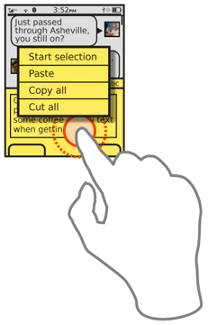
If implementing as an explicit function, simply add buttons adjacent to the field (or within it), or as options available in a menu. These may overlap with the intent of the implicit function by simply offering a "Cut All" function; this has other purposes and in fact loads the clipboard with the data, but also serves to clear the field. Make sure this function is visible enough. Many edit controls are only available via Press-and-Hold or other, low-affordance functions.
One classic implicit functions is to simply over-drive the key repeat. The typical user will, when faced with a large delete task, simply enter the field and begin pressing the delete key. Many will be aware of key repeat, so will keep the key pressed down if the whole field must be cleared. Key repeat usually has a relatively low maximum speed, to allow for stopping at a specific point. But if this is unlikely, such as in the URL field example, or after a longer than usual time, the repeat may accelerate, or simply scroll across the entire field.
This may be a very marked acceleration, even to the point where the entire field is suddenly deleted within a fraction of a second. This must always be coupled with behavior that stops keypresses at the end of the field, and does not move to the next field in line without the user stopping the action, even if the Back key is used to cycle to the previous in focus area otherwise. This behavior can be applied to arrow keys when used for selection as well, but is not applied to other keys. This acceleration method should work for both selection and deletion functions.
These variants and examples should not rule out other methods being developed or used. Gestural clear functions are becoming common on Pen Input fields, however, these have not yet developed into a regularized enough set to be considered a single pattern.
For all of these actions, use the principles of Cancel Protection. Explicit cancel guards are not usually needed if the control is well designed, but saved states, or other paths to retrieve the information should often be developed. URLs can usually be revisited with the existing history functions, and the "Cut All" menu option described above does save the cut data to the clipboard; pasting will recover it.
Presentation Details
Label all buttons, menus and other functions clearly. Rarely can a reset function be a compact button, labeled only with a graphic, due to the potentially catastrophic loss of information. Use text labels when possible.
Be sure to label clearly. "Clear," "Reset," and "Cut" are very different actions, with different implications. Do not confuse terms or assume the user base is not savvy enough to understand subtle semantic differences.
 Live functions such as high speed key repeat, or gestures to select or delete functions, must show the action happening in real time. If the screen cannot update at the speed of the actual behavior, do not use the function. Even at maximum speed, the user must be able to release the key and expect to have the cursor stop where they see it at that moment.
Always use conventional display methods for exaggerated behaviors. Selection at high speeds should use the same highlighting as normal-speed selection, for example.
Antipatterns
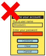
Form-level Clear buttons, if used, must be very carefully placed to avoid accidental activation and should still often use explicit Cancel Protection methods. Do not use the poor convention of the "Clear" button immediately next to the "Submit" button at the bottom of every form.
Next: Audio and Vibration
Discuss & Add
Please do not change content above this line, as it's a perfect match with the printed book. Everything else you want to add goes down here.
Examples
If you want to add examples (and we occasionally do also) add them here.
Make a new section
Just like this. If, for example, you want to argue about the differences between, say, Tidwell's Vertical Stack, and our general concept of the List, then add a section to discuss. If we're successful, we'll get to make a new edition and will take all these discussions into account.