Problem
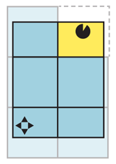
You have complex and/or interactive visual information, which should be presented as a single image, but is so large it must be routinely zoomed into so only a portion is routinely visible in the viewport.
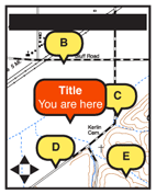
Infinite Area is best used with information best considered actually infinite, such as maps of the whole world, and therefore usually requires a reliable data connection or very large local data capacity. The dynamic loading and reloading is difficult to implement or not supported by all platforms, such as some older web browsers.
Solution
As I've already mentioned, maps are the most common implementation of this, but there is no reason other information sets cannot borrow from it, and some demonstration projects already have used similar technology. You may find this to be a good way to display other photographic information (using very high resolution, composite images) or to allow users to drill into complex infographics. \ The entire breadth of the data set is generally available at every zoom level. Scrolling reveals more of the information. Zoom instead can be considered the depth of data.
Whatever you are loading, the entire data set is considered to be a large, two-dimensional graphic, and smaller subsets can be viewed as though "zoomed in" to portions of the larger image. Zooming reveals more information, generally with newly-rendered images, which revealing additional layers of information. On a map, at the city level you only see highways labeled, and street names only appear when they would be clearly useful and not clutter-inducing.

Variations
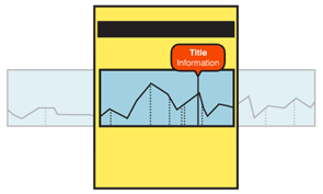
A key variation is be to provide only two-dimensional scrolling of the dataset. Consider a large graph of historical information (e.g. stock prices). At the far right is the current date, with past dates going off to the left, far off the screen. Scale is available, as well as all other controls as usual.
Two information anchoring paradigms are also available. These may be encountered in the same application, and vary based on the immediate user task. However, they are different cases so should be addressed distinctly in design, even if when implemented they appear to overlap almost entirely. Live data uses a real-world anchor point -- or a simulated one, based on reviewing historical data. For example, the current position of the device, or the current time. As this changes, the dataset moves to keep this dynamic point centered. Maps in navigation mode, keeping the current position centered as then map moves about it, are a typical example.
The other mode is one where a fixed point or range is selected by the user and information is browsed around this point. For example, restaurants within 50 miles of a specific point (not where currently located). Or a date range for historical graphs. Zooming of the data to fit the range selected, and other design features will accompany this sort of behavior.
Predictive data may be another sub-variant, where range-limited data is presented for predicted future tracks, such as restaurants you will in future be passing on a planned route.
This pattern, especially the two-dimensional version, is suited for display as a subset of a page, and does not need to take up the entire viewport.

Interaction Details
Scrolling may be by key commands (especially 5-way pads), gestures or on-screen action keys.
Zoom controls should be on the screen, or easily accessed. Zoom by gestures (e.g. pinch and un-pinch) may not be discoverable, even if a standard OS control, so an explicit backup to zoom control should be used.
Layers will be automatically controlled by the system to provide details as the user zooms. Those, or optional layers (e.g. satellite vs. map) should be made available to the user as explicit controls. Optional methods of viewing data should be offered whenever they assist in understanding of the dataset.
Items within the dataset may be selected and acted upon. For certain datasets, any point can be selected and actions taken. Actions may be offered from options menus, or from on-screen layers.
Presentation Details
In most view states -- zoomed in to a portion of the image -- scrolling will need to load additional image data. These are generally stored and loaded as panels. At least one set of panels beyond the current viewport will always be loaded. Use predictive technology (based on scroll actions and other likely behaviors) to load additional panels in the direction the user is likely to scroll. Load as much as is possible, without using too much data or storage.
Use of 3D and effects should be considered whenever it adds to comprehension of the data. Tilting, or simulating elevation, may allow viewing relationships not clear in other ways (and not just for maps).
Scale must be indicated in some manner. This may be explicit, as marks for miles, but implied scale should also be used. For example, at close ranges on maps roads can be depicted as actual width, and buildings can become visible.
Decluttering is the set of techniques used to determine how many layers of detail should be displayed for a particular zoom level. This includes not just the number of items, but how much detail is on a layer; a line on a graph, or a road, can be simplified to reduce the number of points drawn. The goal of declutttering is to provide as much relevant detail as possible without reducing reability and legibility.
Antipatterns
Use caution with clutter control methods. Too simple may remove so much information the data set is not valuable. Too much, and no information can be read. To add to the difficulty, portions of the dataset may have more information, and single rules may not apply. E.g. a declutter factor for a suburb works less well in a dense city.
Scrolling must be live. Do not refresh the entire page. When using scroll-and-select devices, or non-gestural scroll controls, still show the dataset moving from one part of focus to the other. Do not jump.
For maps, do not confuse GPS with "location." Many methods of finding location are available, and map applications should be available on devices without GPS, and on suitably-equipped devices in which it is off, or cannot get a signal.
Do not assume all users will understand gestures, even those common to the OS. It may not be clear which methods apply to the particular application or element. Back up with explicit controls, even if they are hidden in options menus.
