|
Size: 1288
Comment:
|
Size: 6141
Comment:
|
| Deletions are marked like this. | Additions are marked like this. |
| Line 1: | Line 1: |
| ## page was renamed from ExitGuard PROBLEM: Exiting an app, or entire process. And the exiting could cause a catastrophic (unrecoverable) loss of data, or break in the session. Need to prevent this from happening. SOLUTION: Present a modal dialogue which delays the user from exiting immediately (the app or function is kept open in the background), informs them of the consequences of exiting (loss of data) and requires them to make choices, at least confirm exit or return to session. VARIATION: Timer inside exitguard, so you do need just one action to exit. Two actions will exit immediately, but one will exit after a few seconds. Timing depends on users and expected environment. Be sure to notify (sound and/or vibration) so users look at the screen! OR: opposite. For very high criticality apps, have a limited time to hit the pop up and accept exiting. Else, returns to the running app. A version of this is the press-and-hold power (or a button) to turn off. This is not discoverable so a dialogue must appear immediately (and stay up after release of the button) to tell the user HOW to exit. |
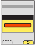
{{attachment:ExitGuard-BasicSoftkey.png|The Exit Guard is a modal dialogue that interrupts the process of exiting an application or process. The "Cancel" Softkey will close the dialogue, and return to the last state, without exiting.|align="right"}} |
| Line 14: | Line 3: |
| Exiting a screen, process or application could cause a catastrophic (unrecoverable) loss of data, or a break in the session. | |
| Line 17: | Line 7: |
| Present a modal dialogue which delays the user from exiting immediately (the app or function is kept open in the background), informs them of the consequences of exiting (loss of data) and requires them to make choices, at least confirm exit or return to session. Build systems to prevent data loss even if exiting occurs. For example, auto-save all user entry, save draft messages, etc. In many cases, even critical entry systems may forgo an '''Exit Guard''' as long as recovery is simple and the process may be easily re-initiated. For high security or time-sensitive entry, such as banking, it may be implausible to auto-save information with sufficient security, or a break in the session may cause too much delay. In these cases, an explicit '''Exit Guard''' is useful. |
|
| Line 19: | Line 14: |
| {{attachment:ExitGuard-BasicTouch.png|Devices without Softkeys will place both buttons within the modal dialogue. The top is generally the "Exit" button, and the bottom will "Cancel" the request.|align="right"}} | |
| Line 20: | Line 16: |
| The most typical variant is a simple modal dialogue, informing the user of the risk of exiting, and presenting a choice to exit or return to the previous state. Sometimes, additional options may also be presented. These are usually special exit conditions, such as choosing to exit with or without saving. A variant uses the '''Wait Indicator''' and a delay timer to provide one-click exiting, as long as the user is willing to wait a short time. For immediate exit, an "Exit now" button can be selected. A sub-variant of the timer, used for high criticality applications, reverses the process. The user must select to exit in a short time (or continue pressing the exit button for a designated time period) or the process will not terminate and will return to the last state. |
|
| Line 23: | Line 26: |
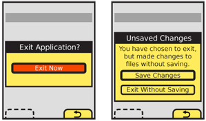
| {{attachment:ExitGuard-DetailExit.png|Titles, descriptions and labels must be clear and easy to understand.|align="right"}} If additional selections are required, they may be loaded in any way needed, such as buttons in the Pop-Up, as pick lists, etc. Use any Softkeys or softkey-like buttons for primary supporting actions, such as Cancel. In the example of exiting with unsaved documents, the choices to exit without saving and save documents would be in the dialogue, and the option to return to the application would be labeled "Cancel" and be the Softkey conventionally used for this. Avoid disregarding Softkeys entirely, for consistency of the interface. Keyboard and touch input buffers must be cleared the moment the exit selection is made. This will prevent accidental press-and-hold or multiple click buffered input from skipping past the '''Exit Guard''' dialogue. If there continue to be problems with this, add a brief delay (1/10th of a second or less is usually enough) before accepting new input. It may additionally be desirable to have no function selected by default on scroll and select devices (requiring a deliberate scroll then select to make either choice). Touch and pen devices may wish to consider the location of the dialogue buttons relative to the original exit selection mechanism, to prevent accidental or too-easy input; requiring moving to a different part of the screen may be sufficiently deliberate to avoid accidental activation. |
|
| Line 26: | Line 37: |
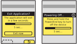
| {{attachment:ExitGuard-Delays.png||align="right"}} Timed '''Exit Guard''' dialogues must notify the user using tones and/or vibration, to assure they are seen. This may also be useful for conventional '''Exit Guard''' dialogues, to assure the user does not assume the application or process exited, and then does not check back for some time. Use the system set volume or vibration settings in general, but always at least vibrate, even if set to no output at all. Remember, this only happens on user action, so is not a notification and should not be detectable to others. The Title of the dialogue must clearly denote the condition requested, usually "Exit?" "Confirm Exit" or something similar. If the title is insufficient to explain the situation, there are special conditions (such as unsaved documents) or to explain a timed exit function, a description should immediately follow the title. Button labels must not depend on the description or title. Never present selections such as "Yes" and "No." The best are along the lines of * "Exit" * "Cancel" Where "Cancel" is the OS default label or icon for canceling or going back from the current process. In this case, the process is the subset of the previous process, or the exit condition '''[[Pop-Up]]''' itself. The logic can get confusing if you think about it too much, so don't. When a choice is clearly the preferred one, that should be indicated. The OS standards should include a method of indicating button preference such as color, icon use or border treatment. This may or may not be the safest choice; the criticality of the process being cancelled, and the input method will determine it. When the delay timer is configured so the user must continue an action, a dialogue must appear as soon as the exit function is selected, to inform the user how to exit. If used in the condition where a function must be continuously pressed for a certain time to exit, state how long, and provide a countdown so the user knows how much longer they have. If the button is released before the time required to exit, the dialogue should remain on the screen for several seconds so the first time user, more familiar with short presses and taps, has a chance to learn the process. |
|
| Line 29: | Line 56: |
| Do not use '''Exit Guard''' for all applications and processes. F |

Problem
Exiting a screen, process or application could cause a catastrophic (unrecoverable) loss of data, or a break in the session.
Solution
Present a modal dialogue which delays the user from exiting immediately (the app or function is kept open in the background), informs them of the consequences of exiting (loss of data) and requires them to make choices, at least confirm exit or return to session.
Build systems to prevent data loss even if exiting occurs. For example, auto-save all user entry, save draft messages, etc. In many cases, even critical entry systems may forgo an Exit Guard as long as recovery is simple and the process may be easily re-initiated.
For high security or time-sensitive entry, such as banking, it may be implausible to auto-save information with sufficient security, or a break in the session may cause too much delay. In these cases, an explicit Exit Guard is useful.

Variations
The most typical variant is a simple modal dialogue, informing the user of the risk of exiting, and presenting a choice to exit or return to the previous state.
Sometimes, additional options may also be presented. These are usually special exit conditions, such as choosing to exit with or without saving.
A variant uses the Wait Indicator and a delay timer to provide one-click exiting, as long as the user is willing to wait a short time. For immediate exit, an "Exit now" button can be selected.
A sub-variant of the timer, used for high criticality applications, reverses the process. The user must select to exit in a short time (or continue pressing the exit button for a designated time period) or the process will not terminate and will return to the last state.
Interaction Details
 If additional selections are required, they may be loaded in any way needed, such as buttons in the Pop-Up, as pick lists, etc. Use any Softkeys or softkey-like buttons for primary supporting actions, such as Cancel. In the example of exiting with unsaved documents, the choices to exit without saving and save documents would be in the dialogue, and the option to return to the application would be labeled "Cancel" and be the Softkey conventionally used for this.
Avoid disregarding Softkeys entirely, for consistency of the interface.
Keyboard and touch input buffers must be cleared the moment the exit selection is made. This will prevent accidental press-and-hold or multiple click buffered input from skipping past the Exit Guard dialogue. If there continue to be problems with this, add a brief delay (1/10th of a second or less is usually enough) before accepting new input.
It may additionally be desirable to have no function selected by default on scroll and select devices (requiring a deliberate scroll then select to make either choice). Touch and pen devices may wish to consider the location of the dialogue buttons relative to the original exit selection mechanism, to prevent accidental or too-easy input; requiring moving to a different part of the screen may be sufficiently deliberate to avoid accidental activation.
Presentation Details
 Timed Exit Guard dialogues must notify the user using tones and/or vibration, to assure they are seen. This may also be useful for conventional Exit Guard dialogues, to assure the user does not assume the application or process exited, and then does not check back for some time. Use the system set volume or vibration settings in general, but always at least vibrate, even if set to no output at all. Remember, this only happens on user action, so is not a notification and should not be detectable to others.
The Title of the dialogue must clearly denote the condition requested, usually "Exit?" "Confirm Exit" or something similar.
If the title is insufficient to explain the situation, there are special conditions (such as unsaved documents) or to explain a timed exit function, a description should immediately follow the title.
Button labels must not depend on the description or title. Never present selections such as "Yes" and "No." The best are along the lines of
- "Exit"
- "Cancel"
Where "Cancel" is the OS default label or icon for canceling or going back from the current process. In this case, the process is the subset of the previous process, or the exit condition Pop-Up itself. The logic can get confusing if you think about it too much, so don't.
When a choice is clearly the preferred one, that should be indicated. The OS standards should include a method of indicating button preference such as color, icon use or border treatment. This may or may not be the safest choice; the criticality of the process being cancelled, and the input method will determine it.
When the delay timer is configured so the user must continue an action, a dialogue must appear as soon as the exit function is selected, to inform the user how to exit. If used in the condition where a function must be continuously pressed for a certain time to exit, state how long, and provide a countdown so the user knows how much longer they have. If the button is released before the time required to exit, the dialogue should remain on the screen for several seconds so the first time user, more familiar with short presses and taps, has a chance to learn the process.
Antipatterns
Do not use Exit Guard for all applications and processes.
F
