Problem
A small label, descriptor or additional piece of information is required to explain a piece of page content, a component or a control.

Solution
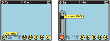
A Tooltip is a transient, usually contextual, informational assistance widgets. They are initiated by the user hovering over a potentially interesting target, or automatically presented when the system determines the user needs help -- such as first time, or a change in the system since last visit.
Information presented in a Tooltip is a helpful label or content add on. It is not content itself, but serves to clarify short labels or icons, or explain jargon, requirements or systematic needs that may not be clear.
When a function like a Tooltip is called for, but it may be deliberately displayed by the user, or has interactivity in the information label itself, this is instead an Annotation. See that pattern for more details and comparison.
Variations
Floating tooltips are the traditional tooltip encountered in modern desktop windowing OSs. A small box appears adjacent to the mouse pointer, above every other item on the page. A small amount of content (almost always just text) populates the box.
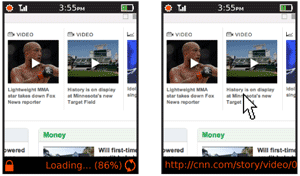
Banner tooltips occupy a strip, generally anchored to the top or bottom of the viewport or window. These are most suitable for larger amounts of text, or when a message can appear here most of the time. This may carry labels for hover states as the floating labels, or information on the current state or mode of the application, such as a browser status bar.
Banner tooltips may use the style and functionality of any Fixed Menu or Revealable Menu used within the OS or application should be carefully considered, and may be re-used without modification.

Interaction Details
There is usually no explicit method to present tooltips. For any systems which support hover states (mostly scroll-and-select), any item in focus may display a Tooltip label. For any device, including touch and pen devices without a hover paradigm, tooltips can be used by the system to point out unused tools, or new features. The lack of contextuality makes this less immediately useful, and the items to be highlighted must be carefully selected to avoid over-selling a single new feature.
Certain desktop systems allow entering a "help mode" where tooltips appear instantly (though still on hover), for all page items, but this has not yet become common in mobile so cannot be considered a pattern yet.
The information labels, whether floating or in a banner, may not be selected in any way. They should be built so they do not exist as far as selection mechanisms go. For example, ***if a tooltip is partly obscuring a function in a touch or pen device, if the tooltip label is under the contact point it should be ignored, and the item behind it activated as though it is visible***.
When the label is being displayed, it has to get out of the way of other actions the user might request. If any selection is made elsewhere on the page, including entering text input fields, it should be disappear immediately.

Presentation Details
The banner Tooltip may operate in one of two modes:
- Always-present: A permanently allocated space, which is empty when no messages are present. Labels for hover states appear and disappear without delay.
- As needed: Labels and the surrounding box will appear with the timing of the floating Tooltip, but always appears in the same place on the screen instead of adjacent to the relevant section.
Any floating Tooltip should be presented after a brief pause, to avoid interfering with use of the interactive elements on the page.
Only one Tooltip may be present at a time. Moving to another element will overwrite the previous Tooltip or label with the new one.
A floating Tooltip should generally disappear after a few seconds. This timing is infinitely variable depending on the user context expected for the application. If the user is likely to not be paying attention to the screen when the tooltip appears, the timing may need to be very long, or a banner style should be used.
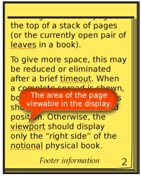
Any floating Tooltip must be clearly not part of the page context. Use borders, shadows, and transitions to make this clear. It is often best to make it appear as though the Tooltip label is floating above the image, or protruding from the page. Certain practices described in the Simulated 3D Effects pattern may be used to emphasize this.
The text inside any Tooltip should only be one line long whenever possible. If it must wrap, never exceed two lines. Avoid truncation, although some labels (such as URLs) make this unavoidable.
Antipatterns
Do not rely on a Tooltip to solve interaction and interface design problems. If icons are unclear, make better ones, or apply fixed labels, for example.
Labels should never exceed the space available. Do not let them simply float off the page. Label text should not end in ellipsis or wrap to a second line. Multiple lines of information may be displayed, but each line should carry it's own information.
Avoid overburdening an already complex, interactive interface with tooltips. Though their non-interactive nature may seem to indicate they can be added freely, they are still observed and must be understood by the user. This may interfere with speed of comprehending the entire interface. Additionally, when multiple small floating items are on a page, it may not be clear what the layer relationship is between them.
