Problem
Everything has to be labeled in a consistent location to make context or process completion clear...

Solution
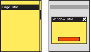
Most pages and elements of a page should be labeled, including sub-tabs, sections, states. Pop-ups and other elements get titles, even sub-page elements, so mention that. Suggested is a straight up title bar, hence you see that in the diagrams here.
Variations
Except for very odd designs, always a horizontal bar or space with title in text.
Can include icons. Try not to be needlessly repetitive and use a more specific icon. For example, if a popup then don't repeat the app icon if the window behind is clearly the app. Either display nothing, or use the space for icons that indicate the state, such as an error triangle if there's an error.
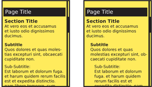
Subsidiary titles are text, but can be stylized to be boxed, indented etc.

Interaction Details
Generally none. Sometimes clicking a title does something, like jumps to home... Should this be a pattern or just a note it can do stuff... Anything it does should be related to the title bar, like jumping to top, not something random, and should be OS-wide if possible.
PAGE title does that... individual section titles can be links to subsidiary info. If so, don't hide it. Underline or otherwise make it clear this is a target.
Presentation Details
Design should follow the OS guidelines, whenever possible. Even if significant changes are required for unique branding of your product, make title bars of similar size, shape and position to the rest of the OS.
Basically, go hire a writer or at least pick up a style guide. But in short...
Label everything similarly. Use the same voice, and tense, and capitalization (sentence vs. title case), and so on.
Hierarchy of presentation... Design the whole product around a simple hierarchy, and stick to it. Don't go too deep.
Just like H level elements in HTML (H1, H2...) there are similar title and other display hierarchies built into native OS development kits. Often, as with semantic web concepts, these have default attributes assigned which can be useful when building the product and can add value to the user experience. Even if additional styles are imposed, try to use these basic attributes as the first definition level.
Indenting and how to make it not too deep so it wastes space... Mostly left aligned.
Antipatterns
Avoid jargon. Etc.
Check all content, not just those in the primary path, or that got mocked up. Errors can be frustrating, etc.
F
