|
Size: 1788
Comment:
|
Size: 5109
Comment:
|
| Deletions are marked like this. | Additions are marked like this. |
| Line 2: | Line 2: |
| Everything has to be labeled in a consistent location to make context or process completion clear... | Every key element should be labeled to make context or process completion clear. |
| Line 5: | Line 5: |
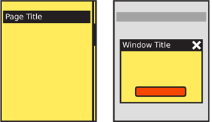
| {{attachment:Titles-PagePop.png|Titles should always be attached to free-standing elements, such as pages, windows or Pop-Ups. Follow the OS design guidelines for the use of title bars.|align="right"}} | |
| Line 6: | Line 7: |
| Most pages and elements of a page should be labeled, including sub-tabs, sections, states. Pop-ups and other elements get titles, even sub-page elements, so mention that. Suggested is a straight up title bar, hence you see that in the diagrams here. | Pages and elements or content sections within a page should almost always labeled. Pop-ups and other free-standing elements should have titles similar to the page level title. Titles must be used in a consistent manner, in size, location, content, and style. The simplest method for pages is a straightforward title bar, which is shown in all the page diagrams in the book. |
| Line 10: | Line 13: |
| Except for very odd designs, always a horizontal bar or space with title in text. | Titles are always horizontal, and any top-level title is boxed or otherwise separated out to make it clearly a key element. |
| Line 12: | Line 15: |
| Can include icons. Try not to be needlessly repetitive and use a more specific icon. For example, if a popup then don't repeat the app icon if the window behind is clearly the app. Either display nothing, or use the space for icons that indicate the state, such as an error triangle if there's an error. | Subsidiary titles are also text, but the text can be stylized as needed (bold, color, etc.) or additionally include boxes, rules, indents or other graphic treatments to differentiate them from the remaining content, and to more clearly communicate the hierarchy. |
| Line 14: | Line 17: |
| Subsidiary titles are text, but can be stylized to be boxed, etc. | If the OS calls for it, the title of the running application may be displayed in a special title style. If so, there is no need to repeat the application name within the page title area. In some cases, the application title bar may disappear shortly after the application is loaded. |
| Line 17: | Line 20: |
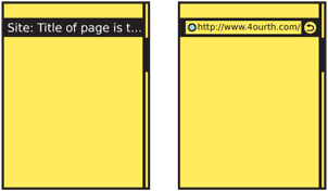
| {{attachment:Titles-URL.png|.|align="right"}} | |
| Line 18: | Line 22: |
| Generally none. Sometimes clicking a title does something, like jumps to home... Should this be a pattern or just a note it can do stuff... Anything it does should be related to the title bar, like jumping to top, not something random, and should be OS-wide if possible. | Titles are not required to have any interaction. |
| Line 20: | Line 24: |
| PAGE title does that... individual section titles can be links to subsidiary info. If so, don't hide it. Underline or otherwise make it clear this is a target. | A typical interaction for titles of modules, or sections is to make the title a link to another page. The title bar of a full-viewport page can be used to reveal additional information (tap or drag down to reveal functions like URL entry for a web browser) or as an anchoring element for very long pages (tap to return to the top of the page). These are generally only useful for touch and pen devices; for scroll-and-select input, having to scroll past the title is generally additional effort to be avoided for secondary functions such as this. If needed, place them within options menus. |
| Line 23: | Line 29: |
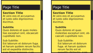
| {{attachment:Titles-Hierarchy.png|Build all content with a hierarchy, and title sections to follow and express this to the end user.|align="right"}} | |
| Line 24: | Line 31: |
| Basically, go hire a writer or at least pick up a style guide. But in short... | Design should follow the OS guidelines, whenever possible. Even if significant changes are required for unique branding of your product, make title bars of similar size, shape and position to the rest of the OS. |
| Line 26: | Line 33: |
| Label everything similarly. Use the same voice, and tense, and capitalization (sentence vs. title case), and so on. | Titles can include icons. Try not to be needlessly repetitive and use a more specific icon instead. For example, in a '''[[Pop-up]]''', don't repeat the application icon, especially if the window behind is clearly visible. Either display nothing, or use the space for icons that indicate the state, such as an error triangle if there's an error. |
| Line 28: | Line 35: |
| Hierarchy of presentation... | It is best to get professional writing resources. If not possible, obtain a style guide, define a communication style for the product, and stick to it. Use similar language for all descriptive titles. * Use the same voice and, when practical, tense. * Use a single name for your product, when it has to be referred to at all. * Use consistent capitalization (sentence or title case). If parts of the product are considered proper names, make sure everyone has the list of these names. Design the whole product around a simple hierarchy, and stick to it. Avoid going too deep; past about 3-4 levels becomes confusing, and difficult to differentiate titles. Indenting is one way to help express a hierarchical relationship. Mobiles may seem too small to use this effectively, but only a few pixels of indent can express this need. Compare to the way '''[[Hierarchy List]]''' is designed, and communicates the relationship between parent and child elements. Just like H level elements in HTML (H1, H2...) there are similar title and other display hierarchies built into native OS development kits. Often, as with semantic web concepts, these have default attributes assigned which can be useful when building the product and can add value to the user experience. Even if additional styles are imposed, try to use these basic attributes as the first definition level. When titles are links, make this clear and follow conventions used in the rest of the application or site. Additional hints may be needed; even if color normally denotes a link, that may not be clear enough for titles which are often a different color from the content text anyway. Icons or underlines may be needed. |
| Line 32: | Line 48: |
| Avoid jargon. Etc. | Avoid jargon, exposing internal processes, excessively harsh error messages and so forth. |
| Line 34: | Line 50: |
| Check all content, not just those in the primary path, or that got mocked up. Errors can be frustrating, etc. | Do not repeat content; if the application is described adequately, do not repeat the application name in a subsidiary page or '''[[Pop-Up]]''' title. |
| Line 36: | Line 52: |
| F | During test, and periodically as maintained, be sure to check all content. Often, only mockups, or the primary path is inspected, but alternative paths and errors must be as clear, consistent and well-described as any other parts of the product. |
Problem
Every key element should be labeled to make context or process completion clear.

Solution
Pages and elements or content sections within a page should almost always labeled. Pop-ups and other free-standing elements should have titles similar to the page level title.
Titles must be used in a consistent manner, in size, location, content, and style. The simplest method for pages is a straightforward title bar, which is shown in all the page diagrams in the book.
Variations
Titles are always horizontal, and any top-level title is boxed or otherwise separated out to make it clearly a key element.
Subsidiary titles are also text, but the text can be stylized as needed (bold, color, etc.) or additionally include boxes, rules, indents or other graphic treatments to differentiate them from the remaining content, and to more clearly communicate the hierarchy.
If the OS calls for it, the title of the running application may be displayed in a special title style. If so, there is no need to repeat the application name within the page title area. In some cases, the application title bar may disappear shortly after the application is loaded.

Interaction Details
Titles are not required to have any interaction.
A typical interaction for titles of modules, or sections is to make the title a link to another page.
The title bar of a full-viewport page can be used to reveal additional information (tap or drag down to reveal functions like URL entry for a web browser) or as an anchoring element for very long pages (tap to return to the top of the page). These are generally only useful for touch and pen devices; for scroll-and-select input, having to scroll past the title is generally additional effort to be avoided for secondary functions such as this. If needed, place them within options menus.

Presentation Details
Design should follow the OS guidelines, whenever possible. Even if significant changes are required for unique branding of your product, make title bars of similar size, shape and position to the rest of the OS.
Titles can include icons. Try not to be needlessly repetitive and use a more specific icon instead. For example, in a Pop-up, don't repeat the application icon, especially if the window behind is clearly visible. Either display nothing, or use the space for icons that indicate the state, such as an error triangle if there's an error.
It is best to get professional writing resources. If not possible, obtain a style guide, define a communication style for the product, and stick to it. Use similar language for all descriptive titles.
- Use the same voice and, when practical, tense.
- Use a single name for your product, when it has to be referred to at all.
- Use consistent capitalization (sentence or title case). If parts of the product are considered proper names, make sure everyone has the list of these names.
Design the whole product around a simple hierarchy, and stick to it. Avoid going too deep; past about 3-4 levels becomes confusing, and difficult to differentiate titles. Indenting is one way to help express a hierarchical relationship. Mobiles may seem too small to use this effectively, but only a few pixels of indent can express this need. Compare to the way Hierarchy List is designed, and communicates the relationship between parent and child elements.
Just like H level elements in HTML (H1, H2...) there are similar title and other display hierarchies built into native OS development kits. Often, as with semantic web concepts, these have default attributes assigned which can be useful when building the product and can add value to the user experience. Even if additional styles are imposed, try to use these basic attributes as the first definition level.
When titles are links, make this clear and follow conventions used in the rest of the application or site. Additional hints may be needed; even if color normally denotes a link, that may not be clear enough for titles which are often a different color from the content text anyway. Icons or underlines may be needed.
Antipatterns
Avoid jargon, exposing internal processes, excessively harsh error messages and so forth.
Do not repeat content; if the application is described adequately, do not repeat the application name in a subsidiary page or Pop-Up title.
During test, and periodically as maintained, be sure to check all content. Often, only mockups, or the primary path is inspected, but alternative paths and errors must be as clear, consistent and well-described as any other parts of the product.
