So, you work in Photoshop or some similar tool. All of us do, at least to put designs on the screen, or create raster production graphics. Eventually maybe we can get out of this and use almost all programmatic styles and vector art, then do design in vector programs, but we're not there yet.
If you are like almost every VizD I have worked with for a very, very long time, you are doing one key thing wrong. Just one. You are designing for pixels. Yes, even though you are a pixel-pusher by trade, you have to account for (and measure in) physical units. Here's how (all instructions for Photoshop, screenshots from CS6):
Go to Image > Image size...
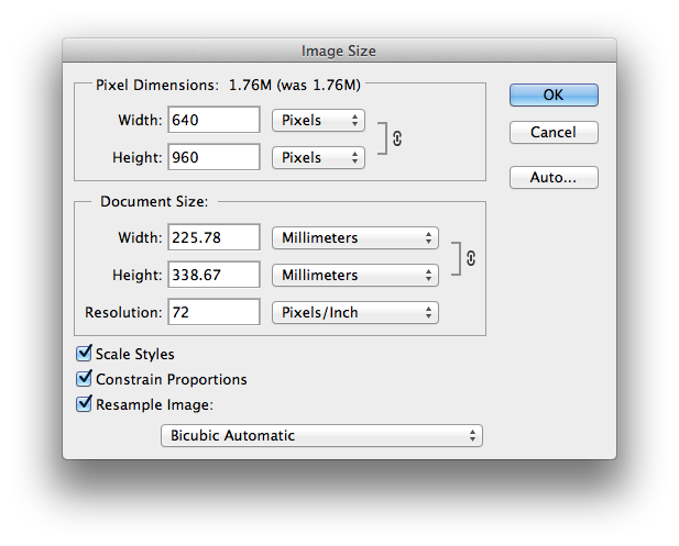
This dialogue will open.

Note the last field is labeled "Resolution"? That's the right way to use it. Resolution is not 320x480 but a pixels per physical size. So, we're gonna change that. Why? Because nothing is 72 dpi. Nothing! It was a pseudo-standard years and years ago, but in practice there were small variations in all the old CRT monitors that used that. And, even before it came out, there were very different pixel densities. I recall older versions of Windows even had a "96 dpi" setting you could use to make stuff on the screen readable.
Which is very much the point. No mobile phone is anywhere close to 72 dpi. That's really, really, crazy low resolution. I have a featurephone I use for testing out stuff, a Nokia C2-00. It's presumably nothing that whippy, and has about 208 dpi. But let's get to what you likely work on, iPhones.
Yes, you should be designing for something else, but also in my experience almost every VizD team is still stuck fast to iOS. So here's the pixel densities for those, and the Galaxy S3 as it's a crazy-popular Android and you should work on that also:
Apple handsets (early iPhones & equivalent iPod Touch) - 163 dpi
Apple handsets, "Retina Display" (iPhone 4, 4S, 5 & equivalent iPod Touch) - 326 dpi
- Apple 10" iPad 1, 2 - 132 dpi
- Apple 10" iPad 3 "Retina Display" - 264 dpi
- Apple iPad Mini - 163 dpi
- Samsung Galaxy S3 - 306 dpi
Here's a list of many devices. Here's a more readable, useful list. It is still unaccountably hard to find the physical size of screens in useful dimensions. Diagonal is not easy to use (rather: it's impossible unless you know aspect ratio also) so it would be nice to have height and width listed in physical sizes, not just pixels for when you lay out non-raster designs, but oh well.
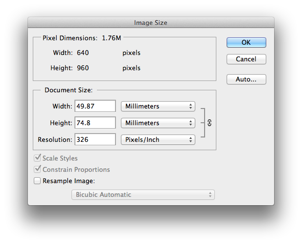
Now pick the one you work with, and change the Resolution number to that. But first... we're not changing the image itself, but just the way we measure it. So you first uncheck "Resample Image" down in the lower left. Now check it out.

Note how the pixel dimensions are the same, but the physical sizes changed. Go ahead, press OK and commit the change. Now start measuring. On any iPhone, you will find the screen is now 50 mm (or 5 cm if you must) wide. When you edit type, the size will be accurate. Are you shocked to find you are giving your users 4.25 pt type? You should be. Fix that.
Etc. Happy pixel pushing!
* The 72 PPI Web Resolution Myth
Next: Documentation Templates
Discuss & Add
Everything you want to add goes down here.
Examples
If you want to add examples (and we occasionally do also) add them here.
Make a new section
Just like this. If, for example, you want to argue about the differences between, say, Tidwell's Vertical Stack, and our general concept of the List, then add a section to discuss. If we're successful, we'll get to make a new edition and will take all these discussions into account.
