|
Size: 7587
Comment:
|
Size: 8324
Comment:
|
| Deletions are marked like this. | Additions are marked like this. |
| Line 1: | Line 1: |
| "Pop Ups: iPad has scrolling lists all the time in popups, although you never see it on small devices. Also: some pop ups can be dismissed by tapping away from them, if they aren’ t alerts." "Not sure what the scrolling means, Need to read the pattern and see if we mention it. Also, he may be thinking the iPad is reference hardware: it could suck. Do maybe touch on non-modal pop-ups if I didn't. Click anywhere else. But mention you need lots of screen for this, and cannot use softkeys, menus, to function it as then the in/out of pop=up becomes confusing." ---- |
|
| Line 29: | Line 20: |
| Content may be anything, and is not a variation, just content. | Content of a Pop-Up may be absolutely anything, including all of the other types of content or interaction described in the rest of this book. |
| Line 33: | Line 24: |
| For larger devices such as tablets, or in rare cases for handset-sized devices, non-modal '''Pop-Ups''' may be used. When this is chosen, a decision will have to be made whether the '''Pop-Up''' becomes obscured by the parent window (and if so, how to again grant focus to the '''Pop-Up''') or whether it is always on top, and obscures a portion of the parent. These design considerations will not be discussed below, as they are currently such exceptions that there is no established best practice on how to achieve them. | For larger devices, such as tablets, or in rare cases for handset-sized devices, you may find a non-modal or "semi modal" '''Pop-Up''' is the best choice. This means that the parent window can be interacted with, or clicking outside the dialogue dismisses it. You have to base this decision on the expected use of the entire system, such as what the relationship between the content on the parent window and the '''Pop-Up''' is. Whatever choice you make, try to enforce it rigidly across the entire application. |
| Line 37: | Line 28: |
| Only one '''Pop-Up''' should be open at a time. This is easily solved by simply not allowing access to the parent, but is a good principle to keep in mind. | Only allow one '''Pop-Up''' to be open at a time. This is easily solved by simply not allowing access to the parent, but since this is sometimes possible, it is a good principle to keep in mind. |
| Line 39: | Line 30: |
| Opening a '''Pop-Up''' is via almost any link, or as a result of other user or system actions. There is no special design method to launch a '''Pop-Up'''. | Opening a '''Pop-Up''' can be allowed via a typical '''[[Link]]''', or as a result of other user or system actions. There is no univerally-recognized design method to launch or make the user aware that the action will load a '''Pop-Up'''. Within an application or service, however, try to use them consistently so the user can learn which items load new pages, and which pop up instead. |
| Line 41: | Line 32: |
| All '''Pop-Up'''s may be dismissed. Even for a step within a required process, the '''Pop-Up''' should be able to be dismissed, so the user may view their context, and take other actions that may only be allowed within the full page. Dismissal may be via a dedicated function like a "close" with icon in the corner, or as a part of the primary content, like a "Cancel" button adjacent to the submit functions. | Always allow your '''Pop-Up''' to be dismissed. Even for a step within a required process, the '''Pop-Up''' should be able to be dismissed, so the user may view their context, and take other actions that may only be allowed within the full page. Dismissal may be via a dedicated function like a "close" icon in the corner of the dialogue, or as a part of the primary content, like a "Cancel" button adjacent to the submit functions. If a dedicated Back function is provided, this should usually dismiss the dialogue also. |
| Line 46: | Line 37: |
| Avoid scrolling within '''Pop-Up'''s. Long text elements, such as legal agreements, should be in full pages, and not '''Pop-Up'''s. Selection lists within '''Pop-Up'''s may, however, scroll. They may work best with only portions of the '''Pop-Up''' scrolling, instead of the entire frame. This will allow the buttons to be revealed at all times, making the presence of actions clear, even if the actions are forbidden until scrolling has occurred. | Avoid scrolling within a '''Pop-Up'''. Long text elements, such as legal agreements, should be in full pages, and not '''Pop-Up'''s. Selection lists within '''Pop-Up'''s may, however, scroll. They may work best with only portions of the '''Pop-Up''' scrolling, instead of the entire frame. This will allow any submission buttons to be revealed at all times, making the presence of actions clear, even if the actions are forbidden until scrolling has occurred. |
| Line 48: | Line 39: |
| When the device OS uses Softkeys or softkey-like on-screen buttons, there is no need to restrict to only the (usually two) actions available. If additional actions are required, they may be loaded in any way needed, such as buttons in the '''Pop-Up''', as pick lists, etc. Use the Softkeys for primary supporting actions, such as Cancel. Avoid disregarding Softkeys entirely, for consistency of the interface. | '''[[Select Lists]]''' are often used for selecting large numbers of items, even in a '''Pop-Up''' dialogue. The single-select variant is most useful as you can use a single action to make the selection and do not have to have additional controls fixed in the dialogue or elsewhere in the viewport. When the device OS uses Softkeys or softkey-like on-screen buttons, you can place buttons that control actions in the '''Pop-Up''' in there. This is nice because you do not have to fit these two buttons inside the smaller window. If additional actions are required, they may be loaded in any way needed, such as buttons in the '''Pop-Up''', as single '''[[Select Lists]]''' or so on. Use the Softkeys for primary supporting actions, such as Cancel. Avoid disregarding Softkeys entirely, for consistency of the interface. |
| Line 60: | Line 53: |
| When the '''Pop-Up''' is non-modal or the content of the page is key to making choices within it, the background should not be obscured. Be sure there is sufficient border, shadow or other treatment on the '''Pop-Up''' to assure it is clearly recognized as a different element, on top of the page. |
|
| Line 63: | Line 58: |
| Always consider ways to avoid using '''Pop-Up'''s. Generally, there are other solutions. Many mobile browser and OSs do not deal with '''Pop-Up'''s well, and may display them poorly, or confusingly. | For small devices especially, such as handsets, consider ways to avoid using '''Pop-Up'''s. Generally, there are other solutions. Many mobile browser and OSs do not deal with '''Pop-Up'''s well, and may display them poorly, or confusingly. |
| Line 71: | Line 66: |
| Do not display a '''Pop-Up''' exclusively to present advertising. If interstitial '''Advertising''' is required, use full-screen display instead. Heavily branded or ad-funded information that is actionable is a valid use. | Do not display a '''Pop-Up''' exclusively to present advertising. If '''[[Interstitial]]''' '''[[Advertising]]''' is required, use full-screen display instead. However, actual content, even if heavily branded or ad-funded, is reasonable as long as it is relevant to the page in some way and was requested by the user. |
Problem
A displayed element must be able to easily reveal a small or medium amount of additional information, while remaining associated with the current context or page.

Solution
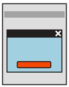
A Pop-Up is a child "page" smaller than the viewport, that appears on top of the parent page or display context which spawned it.
For mobile, these should almost always be "modal," with the Pop-Up having exclusive focus. Elements on the parent cannot be accessed without dismissing the Pop-Up.
The parent can be seen behind and around the Pop-Up, but should be clearly disabled.
Variations
 Pop-Ups may be free-floating, with space around all sides, or may be anchored to one side. Anchoring to the top is used when the Pop-Up is related to a condition in the Annunciator Row or another top-margin item, such as the URL strip of a browser. Anchoring to the bottom is most useful when on a device with Softkeys, or softkey-like on-screen buttons, which will be used in place of button actions within the Pop-Up itself.
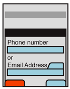
Content of a Pop-Up may be absolutely anything, including all of the other types of content or interaction described in the rest of this book.
If room allows, and there is value (viewing content on the parent, or providing access to other on-screen elements such as virtual keyboards), the Pop-Up may be moved around the screen.
For larger devices, such as tablets, or in rare cases for handset-sized devices, you may find a non-modal or "semi modal" Pop-Up is the best choice. This means that the parent window can be interacted with, or clicking outside the dialogue dismisses it. You have to base this decision on the expected use of the entire system, such as what the relationship between the content on the parent window and the Pop-Up is. Whatever choice you make, try to enforce it rigidly across the entire application.
Interaction Details
Only allow one Pop-Up to be open at a time. This is easily solved by simply not allowing access to the parent, but since this is sometimes possible, it is a good principle to keep in mind.
Opening a Pop-Up can be allowed via a typical Link, or as a result of other user or system actions. There is no univerally-recognized design method to launch or make the user aware that the action will load a Pop-Up. Within an application or service, however, try to use them consistently so the user can learn which items load new pages, and which pop up instead.
Always allow your Pop-Up to be dismissed. Even for a step within a required process, the Pop-Up should be able to be dismissed, so the user may view their context, and take other actions that may only be allowed within the full page. Dismissal may be via a dedicated function like a "close" icon in the corner of the dialogue, or as a part of the primary content, like a "Cancel" button adjacent to the submit functions. If a dedicated Back function is provided, this should usually dismiss the dialogue also.
 Actions the user must take within a Pop-Up should be considered "page level." Whether agreeing they have been presented information, confirming a condition or submitting form information, use buttons (or button analogues like softkeys) to commit the action. Buttons imply page submission or major action so the dismissal of the Pop-Up will be expected.
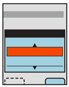
Avoid scrolling within a Pop-Up. Long text elements, such as legal agreements, should be in full pages, and not Pop-Ups. Selection lists within Pop-Ups may, however, scroll. They may work best with only portions of the Pop-Up scrolling, instead of the entire frame. This will allow any submission buttons to be revealed at all times, making the presence of actions clear, even if the actions are forbidden until scrolling has occurred.
Select Lists are often used for selecting large numbers of items, even in a Pop-Up dialogue. The single-select variant is most useful as you can use a single action to make the selection and do not have to have additional controls fixed in the dialogue or elsewhere in the viewport.
When the device OS uses Softkeys or softkey-like on-screen buttons, you can place buttons that control actions in the Pop-Up in there. This is nice because you do not have to fit these two buttons inside the smaller window. If additional actions are required, they may be loaded in any way needed, such as buttons in the Pop-Up, as single Select Lists or so on. Use the Softkeys for primary supporting actions, such as Cancel. Avoid disregarding Softkeys entirely, for consistency of the interface.
Presentation Details
Make sure the Pop-Up is clearly defined as not a portion of the page. Use OS-level framing, and other treatments to make it clear. Shadows are another valuable way to differentiate the Pop-Up.
Control items especially, including close buttons, and Softkeys should appear similar or identical to the OS standard controls. This way, users will not have to learn a new interface language.
Controls should also be as clear as possible, so cancel, accept and close buttons or functions are immediately obvious to the user, and require no interpretation.
The state change of not just loading the Pop-Up but obscuring the parent is also critical to communicating this. The parent should usually be overlaid with a white tint or black shade which allows viewing the content, but is enough different that it is clear the content and interactive elements are superseded by another.
When the Pop-Up is non-modal or the content of the page is key to making choices within it, the background should not be obscured. Be sure there is sufficient border, shadow or other treatment on the Pop-Up to assure it is clearly recognized as a different element, on top of the page.

Antipatterns
For small devices especially, such as handsets, consider ways to avoid using Pop-Ups. Generally, there are other solutions. Many mobile browser and OSs do not deal with Pop-Ups well, and may display them poorly, or confusingly.
For devices with Softkeys or softkey-like on-screen buttons, avoid use of buttons within the Pop-Up. Anchor to the bottom of the screen (or whichever side has the buttons) and use those instead.
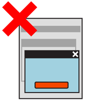
Do not allow a Pop-Up to spawn (be the parent for) another Pop-Up.
Do not over-use Pop-Ups by including navigation, tabs and so on. Present the single information or interactive concept, then allow the Pop-Up to close when the user dismisses it, or the task is completed.
Do not display a Pop-Up exclusively to present advertising. If Interstitial Advertising is required, use full-screen display instead. However, actual content, even if heavily branded or ad-funded, is reasonable as long as it is relevant to the page in some way and was requested by the user.
Discuss & Add
Please do not change content above this like, as it's a perfect match with the printed book. Everything else you want to add goes down here.
Examples
If you want to add examples (and we occasionally do also) add them here.
Make a new section
Just like this. If, for example, you want to argue about the differences between, say, Tidwell's Vertical Stack, and our general concept of the List, then add a section to discuss. If we're successful, we'll get to make a new edition and will take all these discussions into account.
