 Way back in 2007, I was working as an interactive designer for Sprint when it was becoming Sprint-Nextel. A brand refresh was part of this, and there was to be massive amounts of italic (well, oblique) type all over the place. As usual for branding, no one had thought of digital display, so it was just pressing print brand standards into play. I went to some effort to find out why this was terrible, and wrote it down on a public blog post once the new brand went live.
The original article can be read here.
I would love to be able to retire it, but I keep getting lots and lots of hits on that blog post, and cannot find a lot of other good information. So, this seems to be a key information source. Hence, I am just updating and placing it here. Sadly, this didn't make the book, though the basics are in there.
Avoid Italics and Obliques for Digital Display
As a general rule, italics and obliques should be avoided for digital display devices.
Overall, its just about resolution. Type traditionally is smoothly drawn or pressed; pen strokes or lead type create lines going any direction. Any irregularity from beat-up type, or paper texture was inconsequential at normal sizes (usually) and regardless had no direction, so italics with their angles suffered no discernability issues. In reproducable print, from the dawn of photo-lithography to today, the screen (whether angled, straight or stochiastic, square, round or oval) is of such high resolution that all shapes appear essentially straight. Except for very straight lines very close to (but not quite /at/) the screen angle, everything looks smooth and sharp.
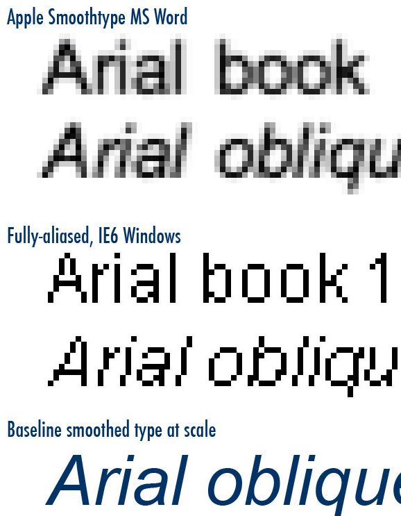
Unlike print, the low resolution of type on the digital display means that angled items, like the vertical in italic type are rendered as a series of sharp steps. Cleartype, Smoothtype and other technologies try to mitigate this with a sort of anti-aliasing (sub-pixel rendering), but its imperfect; the sharpness cannot be preserved with such technologies. Its just a limit of physics.
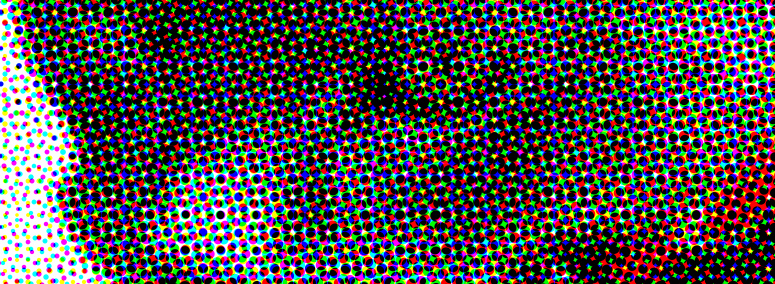
Additionally, pixels are not like halftone dots. While a relationship can be drawn between print and digital resolutions, it is not directly equivalent. Printed matter uses circular (sometimes oval) dots, which vary in size depending on the density of the printing required. Pixels are squares, are always the same physical size, and change only luminance.

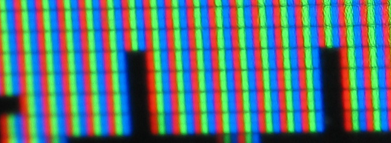
Color displays have even more complexity, as they are composed of several colored pixels adjacent to each other (generally), and which merely appear to be a single square pixel at conventional digital resolutions.

Digital displays can be anywhere from 80 to over 300 ppi. The lower resolutions will display the stairstep effect discussed above, to the naked eye. However, anything over about 250 ppi can be assumed, even for mobile devices (held very close to the eye, so with higher angular resolution) to be of sufficient resolution that stress, obliques and italics can be used successfully. See Size of the Stimulus: Visual Angle to perform your own math on the exact sizes needed for your device at particular viewing distances.
However, the low cost and relative longevity of many devices with lower resolutions means they will continue to exist, and new ones will be made, for at least decades to come. Unless you know for a fact every user has a smartphone with a high resolutions screen, you must assume poor resolutions and avoid italics and obliques.
There are additional issues with readability (comprehension, fatigue) of italics or oblique faces in print as well. Do not use italics or obliques for all the body copy. If there are long quotes phrases, or large sidebars, be careful about using italics or obliques for these as well or you may see the same results; users will not read or not comprehend as well as they skim the type.
As it turns out, I never found the text of any large, well-done study that absolutely proves users cannot read jagged type. There's reference to one, and that's good enough for me. However, aside from the logic shown above, Fred Pilgrim (who worked for me at the time) collected this list of research, technical knowledge and anecdotal information from others. Interesting quotes about italics are here directly, but follow the link for context and more useful info. The IE box model bug is a great one I had forgotten about. Seen a similar one with Verdana (I think) having a space/letterform issue with their Ws.
http://www.grc.nasa.gov/WWW/usability/textfontcss.html (Link broken, cannot find very brief guideline article, but archive of it here http://web.archive.org/web/20070106061855/http://www.grc.nasa.gov/WWW/usability/textfontcss.html)
Research has shown that people can read faster if words are written using mixed case rather than all upper case. Blocks of bold and italics text are more difficult to read. Black is easier to read than colored fonts.
http://www.jimbyrne.co.uk/show.php?contentid=53
- Jim Byrne is the founder of the Guild of Accessible Web Designers and has been a Web accessibility specialist since 1996.
Avoid using italics for small text sizes: the problems of screen display of outline fonts has not entirely disappeared. Italized fonts look particularly bad at small sizes - as italics do not easy to render using a square pixel grid. If you must use italics, avoid using them for large blocks of text.
http://pcworld.co.nz/pcworld/pcw.nsf/how-to/put-yourself-in-their-shoes
- Italics don't work on then-current low resolution screens:
Staying with the same page we see that the chief executive's message, is written in italics. Research has established that reading from computer screens is about 25 percent slower than reading from paper. Even users who don't know about this human-factor research, usually say they do not enjoy reading from a computer screen. Text in italics should be avoided on web sites, as italics are even harder to read on current low resolution (below 80 dpi) screens. I predict that the screen readability problems of today will be solved by the year 2008. By that time we will see screens of 300 dpi in common use.
http://www.smartisans.com/articles/web_writing.aspx
While the Stanford-Poynter study focused on reading news on the Web, the results were similar to various studies conducted by Jakob Nielson, Jarod Spool, and others in the mid-1990's...
..But don't use italics for emphasis because italics are difficult to read on a computer monitor. There are just not enough pixels to render italics clearly.
http://www.456bereastreet.com/archive/200501/ie_and_italics/
Interesting info about Internet Explorer & Italics Ever seen IE/Win ruin a layout just because a few words are in italics? I have. Just the other day I was pulling my hair out over this bug...
Next: Readability and Legibility Guidelines
Discuss & Add
Please do not change content above this line, as it's a perfect match with the printed book. Everything else you want to add goes down here.
Examples
If you want to add examples (and we occasionally do also) add them here.
Make a new section
Just like this. If, for example, you want to argue about the differences between, say, Tidwell's Vertical Stack, and our general concept of the List, then add a section to discuss. If we're successful, we'll get to make a new edition and will take all these discussions into account.
