 Mobile and small-screen design is largely about communicating information to the user. More often than not, regardless of how exciting and shiny the interface is, this will still be centered on the display of text content.
Mobile typography is about the selection and use of all the type elements within the design. It is only partly about the selection of the correct font and face, and has a great deal to do with selecting display technologies, understanding sizes, and applying conventional design methodologies (size, shape, contrast, color, position, space, etc.) to best employ the type elements.
Challenges of Mobile Typography
Computer-based type, especially for Internet display, has always been a challenge due to display technologies (resolution), availability of type, color and contrast reproduction variations, and size variations. Mobile devices take these issues, magnify them, and add a spate of unique environmental and use-pattern issues. The primary barrier is of technology, and the primary concern is of readability within the user’s context.
Type originally existed as shapes cut out of metal. When digital typesetting first became commercially viable, this model was followed and these letterforms were turned into vector glyphs, mathematically describing the shape of the character.
Smartphones now generally support this sort of type, and may include many fonts and faces and scale uniformly, allowing almost unlimited display options. Custom type can be included with applications loaded to the device relatively easily, and web-based font embedding is now appearing as well.
Older and low-end devices, including the billions of feature phones in the world, mostly only support “bitmap” fonts. These do not use vector glyphs, but instead draw each character as a small graphic of pixels. For each size or weight, a new set of type images must be loaded. Only a small number of fonts will be loaded, and generally only three sizes will be supported by J2ME applications running on these handsets.
A "glyph" is the shape of a letterform. For our purposes, in digital type, we mean the vector shape file of an individual letterform. Oh, and "letterform" is another term of art, meaning sorta the same thing; the shape of an individual character, but in a more art and design sense. A glyph is required, but you can love a letterform.
All digital display devices render the final shapes as pixels on a square grid. Even ePaper devices must communicate with the stochastic display device with the same technology. Vector shapes, including type, are “rasterized” to comply with this format, and turned into pixels. Subtle angles and curves can become lost, or appear jagged regardless of antialiasing techniques. See Figure C-1.
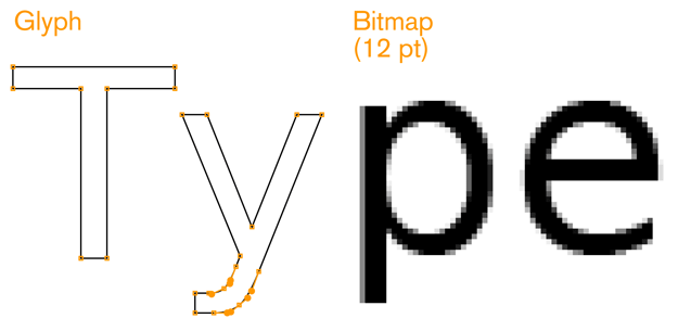
Although very high-resolution devices make some of the problems hard to see, almost eliminating them, the basic issues persist, and should be considered during design, and selection of proper type.
Technology continues to improve, and both digital foundries and OS makers are regularly implementing new techniques to improve rendering and readability.
Technology
Although some devices are beginning to allow effectively unlimited type selection, support vector glyphs, and have large amounts of storage and running memory, most mobile devices are still resource- and technology-constrained. General issues of storage on the device, running memory, download times, and cost of network access limit availability of type for mobile application design. As many devices require raster (bitmap) faces, each size is loaded as a complete, different typeface. Most products end up with the device’s default type, or with a very limited set of choices for their application.
Although this challenge will slowly dissolve, it will always be present to some degree. Inexpensive devices, specialist devices (youth, elderly, and ruggedized), and emerging market needs seem to indicate these issues will persist for another several decades at least.
Usability
Mobiles are used differently from desktops, and even most print use of type. They are closest, perhaps, to signage in that they must be comprehended by all user populations, under the broadest possible range of environmental conditions (e.g., poor lighting) and at a glance. The typical mobile user is working with the device in a highly interruptible manner, glancing at the screen for much of the interaction. The type elements must be immediately findable, readable, and comprehendible.
This is different from the technical challenge in that it is inherent in the mobile device. Users will always interact with their devices in this manner, so it must always be addressed, regardless of the technical implementation.
An Introduction to Typography
To understand mobile typography, you will need to learn a little of the language and principles of typography in general. Do note that this is a very cursory review of this field. Please use the terms to search for more information, and check the sources listed in the references.
Baselines and measurements
The basic building block is lines and measures (see Figure C-2).
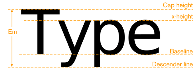
The baseline is where all type rides. Note that some round characters can dip below this, but only very little for optical purposes so it is perceived as straight. At most mobile screen sizes, this may not even happen. X-height is the height of the lowercase x, or any lowercase character, excluding the ascenders for those characters. Cap height is the height (more or less) of the tallest ascenders, and of the uppercase characters.
Letter Height and Measurements
During the letterpress era, letters were created from cast "sorts," or blocks of lead, with the letter being a raised portion in the middle. These sorts were arranged together to form words and sentences. Each metal sort was designed to have a specific measurement. The letter’s height was measured from the top to the bottom of the sort, not the actual letter, which could vary. This standard measurement became known as the type’s point size.
Today, type is still commonly referred to by its size in points. Other related measures are also useful to know, and are increasingly supported by modern mobile device OSs. These are the most important measures:
Point
One point is 1/72nd of an inch or about .35 mm. It used to be a slightly odd number, but has been standardized with digital typesetting. Specifically, PostScript defined it as this. In serious page layout programs, you can choose between traditional and "PostScript points." Use the latter.
Pica
- 12 points is one pica. Picas are not used to specify type, but are used as a larger measure for any other dimensions of layout, such as spacing or column width. In traditional layout, many of these are used without units. Columns, for example, are traditionally measured in picas so are simply "8 wide," for example.
Em
- This is the height of the sort, which is still defined by an invisible box which contains the glyph shape. Although a relative measure (it depends on the typeface and the size of the type being referenced), it is a general unit of measure, and distances and spacing can be referred to in “ems.” Em-dashes are very long dashes. Pronounce it as "m," not "e-m."
En
- This is simply half an em. It is mostly encountered not as a unit of measure (though technically it is) but as a definition of a shorter dash. If it takes a short dash, use an en dash, not a hyphen. There are also 1/4 and 1/8 ems, used to define spaces, but they have no special names. Same pronunciation, not "e-n" but "n."
Twip
- Rarely used, but encountered deep in some interactive systems as a scale measure with-out need of decimals, is the very small twip. This is, properly, 1/20th of a point, but sometimes has other meanings, so be careful when you encounter it.
Hairline
- This is an old printing term, meaning the smallest consistently printable element, and is always a rule such as a line to separate columns. So, it is variable depending on the printing and other reproduction technology available, and not well supported with digital typesetting systems. For digital display, this has no explicit meaning. But the concept is valid, and it would be “one pixel.” While not much encountered, I like it for the concept: understand the limits of your technology and design to those.
Abbreviations for points and picas can be odd. When alone, “p” is for pica and “pt” is for point, but typographers have a convention (supported by all serious digital design tools still) of “picas” p “points,” as in “3p6,” for example. This may even be encountered as a way to express points without the preceding zero, such as “p6.” Type is always specified as points, such as “72pt.”
Letterforms and their parts
When choosing the appropriate mobile type we must understand that each typeface has unique characteristics that affect its legibility across device screen technologies, reading distances, and screen sizes.
In order to create effective message displays that are legible for mobile displays, understanding the basic elements of type is important. The information that follows will assist you when choosing the appropriate typeface for your design:
Font
- The physical character or characters that are produced and displayed.
Typeface
- A collection of characters—letters, numbers, symbols, punctuation marks, etc.
Glyph
- The smallest shape of a character that still conveys its meaning. Also means the actual shape data, such as the vector or raster information stored and called up to display the character.
Baseline
The invisible guideline upon which the main body of text sits. Some letters may, of course, extend below the baseline, with descenders. Think g, j, q.
X-height
- The height of the main lowercase body from the baseline. It is usually defined as the size of the lowercase letter x, hence the name. It excludes ascenders and descenders. For body copy in mobile and small-screen devices, the x-height must be between 65% and 80% of the cap height for readability.
Cap height
- The distance from the baseline to the height of the capital letter (and often all ascend- ers). When measuring to determine a font’s point size, the cap height is used.
Descender line
The descender is the part of a letter that extends below the baseline. The descender line is the guide to which all descenders within the font family rest against. For mobile and small-screen devices, do not use excessive descenders. Avoid exceeding 15% to 20% of the cap height, to avoid excessive leading.
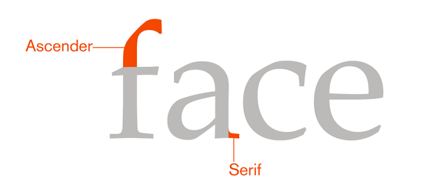
Ascender
- The part of the letter that extends above the x-height. For mobile and small-screen devices, do not have ascenders above the cap height. This is critical for non-English languages, to better support accent marks without excess leading or overlapping type.
Counters
- The negative spaces formed inside characters, such as the shape in the middle of an O. Small type sizes or heavy typefaces may cause counters to appear to fill in and look solid if they are too small, or complex.
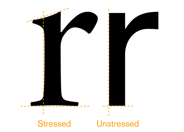
Stress
- Adding curvature to the straight shapes of a letterform. This is generally not desired for mobile faces. At best, the small rendered size will simply blur out these subtleties. It could also make it impossible to render sharp letters at small sizes. See Figure C-6.
Stems
- The main vertical or diagonal elements of a character.
Bowls
- The main, generally curved area that forms an enclosed area for a letterform with a stem. Think of the round, enclosed areas on either type of the lowercase a.
Type is composed of letterforms, and very importantly to the readability, the counter forms made up of the white space inside letters (see Figure C-3).
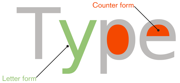
The space between letters is another sort of counter form, and we will discuss it shortly.
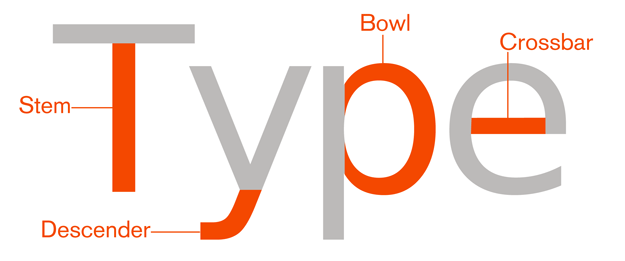
Every piece of the letterform also has a name. There are many more of these, but the following list discusses the most important ones for understanding and selecting type appropriate for mobile and small-screen use (see Figure C-4 and Figure C-5).
Serifs
- Finishing details at the ends of a character’s main stroke. They extend outward. They are not solely decorative. They also help with our ability to discriminate other characters that make up lines of text. Serif faces are more readable for large blocks of type than sans-serif faces (there is some argument about this, discussed separately). However, in small mobile type, these may become undetectable, become blurry, and decrease legibility due to the limits of screen pixel technologies.
San-Serifs
- Characters without serifs. For mobile type, sans serif is often the default choice as it works well enough for all uses, at all sizes. For users that have poor vision, you may need to use sans serifs that include more visually distinct characters in certain cases.
Square Serifs
- Also called slab serifs, these use heavy, squared-off serifs. Using these may be a good compromise, to ensure that the serifs display at the rendered sizes. Appropriate kerning is important to use for letter dis- crimination and legibilit
These three basic styles are shown in Figure C-7.
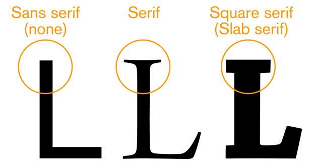
For mobile type, sans serif is often the default choice as it works well enough for all uses, at all sizes. Serif faces are more readable for large blocks of type than sans serif faces. If your application is filled with news articles or something similar, consider if a serif face might work. Square serifs work well, to ensure that the serifs display at the rendered sizes and under difficult lighting conditions. Square (or slab) serif faces are the default faces used in popular eReaders.
All these letterform details matter not just for style, but for legibility and readability. Note that most of the letterform is similar to every other letterform. The bottom half is just a series of undifferentiated legs, as shown in Figure C-8.

So, fairly small portions; mostly in the top half; their ascenders, descenders, counters, and inter-forms are the keys to readers understanding the form and reading the phrase.
Families and Styles
A font family is a group of stylistically related fonts.
A font is a small group of (generally) very similar typefaces, which mostly will vary in weight. A common weight is “bold.” If you have ever heard the term boldface, that’s because it’s a “bold typeface.”
Black is a weight heavier than bold. Roman, Book, or Normal is the default weight. Thin or light is thinner or lighter, essentially the opposite of bold. Numerous other terms are also used, and some fonts have more than a dozen weights.
Weight will, usually, strongly influence the width of the overall type. Readability in long strings can be quite negatively impacted by large blocks of bold text. Very often, other methods (color, shape, position, whitespace) are more suitable for emphasis than bold on small screens. See Figure C-9.

A few fonts are specifically designed to have little or no change in width as weight varies. Some are good for screen display purposes, and can be used to solve these problems if available.
Italics are almost script-like faces which complement the normal faces. They are generally both tilted and with additional curves and more decorative serifs. Oblique is the same font more or less just slanted over as a sort of fake italic.
Italics and obliques are not suggested for any purposes on displays with less than about 150 pixels per inch. The angled forms, much like stressed verticals, cannot be rendered sharply. The stairstep effect is noticeable even with type-specific antialiasing techniques. Over about 200 ppi, this begins to become less noticeable, and such types can be used effectively.
Using large blocks of all caps, bold, or italics (or obliques) will result in reduced reading speeds, and lower comprehension. The best results are achieved with mixed case (both uppercase and lowercase) Romans. This can apply even to small passages, such as titles, so if readability is critical consider testing the use of styles such as all-caps titles to be sure they work.
All-caps is sometimes used for emphasis, but this is not always useful, and may provide effectively less emphasis due to reduced legibility.
Space: Kerning and Leading
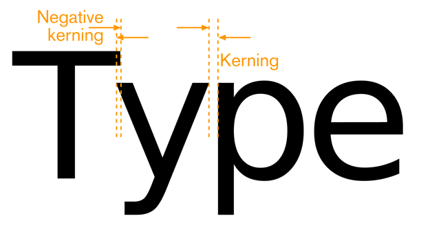
Proper spacing between characters and lines of type is crucial to readability, but must often be handled automatically for interactive systems. Even well-designed ones must take into account multiple screen sizes and aspect ratios, and sometimes even user-controlled zoom. There is little room for the designer to individually kern letter pairs.
Instead, be aware of the issue, pick fonts that are well designed, and use type display tools that respect the embedded kerning tables and work well for the devices and functions you are designing.
The key spacing attributes are:
Kerning
- The space between any two characters. Ideally, this is automatically generated and follows well-established principles laid out by the type designer, and set forth in a kerning table. See Figure C-10.
Tracking
- The overall inter-character spacing for a block of text. Tracking has a parent relationship to kerning, if both are defined.
- Do not, as a general rule, use monospace faces, where each character takes the same horizontal width, except for specialist reasons, such as examples of code or tables rendered as text, where spacing is crucial to display clarity.
Leading
- Also known as line spacing, or the amount of vertical space from one baseline to the next baseline. Larger leading can often increase readability in poor conditions, such as low light or in motion, but too much can make it impossible to understand that two lines are related to each other. Larger than default leading can be used to make improperly long lines of text more readable, if they are otherwise unavoidable. Leading is traditionally specified in the same notation as the type size. It's shown as type/leading, such as 10/12, usually without units. It's read aloud as "10 on 12." If you like the history lessons, it's called "leading" because in mechanical typesetting, the lines of type were set apart with strips of lead. No leading, such as 10/10 is called "set solid" as it's a solid block of type, without lead spacers. Leading is measured as the vertical distance between baselines (or any like-to-like line). Sufficient room must be provided for the ascenders and descenders to not collide with each other, so it's often a bad idea to set solid. Additional room must be provided to ensure that lines of type can be read, without forming intercharacter counters in the space between lines. See Figure C-11.
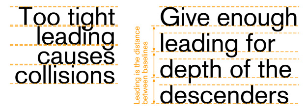
Many typefaces suitable for mobile display have very small descenders to help you eliminate extra leading, and fit more information on a page.
Most languages have some accent characters. These are usually placed above the letterform, occupying the ascender space for lowercase characters, but an above-cap-height space for uppercase characters. Typically, this will require very large leading to enable readability of the accents. See Figure C-12.

This generally is unacceptable for small-screen display, and some faces have special letterforms that fit the accent and character within the cap height. If your application must support accent-enabled languages, consider the effect this will have on your design.
Alignment
Alignment of type is used as a design tool, and to make the text fit appropriately. All type is “aligned.” Some is justified, but this is a subset. Available types of alignment are:
Left align
- The most common alignment by far. Aside from tabbed-in first lines of a paragraph, and so on, all type is aligned to a single invisible vertical guideline. The type con- tinues to the right until no more complete words can fit, and then it breaks to the next line. The irregular right side makes it also sometimes called “flush left” and/or “ragged right.” Hyphenation can be used to make the “rags” less dramatic, but inter- active systems have poor or no automatic hypehnation currently.
Right align
- The opposite of left align, sometimes called “flush right.” Used for special design purposes or to set apart small amounts of type.
Center
- Most used for titles and other items that easily fit the space. For items longer than a line, the same rule about breaking as in left align is used, but there is no straight side, and both edges are ragged. Note that the rags are perfectly symmetrical.
Justify left
- Only really available when optical typesetting appeared, and most successful in the digital age. This uses line-by-line tracking (and sometimes kerning) controls to es- sentially remove the ragged right side from the left-aligned type by stretching and squeezing the amount of text on one line to make the lines even, or “flush” on both sides. Hyphenation is also heavily relied on to make the lines of more even length. This does not preclude first lines of paragraphs being indented and other spacing for design purposes. How last lines are handled varies stylistically, but usually is allowed to be “ragged,” with the conventional tracking.
Justify right
- Identical to justify left, but flipped so that the ragged last line is on the left. (This is an error in the book. It says "Right").
For narrow columns, texts with long words (such as technical jargon), or systems with poor tracking control (such as those that only adjust interword spacing) distracting “rivers” of whitespace may appear in the text. If this is common, justification may not be suitable.
Do not use monospace fonts and additional spaces to simulate justified paragraphs. This is highly unreadable.
Guidelines for Selecting a Typeface for Mobile and Small-Screen Devices
Research shows that reading from a computer screen is about 25% slower than from pa- per. Many mobile devices, due to size or environmental complexities, can make this even more challenging. Understand the principles of type and the limits of mobile to help you make appropriate decisions for your content, and your users. See Figure C-13.
Must have:
- X-height between 65% and 80% of the cap height
- Strong counters (or “counter forms”); often, using squared-off shapes for small coun- ters is a good idea
- Unstressed forms; straight, even-width lines
- No excessive descenders; avoid exceeding 15% to 20% of the cap height, to avoid excessive leading
- No ascenders above the cap height; this is critical for non-English languages

Should also:
- Be space-efficient. Generally this means narrow, to allow sufficient height for all us- ers to read the characters.
- Not look compressed.
- Be well kerned. Letters should not run together, or have spaces that look like word breaks.
- Have the same, or similar, width for all weights and styles (there is no penalty for us- ing oblique/italics or boldface for emphasis).
- Use subtle serifs when it can be beneficial to the form; consider them for a face, or for some characters of a face.
- Include a true italic. A sloped Roman ensures that hardly any elements are vertical; a true italic can preserve legibility, following the aforementioned rules, while also being different enough to read as “other than body.
- Be part of a complete family. Serif and sans serif can both be used (titles and body text have different needs), as well as many weights of each, if space is available on the device.
Non-Latin languages will have additional requirements. As always, be aware of regional needs and cultural distinctions.
Resources
Foundries and Catalogs
While no longer usually casting metal type, places that produce type as distributable products are still called foundries.
Display technologies
Type blogs and books
Mobile type info
Some is from foundries, so is self-serving, but we only post those that are largely or completely true
Next: Italics and Obliques For Digital Display
Discuss & Add
Please do not change content above this line, as it's a perfect match with the printed book. Everything else you want to add goes down here.
All Caps?
I just read the other day a study that seemed to say readability of all-caps went up for those accustomed to it. I lost the link, but it's interesting. Someone find it.
Serifs
Yes, we sometimes have minor contradictions in the book. Here, we go with the classic take that well-formed serifs (printed at decent resolution) help readability. This may not be universally true, but we can discuss further.
A Bunch More Reading for You
A lot of the topics in this section started being written down in this blog post, and not all the links made it across to the book, or even to the resources pages. So, here they are quite unordered for now.
Better Screen, Same Typography by Khoi Vinh.
WIRED on iPad: Just like a Paper Tiger… and <a href="http://informationarchitects.jp/designing-for-ipad-reality-check/|Designing for iPad: Reality Check]] from iA, though I am not clear who the author of each is, not that I looked that hard. And while we're at iA, a great critique of very contemporary print in the modern age <a href="http://informationarchitects.jp/tages-anzeiger-paper-redesign-pitch-lost/|Links in Print: Story of a Beautiful Failure]]
The iPad is not a Magazine by Milind Alvares at Smoking Apples.
My introduction to typography, leaning towards mobile stuff a bit. But if you want info on serifs and stuff, read this as an intro. <a href="http://wiki.forum.nokia.com/index.php/Typography_in_Mobile_Devices|The same entry is also posted at Forum Nokia,]] if you prefer those guys.
The Design for Mobile pattern wiki which is mostly so far contributed to only by Little Springs Design. Please add your own ideas if you have any. Please.
Some good articles about grids but a bit heavy on web, and some broken image links and stuff. When it works, great place.
How to Use Visual Hierarchy in Web Design by Joshua Johnson at Designshack. Someone had a discussion of time and space as design elements, but I cannot find it. If anyone does, tell me and I'll link it.
http://acquia.com/blog/10-usability-guidelines#comment-12214 which I put in here for a false-bottom discussion. Hard to find a good, full discussion of this.
Information Architecture and Wayfinding a part of a lecture series I guess, from the Raffles Design Institute in Shanghai.
Alignment via Wikipedia. Note they say "flush left" and so on. I do not. It's a style or regional difference I suspect.
Edward Tufte is a legendary proponent of good design in all sorts of cases, and is generally known (i.e. not just to the design community) for his critiques of Powerpoint, and how bad presenting all but caused the Challenger accident. His books are pricey, but wonderfully printed, and worth keeping. Buy at least one.
A Pixel is Not a Pixel a really interesting article from Quirksblog. Read it.
LCD display via Wikipedia, and <a href="http://archive.chipcenter.com/circuitcellar/june01/c0601rr1.htm|Chipcenter]].
ePaper Central which has all you want to know about it. Check out their <a href="http://www.epapercentral.com/epaper-technologies-guide|Reference Guide]] for more than you can possibly care about.
Letterpress printing, <a href="http://en.wikipedia.org/wiki/Offset_printing|offset printing]], <a href="http://en.wikipedia.org/wiki/Laser_printer|laser printers]], <a href="http://en.wikipedia.org/wiki/Halftone|halftone]], and <a href="http://en.wikipedia.org/wiki/CMYK_color_model|process color]] all from Wikipedia.
Rich Black vs. Plain Black comparing print and display technologies.
Type and optical sizing from Adobe.
Kerning from I Love Typography, which is a great blog about type in general. Subscribe.
Font hinting and you'll be happy to see sub-pixel display images. This is why type looks good on monitors today. They know all this stuff.
Bitstream Font Fusion sadly a marketing page, because like I said they all consider it secret IP. But if you want to get good type on your small screen (or TV, or whatever) call them up.
Ink traps are so nerdy they aren't well discussed. This will do as a definition though. Mentioned in some other articles at <a href="http://ilovetypography.com/?s=ink+trap&button=search|iLT]], if you want to search.
CSS units of measure from the W3C.
Em, <a href="http://en.wikipedia.org/wiki/En_(typography)|en]], <a href="http://en.wikipedia.org/wiki/Point_(typography)|point]], <a href="http://en.wikipedia.org/wiki/Pica_(typography)|pica]], <a href="http://en.wikipedia.org/wiki/Twip|twip]], all from Wikipedia.
Make a new section
Just like this. If, for example, you want to argue about the differences between, say, Tidwell's Vertical Stack, and our general concept of the List, then add a section to discuss. If we're successful, we'll get to make a new edition and will take all these discussions into account.
