|
Size: 3859
Comment:
|
Size: 7022
Comment:
|
| Deletions are marked like this. | Additions are marked like this. |
| Line 1: | Line 1: |
| Describe General Touch Interaction Guidelines here. | [[http://www.amazon.com/gp/product/1449394639/ref=as_li_tf_tl?ie=UTF8&tag=4ourthmobile-20&linkCode=as2&camp=217145&creative=399373&creativeASIN=1449394639|{{attachment:wiki-banner-bonus.png|Click here to buy from Amazon.|align="right"}}]] |
| Line 3: | Line 3: |
| The minimum area for touch activation, to address the general population, is a square 3/8” on each side (10 mm). When possible, use larger target areas. Important targets should be larger than others. | The minimum area for touch activation, to address the general population, is a square 3/8 of an inch on each side (10 mm). See Figure D-1. When possible, use larger target areas. Important targets should be larger than others. |
| Line 5: | Line 5: |
| There is no distinct preference for vertical or horizontal finger touch areas. All touch can be assumed to be a circle, though the actual input item may be shaped as needed to fit the space, or express a preconceived notion (e.g. button). Due to reduced precision and poor control of pressure, but smaller fingers, children who can use devices un-assisted have the same touch target size. | There is no distinct preference for vertical or horizontal finger touch areas. All touch can be assumed to be a circle, though the actual input item may be shaped as needed to fit the space, or express a preconceived notion (e.g., button). Due to reduced precision and poor control of pressure, but smaller fingers, children who can use devices unassisted have the same touch target size. |
| Line 7: | Line 7: |
| {{attachment:GICintro-Sizec.png|Minimum area for touch activation. Do not rely on pixel sizes. Pixel sizes vary based on device and are not a consistent unit of measure}} | {{attachment:GICintro-Sizec.png|Figure D-1. Minimum area for touch activation. Do not rely on pixel sizes to measure touch targets. Pixel sizes vary based on device and are not a consistent unit of measure.}} |
| Line 11: | Line 11: |
| The visual target is not always the same as the touch area. However the touch area may never be smaller than the visual target. When practical (i.e. there is no adjacent interctive item) the touch area should be notably larger than the visual target, filling the "gutter" or white-space between objects. Some dead space should often be provided so edge contact does not result in improper input. | The visual target is not always the same as the touch area. However, the touch area may never be smaller than the visual target. When practical (i.e., there is no adjacent interactive item) the touch area should be notably larger than the visual target, filling the “gutter” or whitespace between objects. Some dead space should often be provided so that edge contact does not result in improper input. |
| Line 13: | Line 13: |
| In the example, the orange dotted line is the touch area. It is notably larger than the visual target, so a missed touch (as shown) still functions as expected. | In the example shown in Figure D-2, the orange dotted line is the touch area. It is notably larger than the visual target, so a missed touch (as shown) still functions as expected. |
| Line 15: | Line 15: |
| {{attachment:GICintro-Targetd.png|Visual target compared to the touch area. The touch area should never be smaller than the visual target}} | {{attachment:GICintro-Targetd.png|Figure D-2. Visual target compared to the touch area. The touch area should never be smaller than the visual target.}} |
| Line 18: | Line 18: |
| === Touch area and the centroid of contact === The point activated by a touch (on capacitive touch devices) is the centroid of the touched area; that area where the user’s finger is flat against the screen. |
=== Touch Area and the Centroid of Contact === The point activated by a touch (on capacitive touch devices) is the centroid of the touched area; that area where the user’s finger is flat against the screen. |
| Line 21: | Line 21: |
| The centroid is the center of area whose coordinates are the average (arithmetic mean) of the co-ordinates of all the points of the shape. This may be sensed directly (the highest change in local capacitance for projected-capacitive screens) or calculated (center of the obscured area for beam-sensors). | The centroid is the center of area whose coordinates are the average (arithmetic mean) of the coordinates of all the points of the shape. This may be sensed directly (the highest change in local capacitance for projected-capacitive screens) or calculated (center of the obscured area for beam sensors). |
| Line 23: | Line 23: |
| A larger area will typically be perceived to be touched by the user, due to parallax (advanced users may become aware of the centroid phenomenon, and expect this). | A larger area will typically be perceived to be touched by the user, due to parallax (advanced users may become aware of the centroid phenomenon, and expect this). See Figure D-3. |
| Line 25: | Line 25: |
| {{attachment:GICintro-Centroidb.png|The centroid area compared to the area touched. Due to screen parallax, we typically perceive a larger area exists to touch}} | {{attachment:GICintro-Centroidb.png|Figure D-3. The centroid area compared to the area touched. Due to screen parallax, we typically per- ceive a larger area exists to touch.}} |
| Line 28: | Line 28: |
| === Bezels, edges and size cheats === Buttons at the edges of screens with flat bezels may take advantage of this to use smaller target sizes. The user may place their finger so that part of the touch is on the bezel (off the sensing area of the screen). This will effectively reduce the size of their finger, and allow smaller input areas. |
=== Bezels, Edges, and Size Cheats === Buttons at the edges of screens with flat bezels may take advantage of this to use smaller target sizes. The user may place her finger so that part of the touch is on the bezel (off the sensing area of the screen). This will effectively reduce the size of her finger, and allow smaller input areas. |
| Line 31: | Line 31: |
| This effective size reduction can only be about 60% of normal (so no smaller than 0.225 in or 6 mm) and only in the dimension with the edge condition. This is practically most useful to give high priority items a large target size without increasing the apparent or on-screen size of the target or touch area. | This effective size reduction can only be about 60% of normal (so no smaller than 0.225 inch or 6 mm) and only in the dimension with the edge condition. This is practically most useful to give high-priority items a large target size without increasing the apparent or on- screen size of the target or touch area. See Figure D-4. |
| Line 33: | Line 33: |
| {{attachment:GICintro-Bezela.png|By using the space provided on the screen bezel, the actual target size can be slightly reduced}} | {{attachment:GICintro-Bezela.png|Figure D-4. By using the space provided on the screen bezel, or the frame around the screen, the actual target size can be slightly reduced and speed of interaction can be increased.}} |
| Line 43: | Line 43: |
| == Examples == If you want to add examples (and we occasionally do also) add them here. |
== Where this info came from == When I needed to know touch target sizes, there were basically no guidelines, at least from a digital POV. Apple had their 44px thing, but it seemed rather suspiciously non-physical. |
| Line 46: | Line 46: |
| == Make a new section == Just like this. If, for example, you want to argue about the differences between, say, Tidwell's Vertical Stack, and our general concept of the List, then add a section to discuss. If we're successful, we'll get to make a new edition and will take all these discussions into account. |
So, I did primary research. Without funding, I had to do "friends and family" but indeed grabbed everyone I could (over 150 individuals as I recall) at a couple parties, sent the interns off to grab all their friends and classmates, etc. The methodology involved a target printed on a piece of paper, which the user touched with an inked (inkpad) finger. This is how not only did we come up with sizes, but other good observations like: * The pad of the finger, though apparently vertically-oriented, doesn't always flatten like that. * Also, many people do not hit the target vertically. * Children have the same touch target as adults. I gather due to the excessive force used, their fingers flatten out more. * No other differences in age, sex, experience, etc. Fingers are fingers. Hence, a circular target of the size we say. The data gathering, along with subsequent observations of applying these specifications, make me very confident of them. The edge-usage sizing, for example, was a theory until we applied it and checked in a lab. First try I made them too small (there was a math reason), so am sure of the 60% size. == Test for touch target compliance == There's a blog post up here where I discuss how to apply these guidelines, with specific hints on using templates as guides to observe interfering interaction elements. * http://shoobe01.blogspot.com/2011/10/web-to-mobile-testing-how-well-it-will.html Hint: I am working on a better method. Probably will be on Kickstarter in a couple weeks here. == More References == For now, just gathering. But there are a few papers that are new, which I missed before, etc. and I want to pull them all in and see what they say: * http://dl.acm.org/citation.cfm?id=1766419 * Effect of touch screen button size and spacing on touch characteristics of users with and without disabilities (need link!) * http://dl.acm.org/citation.cfm?id=2042053.2042065&coll=DL&dl=GUIDE&CFID=198677358&CFTOKEN=56947740 * http://dl.acm.org/citation.cfm?id=1152215.1152260&coll=DL&dl=GUIDE&CFID=198677358&CFTOKEN=56947740 * http://dl.acm.org/citation.cfm?id=1518701.1518750&coll=DL&dl=GUIDE&CFID=198677358&CFTOKEN=56947740 * http://dl.acm.org/citation.cfm?id=1409240.1409304&coll=DL&dl=GUIDE&CFID=198677358&CFTOKEN=56947740 * http://dl.acm.org/citation.cfm?id=1610664.1610711&coll=DL&dl=GUIDE&CFID=198677358&CFTOKEN=56947740 * http://dl.acm.org/citation.cfm?id=1610582.1610613&coll=DL&dl=GUIDE&CFID=198677358&CFTOKEN=56947740 * http://dl.acm.org/citation.cfm?id=2379636.2379644&coll=DL&dl=GUIDE&CFID=198677358&CFTOKEN=56947740 * http://dl.acm.org/citation.cfm?id=1769821.1769895&coll=DL&dl=GUIDE&CFID=198677358&CFTOKEN=56947740 * http://dl.acm.org/citation.cfm?id=1851600.1851619&coll=DL&dl=GUIDE&CFID=198677358&CFTOKEN=56947740 * http://dl.acm.org/citation.cfm?id=2037373.2037395&coll=DL&dl=GUIDE&CFID=198677358&CFTOKEN=56947740 |
General Touch Interaction Guidelines
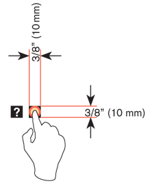
The minimum area for touch activation, to address the general population, is a square 3/8 of an inch on each side (10 mm). See Figure D-1. When possible, use larger target areas. Important targets should be larger than others.
There is no distinct preference for vertical or horizontal finger touch areas. All touch can be assumed to be a circle, though the actual input item may be shaped as needed to fit the space, or express a preconceived notion (e.g., button). Due to reduced precision and poor control of pressure, but smaller fingers, children who can use devices unassisted have the same touch target size.

Targets
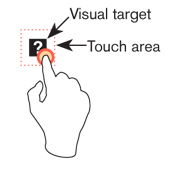
The visual target is not always the same as the touch area. However, the touch area may never be smaller than the visual target. When practical (i.e., there is no adjacent interactive item) the touch area should be notably larger than the visual target, filling the “gutter” or whitespace between objects. Some dead space should often be provided so that edge contact does not result in improper input.
In the example shown in Figure D-2, the orange dotted line is the touch area. It is notably larger than the visual target, so a missed touch (as shown) still functions as expected.

Touch Area and the Centroid of Contact
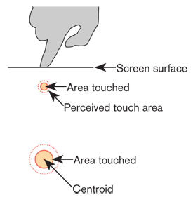
The point activated by a touch (on capacitive touch devices) is the centroid of the touched area; that area where the user’s finger is flat against the screen.
The centroid is the center of area whose coordinates are the average (arithmetic mean) of the coordinates of all the points of the shape. This may be sensed directly (the highest change in local capacitance for projected-capacitive screens) or calculated (center of the obscured area for beam sensors).
A larger area will typically be perceived to be touched by the user, due to parallax (advanced users may become aware of the centroid phenomenon, and expect this). See Figure D-3.

Bezels, Edges, and Size Cheats
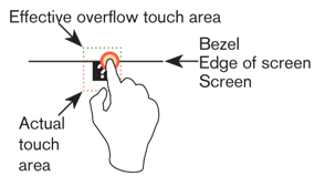
Buttons at the edges of screens with flat bezels may take advantage of this to use smaller target sizes. The user may place her finger so that part of the touch is on the bezel (off the sensing area of the screen). This will effectively reduce the size of her finger, and allow smaller input areas.
This effective size reduction can only be about 60% of normal (so no smaller than 0.225 inch or 6 mm) and only in the dimension with the edge condition. This is practically most useful to give high-priority items a large target size without increasing the apparent or on- screen size of the target or touch area. See Figure D-4.

Next: Fitts' Law
Discuss & Add
Please do not change content above this line, as it's a perfect match with the printed book. Everything else you want to add goes down here.
Where this info came from
When I needed to know touch target sizes, there were basically no guidelines, at least from a digital POV. Apple had their 44px thing, but it seemed rather suspiciously non-physical.
So, I did primary research. Without funding, I had to do "friends and family" but indeed grabbed everyone I could (over 150 individuals as I recall) at a couple parties, sent the interns off to grab all their friends and classmates, etc. The methodology involved a target printed on a piece of paper, which the user touched with an inked (inkpad) finger.
This is how not only did we come up with sizes, but other good observations like:
- The pad of the finger, though apparently vertically-oriented, doesn't always flatten like that.
- Also, many people do not hit the target vertically.
- Children have the same touch target as adults. I gather due to the excessive force used, their fingers flatten out more.
- No other differences in age, sex, experience, etc. Fingers are fingers.
Hence, a circular target of the size we say. The data gathering, along with subsequent observations of applying these specifications, make me very confident of them. The edge-usage sizing, for example, was a theory until we applied it and checked in a lab. First try I made them too small (there was a math reason), so am sure of the 60% size.
Test for touch target compliance
There's a blog post up here where I discuss how to apply these guidelines, with specific hints on using templates as guides to observe interfering interaction elements.
Hint: I am working on a better method. Probably will be on Kickstarter in a couple weeks here.
More References
For now, just gathering. But there are a few papers that are new, which I missed before, etc. and I want to pull them all in and see what they say:
- Effect of touch screen button size and spacing on touch characteristics of users with and without disabilities (need link!)
http://dl.acm.org/citation.cfm?id=2042053.2042065&coll=DL&dl=GUIDE&CFID=198677358&CFTOKEN=56947740
http://dl.acm.org/citation.cfm?id=1152215.1152260&coll=DL&dl=GUIDE&CFID=198677358&CFTOKEN=56947740
http://dl.acm.org/citation.cfm?id=1518701.1518750&coll=DL&dl=GUIDE&CFID=198677358&CFTOKEN=56947740
http://dl.acm.org/citation.cfm?id=1409240.1409304&coll=DL&dl=GUIDE&CFID=198677358&CFTOKEN=56947740
http://dl.acm.org/citation.cfm?id=1610664.1610711&coll=DL&dl=GUIDE&CFID=198677358&CFTOKEN=56947740
http://dl.acm.org/citation.cfm?id=1610582.1610613&coll=DL&dl=GUIDE&CFID=198677358&CFTOKEN=56947740
http://dl.acm.org/citation.cfm?id=2379636.2379644&coll=DL&dl=GUIDE&CFID=198677358&CFTOKEN=56947740
http://dl.acm.org/citation.cfm?id=1769821.1769895&coll=DL&dl=GUIDE&CFID=198677358&CFTOKEN=56947740
http://dl.acm.org/citation.cfm?id=1851600.1851619&coll=DL&dl=GUIDE&CFID=198677358&CFTOKEN=56947740
http://dl.acm.org/citation.cfm?id=2037373.2037395&coll=DL&dl=GUIDE&CFID=198677358&CFTOKEN=56947740

