|
Size: 652
Comment:
|
Size: 7270
Comment:
|
| Deletions are marked like this. | Additions are marked like this. |
| Line 1: | Line 1: |
| adding notes and nodes along a line graph like google analytics, adding pins to map locations, establishing a reference point with additional information. So: A little thing that indicates, and clicking gives you a little more data, which may well NOT be in the little icon, hence it's not just an Icon (which see) and is a different item. ALSO see the eReader project where the highlight can be selected and show more info (not a Tooltip, though, as that is limited, read only, etc.) |
|
| Line 4: | Line 2: |
| A data point in a dense array of information must be able to show additional details or options without leaving the original display context. | |
| Line 6: | Line 5: |
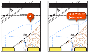
| {{attachment:Annotation-Expanded.png|A typical example of a Reveal Label. When originally selected, a small pointer indicator is used alone. When selected further, a label with details is revealed, as shown to the right.|align="right"}} | |
| Line 7: | Line 7: |
| High-density information displays, such as maps, charts and graphs, often carry additional layers of information, or may be best understood by viewing details at a point. Conventional methods of drilling in deeper such as the '''[[Link]]''' or '''[[Button]]''' are unsuitable for finding out about a specific data point as they remove the user from the original context. A special type of widget is used instead, exemplified by the "pinpoint." An iconic element points to the information selected, and presents (sometimes only after further selection, or in another area of the screen) a label and additional options. This should not be confused with the '''[[Tooltip]]'''. A deliberate action is required to reveal the info information. Tooltips, instead, are transient and initiated by hover or automatically presented when the system determines the user needs help Content within an '''Annotation''' is discrete information, or may even carry functionality, and is not simply help or explanatory text as in a Tooltip. |
|
| Line 9: | Line 16: |
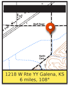
| {{attachment:Annotation-Banner.png|A banner attached to the edge of the viewport can also be used as a label. This is most useful for large amounts of information, which would otherwise clutter the display so much it could not be seen clearly.|align="right"}} | |
| Line 10: | Line 18: |
| There are numerous ways in which selection of an item can reveal additional details without entirely disreagrding the original context. Many of these, such as split-screen variations, are not yet common enough they can be considered patterns, but these three are very common: '''Fixed Label''' - When an area is highlighted by the system, or selected by the user, a label bearing text and/or icons is displayed as a part of the graphic "pinpoint" indicator. '''Reveal Label''' - When originally selected, either by the user or the system, a small "pinpoint" indicator is placed. This may have no label, or a very simple one such as a shape, color or single letter. When the user selects the pinpoint again, it will expand to reveal a larger label, which may be identical to the Fixed Label. This is especially useful when multiple pinpoints may be needed, such as graphically-represented search results. The user may then subsequently select details on any individual result. '''Banner''' - A small "pinpoint" indicator is used to mark the location on the data array, as in the Reveal Label. At another location on the page, usually a strip anchored to the top or bottom of the viewport, is the label text, or graphics. This is most suitable when a large amount of data must be presented, or a number of selectable options should be selected. In this case, the style and functionality of any '''[[Fixed Menu]]''' or '''[[Revealable Menu]]''' used within the OS or application should be carefully considered, and may be re-used without modification. Any of these three options may well be used in conjunction with each other, within a single interface. For example when single selections are made, the Fixed Label is used, and for search results, the Reveal Label. |
|
| Line 12: | Line 31: |
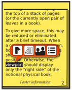
| {{attachment:Annotation-Text.png|Annotations can be used in non-graphical data sets, such as charts or as shown here, to provide options for selected text. This also exemplifies how multiple selections may be made within a single pinpoint label.|align="right"}} | |
| Line 13: | Line 33: |
| Selection details are simple, and mostly outlined in the Variations section above. In some cases, Reveal Labels may convert from the small to large display when hovered or when the item is in focus, instead of by explicit selection. This is, of course, only suitable for interfaces with a focus separate from selection, such as scroll and select and certain pen devices. When more than one pinpoint is visible, the Reveal Label or Banner style should be used, and only the item in focus (or selected) should display it's label. This also serves to simplify selection of options from any other menu systems that may be present in the application. When a Reveal Label is expanded, it has to get out of the way of other actions the user might request. If a selection is made somewhere else on the page, especially somewhere adjacent to the label, it should be disappear and revert to a pinpoint only. |
|
| Line 15: | Line 42: |
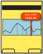
| {{attachment:Annotation-Bar.png|The type of pointer used must be selected to comport with the data being indicted. The expanded label can be quite far from the content being pointed out if the indictor is extended properly. Here, a one-dimensional scrolling graph has a pinpoint that indicates a position on the horizontal axis. The intersection point on the graph could have been selected instead, if this is the only data shown on this date.|align="right"}} | |
| Line 16: | Line 44: |
| Pinpoints must be easily selectable. For touch or pen devices, follow best practices for the size of the pinpoint. For scroll and select devices, the pinpoint currently in focus must indicate it is selected, and clearly differentiate this from any non-selected pinpoints. The pinpoint must clearly indicate the location in the data set referenced. Use appropriate selection methods: * Pointers for two-dimensional coordinates. * Lines for positions on one-dimensional graphs. * Highlights for text, or fields within charts. Pinpoints and labels must be clearly not part of the page context. Use borders, shadows, and transitions to make this clear. It is often best to make it appear as though the pinpoint is floating above the image, or protruding from the page. Certain practices described in the '''[[Simulated 3D Effects]]''' pattern may be used to emphasize this. When only one item may be selected, be sure to not imply there are multiple options, by offering a '''[[Button]]''' or underlined '''[[Link]]''' separate from other selectable items. If needed, to clarify the click action, a false button (or link) can be added to the area, as it might be used in a banner ad. |
|
| Line 19: | Line 59: |
| Labels should never exceed the space available. Do not let them simply float off the page. Label text should not end in ellipsis or wrap to a second line. Multiple lines of information may be displayed, but each line should carry it's own information. | |
| Line 21: | Line 62: |
---- = Discuss & Add = Please do not change content above this line, as it's a perfect match with the printed book. Everything else you want to add goes down here. |
|
| Line 22: | Line 69: |
| If you want to add examples (and we occasionally do also) add them here. == Make a new section == Just like this. If, for example, you want to argue about the differences between, say, Tidwell's Vertical Stack, and our general concept of the List, then add a section to discuss. If we're successful, we'll get to make a new edition and will take all these discussions into account. |
Problem
A data point in a dense array of information must be able to show additional details or options without leaving the original display context.

Solution
High-density information displays, such as maps, charts and graphs, often carry additional layers of information, or may be best understood by viewing details at a point. Conventional methods of drilling in deeper such as the Link or Button are unsuitable for finding out about a specific data point as they remove the user from the original context.
A special type of widget is used instead, exemplified by the "pinpoint." An iconic element points to the information selected, and presents (sometimes only after further selection, or in another area of the screen) a label and additional options.
This should not be confused with the Tooltip. A deliberate action is required to reveal the info information. Tooltips, instead, are transient and initiated by hover or automatically presented when the system determines the user needs help
Content within an Annotation is discrete information, or may even carry functionality, and is not simply help or explanatory text as in a Tooltip.

Variations
There are numerous ways in which selection of an item can reveal additional details without entirely disreagrding the original context. Many of these, such as split-screen variations, are not yet common enough they can be considered patterns, but these three are very common:
Fixed Label - When an area is highlighted by the system, or selected by the user, a label bearing text and/or icons is displayed as a part of the graphic "pinpoint" indicator.
Reveal Label - When originally selected, either by the user or the system, a small "pinpoint" indicator is placed. This may have no label, or a very simple one such as a shape, color or single letter. When the user selects the pinpoint again, it will expand to reveal a larger label, which may be identical to the Fixed Label.
This is especially useful when multiple pinpoints may be needed, such as graphically-represented search results. The user may then subsequently select details on any individual result.
Banner - A small "pinpoint" indicator is used to mark the location on the data array, as in the Reveal Label. At another location on the page, usually a strip anchored to the top or bottom of the viewport, is the label text, or graphics. This is most suitable when a large amount of data must be presented, or a number of selectable options should be selected. In this case, the style and functionality of any Fixed Menu or Revealable Menu used within the OS or application should be carefully considered, and may be re-used without modification.
Any of these three options may well be used in conjunction with each other, within a single interface. For example when single selections are made, the Fixed Label is used, and for search results, the Reveal Label.

Interaction Details
Selection details are simple, and mostly outlined in the Variations section above.
In some cases, Reveal Labels may convert from the small to large display when hovered or when the item is in focus, instead of by explicit selection. This is, of course, only suitable for interfaces with a focus separate from selection, such as scroll and select and certain pen devices.
When more than one pinpoint is visible, the Reveal Label or Banner style should be used, and only the item in focus (or selected) should display it's label. This also serves to simplify selection of options from any other menu systems that may be present in the application.
When a Reveal Label is expanded, it has to get out of the way of other actions the user might request. If a selection is made somewhere else on the page, especially somewhere adjacent to the label, it should be disappear and revert to a pinpoint only.

Presentation Details
Pinpoints must be easily selectable. For touch or pen devices, follow best practices for the size of the pinpoint.
For scroll and select devices, the pinpoint currently in focus must indicate it is selected, and clearly differentiate this from any non-selected pinpoints.
The pinpoint must clearly indicate the location in the data set referenced. Use appropriate selection methods:
- Pointers for two-dimensional coordinates.
- Lines for positions on one-dimensional graphs.
- Highlights for text, or fields within charts.
Pinpoints and labels must be clearly not part of the page context. Use borders, shadows, and transitions to make this clear. It is often best to make it appear as though the pinpoint is floating above the image, or protruding from the page. Certain practices described in the Simulated 3D Effects pattern may be used to emphasize this.
When only one item may be selected, be sure to not imply there are multiple options, by offering a Button or underlined Link separate from other selectable items. If needed, to clarify the click action, a false button (or link) can be added to the area, as it might be used in a banner ad.
Antipatterns
Labels should never exceed the space available. Do not let them simply float off the page. Label text should not end in ellipsis or wrap to a second line. Multiple lines of information may be displayed, but each line should carry it's own information.
Discuss & Add
Please do not change content above this line, as it's a perfect match with the printed book. Everything else you want to add goes down here.
Examples
If you want to add examples (and we occasionally do also) add them here.
Make a new section
Just like this. If, for example, you want to argue about the differences between, say, Tidwell's Vertical Stack, and our general concept of the List, then add a section to discuss. If we're successful, we'll get to make a new edition and will take all these discussions into account.
