|
Size: 152
Comment:
|
Size: 6129
Comment:
|
| Deletions are marked like this. | Additions are marked like this. |
| Line 1: | Line 1: |
| Dan Saffer "Advertising: Might mention ads that are inserted into the middle of a list. See these occasionally with various clients." Hmm... Need to ask him if it's a pattern or anti? Illustration. One size in illustration is "AAV" - Presume a section mechanism typo. Need to fix it. ---- |
|
| Line 2: | Line 8: |
| Advertising must be placed in an application, site or other service. | |
| Line 3: | Line 10: |
{{attachment:Advertising-TwoTypes.png|Advertising may be within the page, so it scrolls with content, or locked to the side of the viewport, and does not scroll.|align="right"}} |
|
| Line 4: | Line 13: |
| Many sites, applications, and even entire mobile services are ad sponsored. These ads must be neither hidden away, nor so prominent they damage the user experience. They are a key, necessary function of the product, and must be integrated correctly and well or the product will go out of business. Advertising in mobile must be: * Clearly differentiated from the content. * Clear, readable, legible and interactable. * In the same place, and used in the same way, on each screen and in each state. * Unobtrusive enough to not interfere with the interaction of the actual product. |
|
| Line 6: | Line 23: |
| While numerous graphic variations are possible, only two key methods are really used. Ads may be loaded within the content of the page, so they scroll with the page. These are usually near the top and bottom of any particular page, associated with the masthead/title and any links or functions in the footer. For very large pages, there may be additional advertising at key breaks in the middle of the page as well. Ads may, alternatively, be docked, or fixed in the viewport. This is an especially useful solution for applications with multi-tier access, where payment removes the whole layer. The rest of the screen scrolls as normal, but this element is locked to the edge of the viewport, much like a '''[[Fixed Menu]]'''. |
|
| Line 8: | Line 31: |
| Advertising should always be selectable, so the user may get more information or purchase the product. This link must load so it does not interfere with the existing process, by opening in a new browser window, or launching the application store. For tiered services, which an ad is displayed for low-price or free access, a link should be provided immediately adjacent to the ad to allow the user to upgrade to the paid version, without advertising. |
|
| Line 10: | Line 37: |
| Banners should always display in standard sizes. Ad providers can then use existing ad units, and do not need excessive productions details, as they can follow standards published elsewhere. In most cases, the sizes and other specifications published by the Mobile Marketing Association will work (See http://www.mmaglobal.com/mobileadvertising.pdf for details). {{attachment:Advertising-MMA.png|The sizes of standard MMA banners and their suggested common screen sizes.}} Only for very large devices, especially tablet-sized devices, will other sizes be used. These will often be provided by others (such as ad services) or the smaller common desktop sizes can be used instead. The ad must be displayed in a manner that clearly differentiates is from the actual page content. There are three basic ways to accomplish this: 1. Place the ad on a shaded, tinted or colored background. Usually, the background should extend the full width of the page. 1. Separate the ad from the rest of the content with rules, which must run full width, or a closed box larger than the ad. 1. If the ad is slightly smaller than the screen width (by using one size smaller than the suggested size for the screen) use different alignment than the content. If content is left aligned, right align or center the advertising. {{attachment:Advertising-ThreeTypes.png|The three methods of differentiating the ad from the surrounding content as described above.|align="right"}} When the ad is in a docked area, it is usually docked at the bottom, and is considered to be one layer above the content. '''[[Revealable Menu]]s''' will overlaps the advertising when open. The ad may be placed at the top when fixed menus are used, or when closed reveal menus would interfere with display. The ability to select the ad should be clear. Provide a link or button in the ad, whenever possible. If there is insufficient room, use the OS standard method to indicate a link (such as a border on the image). |
|
| Line 12: | Line 55: |
| Mobile is generally so task focused that failures in advertising -- that make it too obvious or confuse it with the content -- may cause immediate loss of customers. Follow the guidelines here (and at the MMA) and be sure to include real ads when conducting user research. Do not make ads too large, so the content is difficult to read. This is especially key for small screens using docked advertising space. If this could be a problem, then switch to the in-line style. There is almost never a reason to place a text label such as "advertising" next to the banners. This should be able to be communicated with design. If not, fix the design, instead of wasting space with labels. Advertising should almost never animate. This will distract from the core content of the application or other process. If absolutely required, use it very carefully and sparingly. Do not use custom sizes for any banners. Advertisers will not go to the effort of making new sizes, and all services require abiding by their guidelines, so your revenue base will be severely limited. ---- = Discuss & Add = Please do not change content above this like, as it's a perfect match with the printed book. Everything else you want to add goes down here. |
|
| Line 14: | Line 72: |
| If you want to add examples (and we occasionally do also) add them here. == Make a new section == Just like this. If, for example, you want to argue about the differences between, say, Tidwell's Vertical Stack, and our general concept of the List, then add a section to discuss. If we're successful, we'll get to make a new edition and will take all these discussions into account. |
Dan Saffer "Advertising: Might mention ads that are inserted into the middle of a list. See these occasionally with various clients." Hmm... Need to ask him if it's a pattern or anti? Illustration.
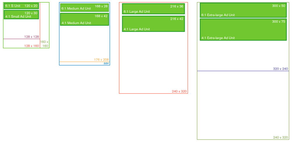
One size in illustration is "AAV" - Presume a section mechanism typo. Need to fix it.
Problem
Advertising must be placed in an application, site or other service.

Solution
Many sites, applications, and even entire mobile services are ad sponsored. These ads must be neither hidden away, nor so prominent they damage the user experience. They are a key, necessary function of the product, and must be integrated correctly and well or the product will go out of business.
Advertising in mobile must be:
- Clearly differentiated from the content.
- Clear, readable, legible and interactable.
- In the same place, and used in the same way, on each screen and in each state.
- Unobtrusive enough to not interfere with the interaction of the actual product.
Variations
While numerous graphic variations are possible, only two key methods are really used.
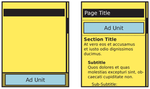
Ads may be loaded within the content of the page, so they scroll with the page. These are usually near the top and bottom of any particular page, associated with the masthead/title and any links or functions in the footer. For very large pages, there may be additional advertising at key breaks in the middle of the page as well.
Ads may, alternatively, be docked, or fixed in the viewport. This is an especially useful solution for applications with multi-tier access, where payment removes the whole layer. The rest of the screen scrolls as normal, but this element is locked to the edge of the viewport, much like a Fixed Menu.
Interaction Details
Advertising should always be selectable, so the user may get more information or purchase the product. This link must load so it does not interfere with the existing process, by opening in a new browser window, or launching the application store.
For tiered services, which an ad is displayed for low-price or free access, a link should be provided immediately adjacent to the ad to allow the user to upgrade to the paid version, without advertising.
Presentation Details
Banners should always display in standard sizes. Ad providers can then use existing ad units, and do not need excessive productions details, as they can follow standards published elsewhere. In most cases, the sizes and other specifications published by the Mobile Marketing Association will work (See http://www.mmaglobal.com/mobileadvertising.pdf for details).

Only for very large devices, especially tablet-sized devices, will other sizes be used. These will often be provided by others (such as ad services) or the smaller common desktop sizes can be used instead.
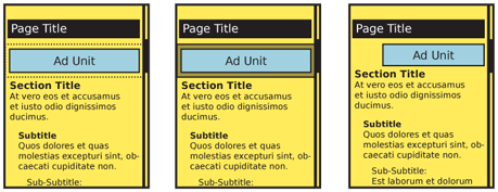
The ad must be displayed in a manner that clearly differentiates is from the actual page content. There are three basic ways to accomplish this:
- Place the ad on a shaded, tinted or colored background. Usually, the background should extend the full width of the page.
- Separate the ad from the rest of the content with rules, which must run full width, or a closed box larger than the ad.
- If the ad is slightly smaller than the screen width (by using one size smaller than the suggested size for the screen) use different alignment than the content. If content is left aligned, right align or center the advertising.
 When the ad is in a docked area, it is usually docked at the bottom, and is considered to be one layer above the content. Revealable Menus will overlaps the advertising when open. The ad may be placed at the top when fixed menus are used, or when closed reveal menus would interfere with display.
The ability to select the ad should be clear. Provide a link or button in the ad, whenever possible. If there is insufficient room, use the OS standard method to indicate a link (such as a border on the image).
Antipatterns
Mobile is generally so task focused that failures in advertising -- that make it too obvious or confuse it with the content -- may cause immediate loss of customers. Follow the guidelines here (and at the MMA) and be sure to include real ads when conducting user research.
Do not make ads too large, so the content is difficult to read. This is especially key for small screens using docked advertising space. If this could be a problem, then switch to the in-line style.
There is almost never a reason to place a text label such as "advertising" next to the banners. This should be able to be communicated with design. If not, fix the design, instead of wasting space with labels.
Advertising should almost never animate. This will distract from the core content of the application or other process. If absolutely required, use it very carefully and sparingly.
Do not use custom sizes for any banners. Advertisers will not go to the effort of making new sizes, and all services require abiding by their guidelines, so your revenue base will be severely limited.
Discuss & Add
Please do not change content above this like, as it's a perfect match with the printed book. Everything else you want to add goes down here.
Examples
If you want to add examples (and we occasionally do also) add them here.
Make a new section
Just like this. If, for example, you want to argue about the differences between, say, Tidwell's Vertical Stack, and our general concept of the List, then add a section to discuss. If we're successful, we'll get to make a new edition and will take all these discussions into account.
